The widget (fig. 1) allows creating a button that triggers a popup.
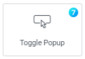
Fig. 1. Toggle Popup Widget.
The widget can use different icon skins that are displayed on the element.
Content
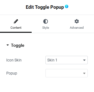
Fig. 2. Toggle Popup Content Tab Settings.
Content tab (fig. 2) includes the following settings:
- icon skin (predefined skins that define the icon appearance);
- popup (select the popup that will be triggered by the button);
Style
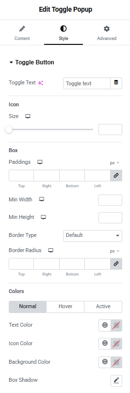
Fig. 3. Toggle Popup Style Tab Settings.
Style tab (fig. 3) allows to configure the appearance of the following elements:
Toggle Button section includes the following settings:
- toggle text;
- icon size;
Box section allows to configure:
- padding;
- minimum width;
- minimum height;
- border type;
- border radius;
Colors section allows to configure:
- text color (normal/hover/active);
- icon color (normal/hover/active);
- background color (normal/hover/active);
- box shadow;
Advanced
The advanced section contains standard Elementor settings. More info is available here.