Using this element, you can add a carousel with WooCommerce products to your page (fig. 1.1 – 1.2):
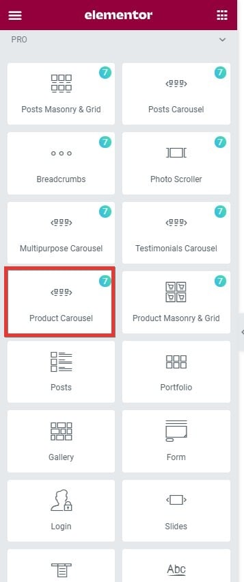
Fig. 1.1. Product Carousel. Widget.
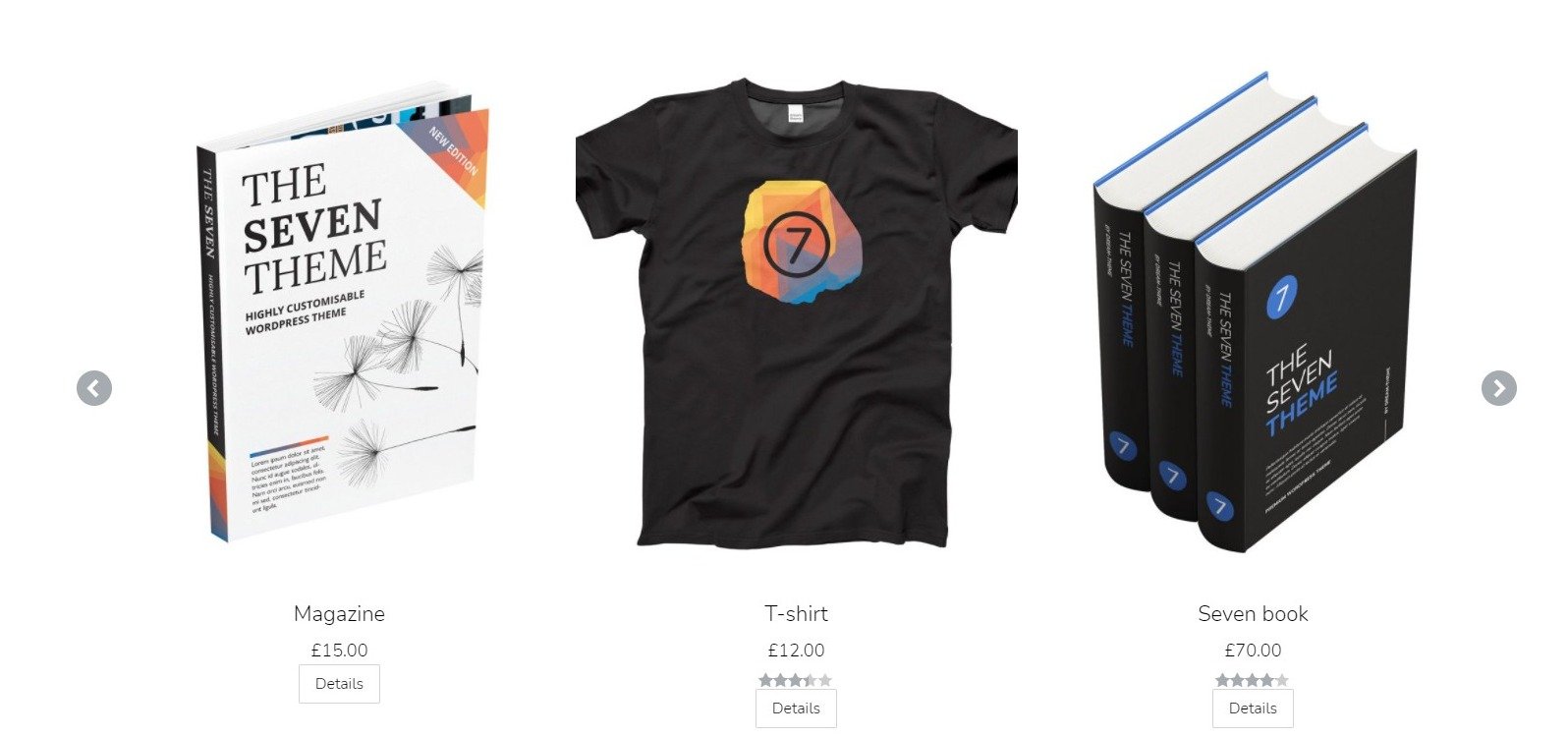
Fig. 1.2. Product Carousel. Appearance.
Content
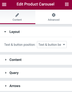
Fig. 2.2. Products layout.
You can adjust “text & button” position in the “Layout” tab (fig. 2.1). Choose among the following options:
- Text & button below image
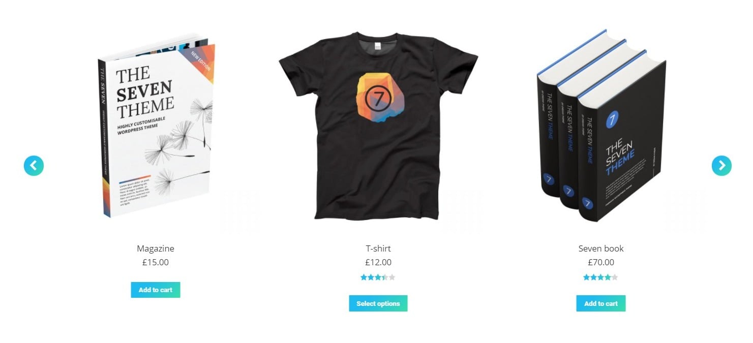
Fig. 2.2. Text & button below image.
- Text below image, button on image
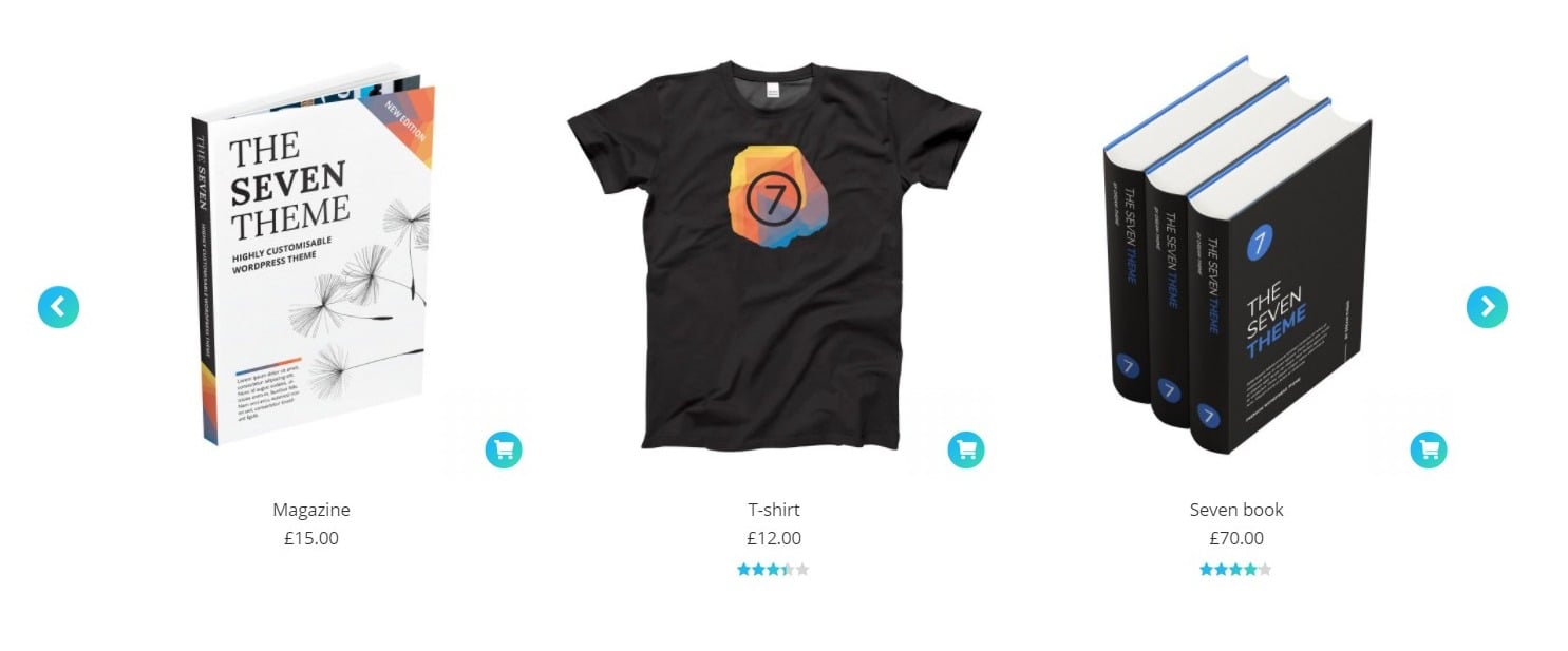
Fig. 2.3. Text below image, button on image
- Text below image, button on image hover
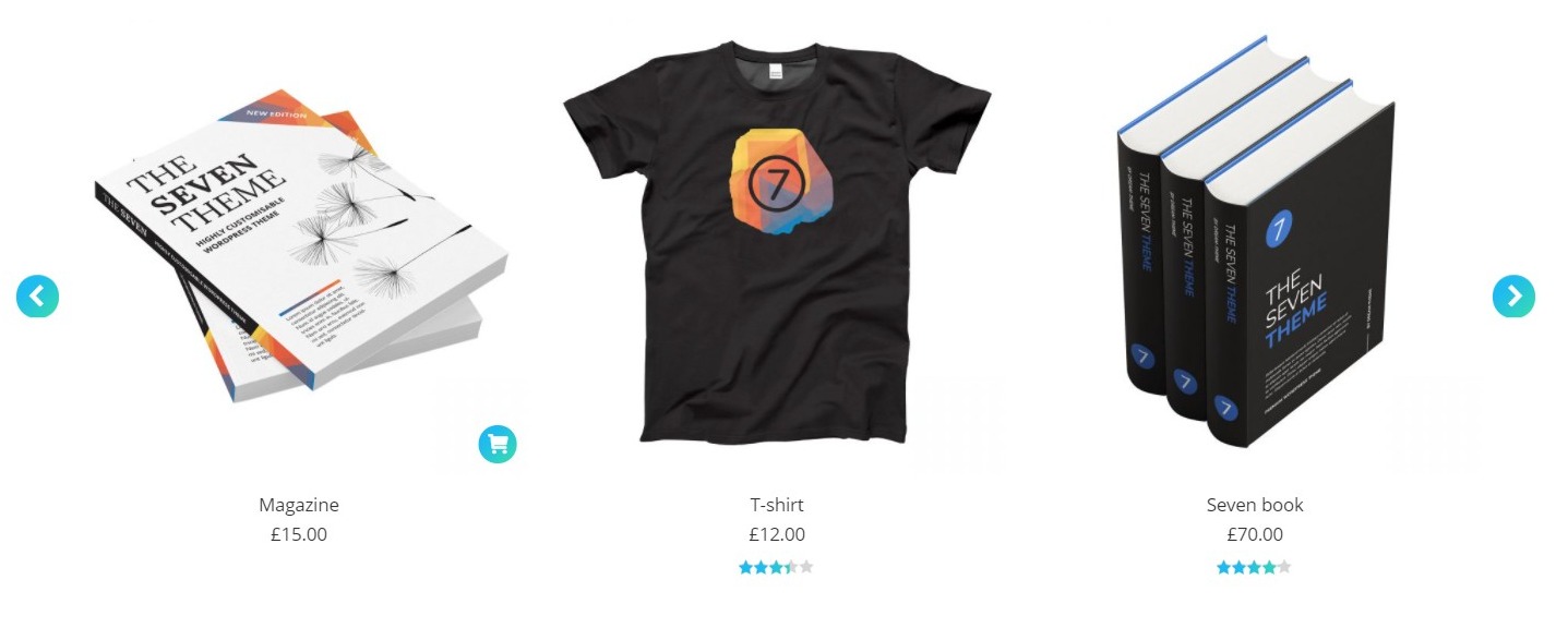
Fig. 2.4. Text below image, button on image hover.
In the “Content” you can also configure:
- amount of the products in the carousel;
- number of columns per device (fig. 3);
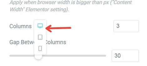
Fig. 3. Responsive settings.
- gap between columns;
- paddings of the carousel;
- adaptive height: to automatically adjust the height of the carousel depending on the content height of each slide.
In the “Content” tab (fig. 4), you can set what posts you want to show in the carousel.
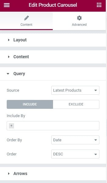
Fig. 4. Content tab.
You can pick from:
- latest products;
- sale;
- top rated products;
- best selling;
- featured;
- manual selection;
- related products – usable when you use it on a single product, or in product’s template;
- current query – usable on archive templates.
In the “Arrows” tab (fig. 5), you can:
- pick the icons for the carousel arrows;
- control the entire appearance of the arrows (color, size, margins, paddings, position and much more).
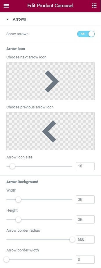
Fig. 5. Arrows tab.
Advanced
Advanced section contains standard Elementor settings. More info is available here.