This widget allows displaying a carousel of blog posts, portfolio, etc. (fig. 1):
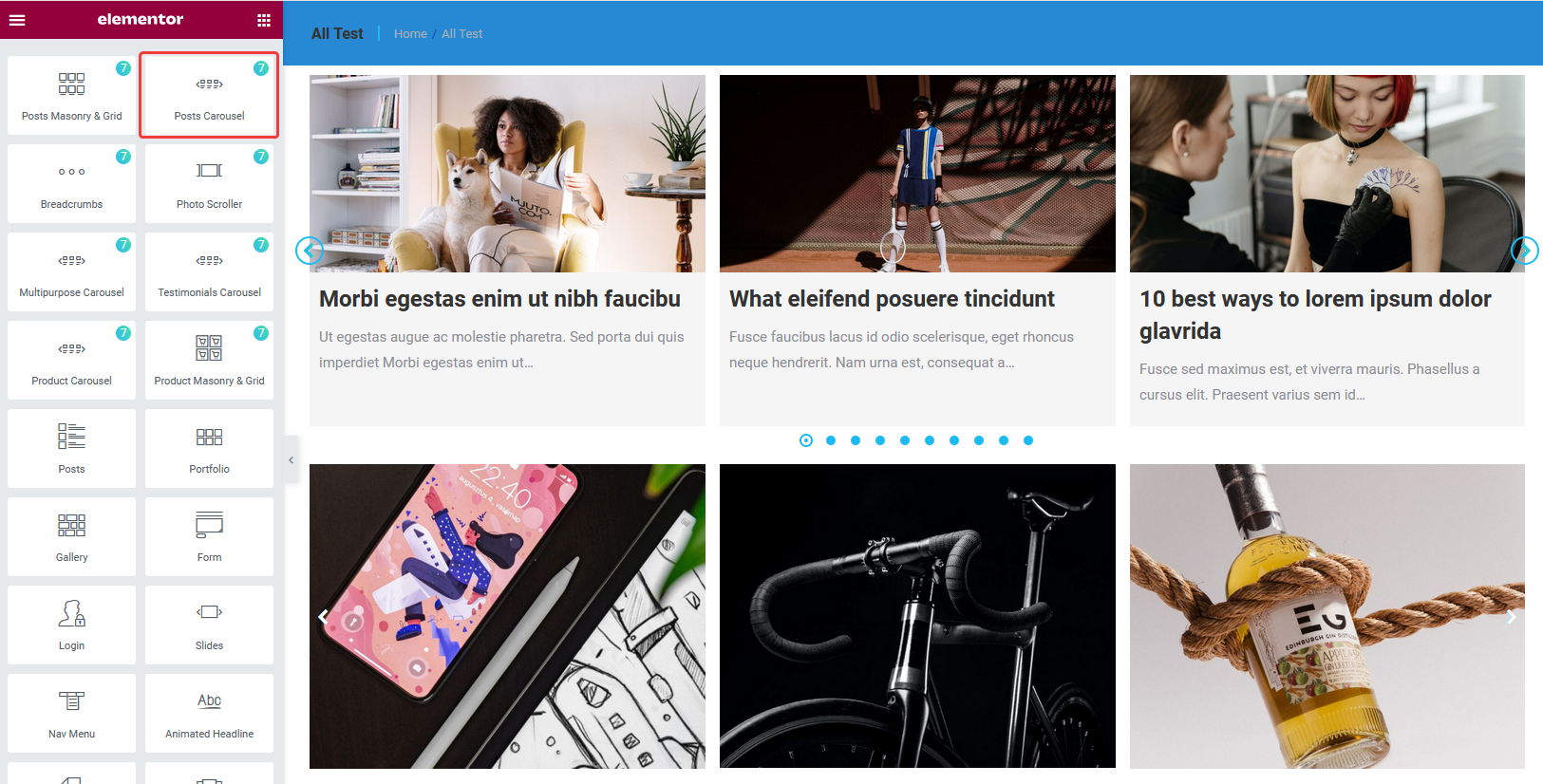
Fig. 1.1. Posts Carousel.
Content
The first “Query” tab in widget settings offers to select which posts to display (fig. 1.2):
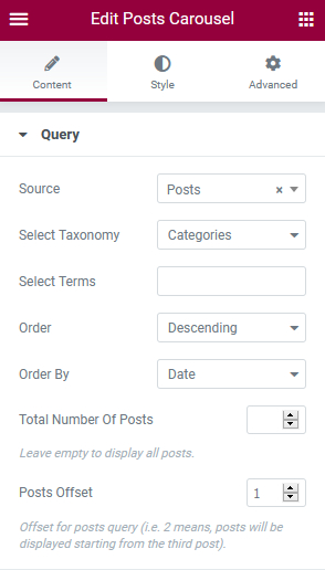
Fig. 2.1. Query tab.
You can select posts basing on their:
- post type: blog post, portfolio, album, team, testimonials. There are also options “Archive” – for displaying current query of posts, when building an archive template; and “Related” – for displaying so called “Related Posts” section on a single post page;
- category;
- tags (available for blog and portfolio posts only).
It also has an option for ordering posts by date, name, etc.
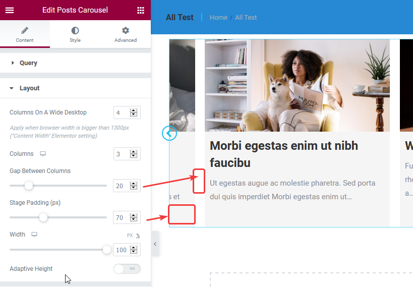
Fig. 2.2. Layout tab.
“Layout” tab allows to select:
- the number of columns for different devices;
- gap between columns;
- stage padding: the padding on the left and right of the carousel;
- width: width of the carousel for different devices;
- adaptive height: to automatically adjust the height of the carousel depending on the content height of each slide.
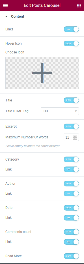
Fig. 2.3. Content tab.
- links across the post;
- hover Icon (also choose the icon itself);
- title (also select h1/h2/h3/… tag for the title);
- excerpt (specify the number of words);
- meta info: category, author, date, number of comments;
- “Read more” button (also specify the button label, icon and its position).
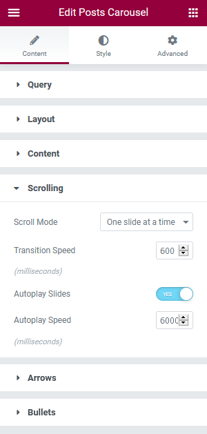
Fig. 2.4. Scrolling tab.
In the “Scrolling” tab (fig. 2.4), you can configure:
- scrolling mode: One slide (post) at a time / All slides in the viewport;
- transition speed;
- autoplay.
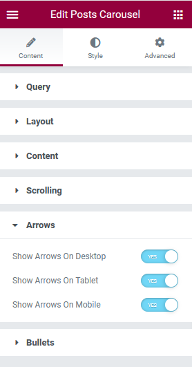
Fig. 2.5. Arrows and Bullets tabs.
In the “Arrows” and “Bullet” tabs, you can enable/disable arrows and bullets for different devices. The icon, size, style, size, color, position, etc can be configured under the Style tab (fig. 12).
Style
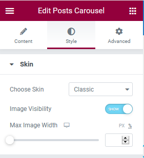
Fig. 3.1. Skin tab.
“Skin” tab (fig. 3.1) allows choosing different skins for the carousel:
- Classic
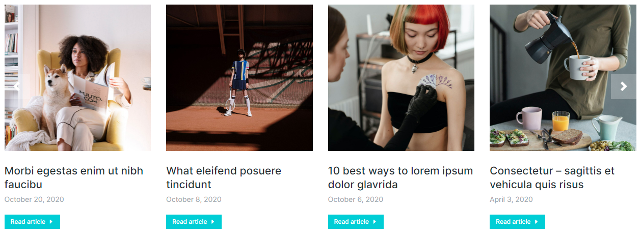
Fig. 3.2. Classic skin.
- Overlapping content area
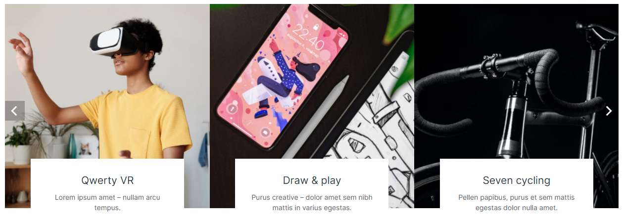
Fig. 3.3. Overlapping content area.
- Blurred content area
Fig. 3.4. Blurred content area.
- Simple overlay on hover
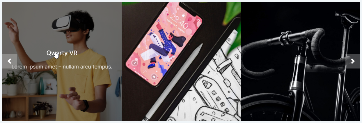
Fig. 3.5. Simple overlay on hover.
- Blurred bottom overlay on hover
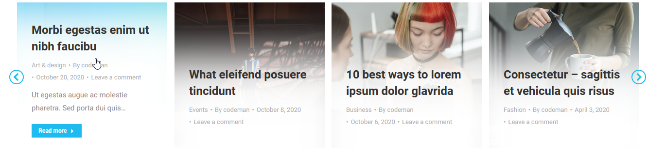
Fig. 3.6. Blurred bottom overlay on hover.
You can also hide the featured image there, as well as specify its max-width.
The “Box” tab allows to style the area behind the entire box (fig. 4):
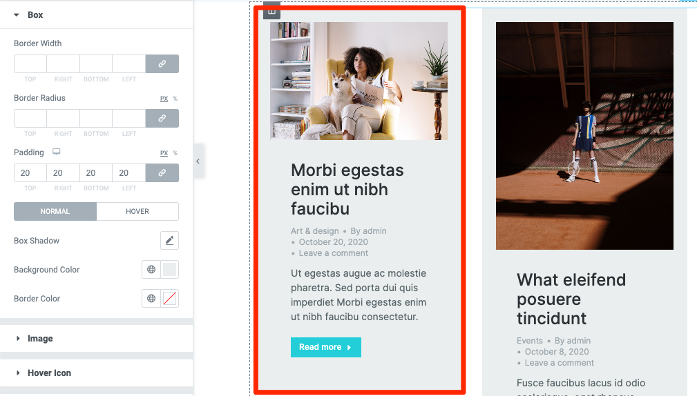
Fig. 4. Box behind the text.
You can adjust border width, color and radius, as well as background color and padding. Box shadow setting is also available here.
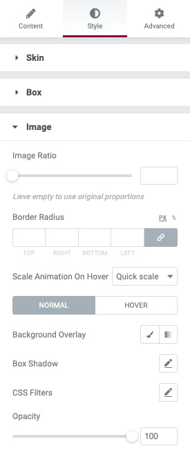
Fig. 5. Image tab.
Within the “Image” tab, it is possible to configure the following settings of posts featured images (fig. 5):
- image ratio;
- border radius;
- animation effect on image hover;
- image overlay effects. Including color, opacity, filters (blur, brightness, etc.) and box shadow.
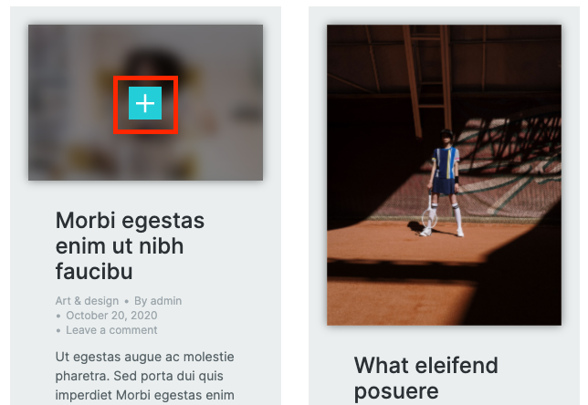
Fig. 6.1. Hover icon.
While the hover icon itself (fig. 6.1) can be chosen in the “Content” section (fig. 2.3), its appearance should be configured in the “Hover” tab (fig. 6.2) of the “Style” section:
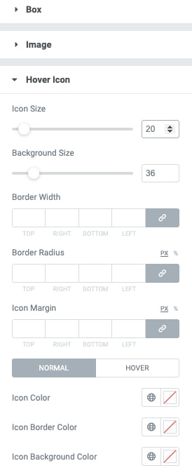
Fig. 6.2. Hover icon styling.
Adjust the following settings there:
- icon size and size of the background behind the icon;
- border width and radius;
- icon margins;
- colors of the icon, its background and border. For both idle and hover states.
“Content” tab allows to adjust appearance of the area behind text content: title, excerpt, etc. (fig. 7):
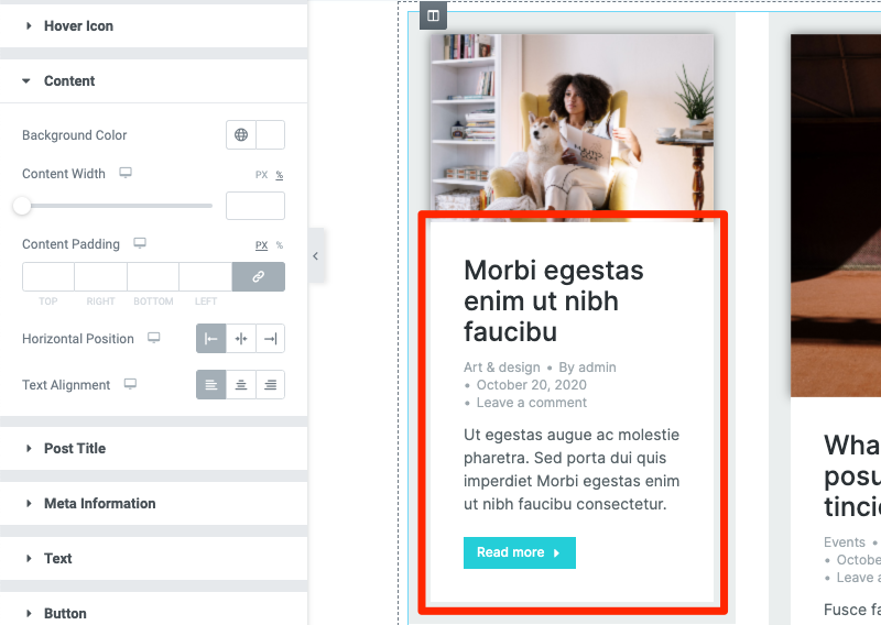
Fig. 7. Content tab.
The following options are available:
- background color;
- content width and color;
- horizontal position of the entire content are;
- horizontal alignment of the text inside.
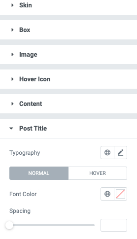
Fig. 8. Post title.
Configure post title color and typography in the appropriate tab (fig. 8). You can also specify the gap below the title (“Spacing” setting).
Same settings are available for the “Meta information” and “Text” (fig. 10) tabs. But “Meta information” tab also offers to specify a delimiter sign (fig. 9).
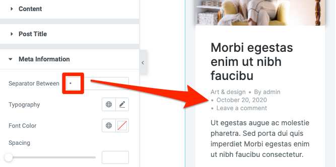
Fig. 9. Meta information tab.
Fig. 10. Text tab.
And the last “Button” tab (fig. 11) provides all required settings for the “Read more” button:
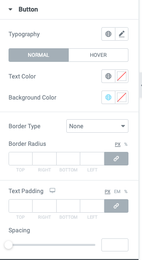
Fig. 11. Button tab.
- typography;
- text and background colors (for both idle and hover states);
- border style, width, color and radius;
- text paddings;
- gap below the button.

Fig. 12. Arrow styling.
In the “Arrows” tab (fig. 12), you can select icons for the carousel navigation, as well as control the entire appearance of the arrows:
- color;
- size;
- margins;
- paddings;
- position and much more.
Control the appearance of Bullets in the appropriate tab:
- style;
- size;
- margins;
- paddings;
- position, etc.
Bullet Styles:
- Small dot stroke

- Scale up
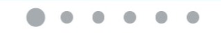
- Stroke
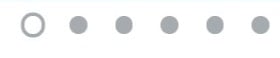
- Fill in
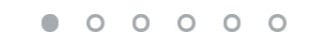
- Square
- Rectangular
Advanced
Advanced section contains standard Elementor settings. More info is available here.