The element (fig. 1.1 – 1.2) serves to show a simple, light list of products:
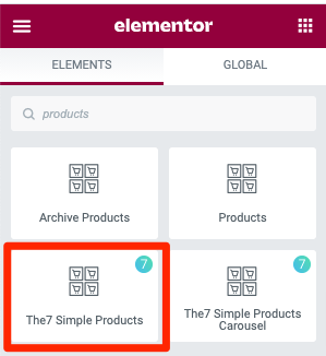
Fig. 1.1. Simple products. Widget.
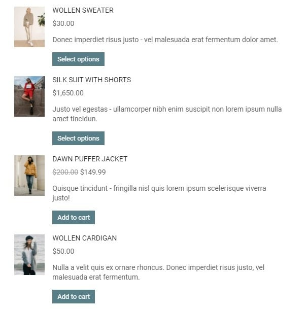
Fig. 1.2. Simple products. Appearance.
Content
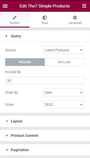
Fig. 1.3. Content tab.
In the “Query” tab (fig. 1.3) you can select the source like:
- latest products;
- sale products;
- top rated products;
- best selling products;
- manual selection;
- featured products;
- related products – usable when you use it on a single product, or in product’s template;
- recently viewed products;
- current query – usable on archive templates.
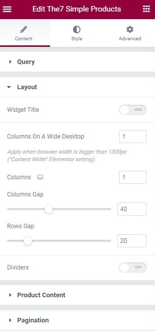
Fig. 1.4. Layout Tab.
“Layout” tab (fig. 1.4) allows to configure the basic appearance of the element:
- hide/show the title of the element, and set its Text and HTML Tag if enabled;
- number of columns per device;
- gap between columns;
- gap between rows;
- dividers (ON/OFF).
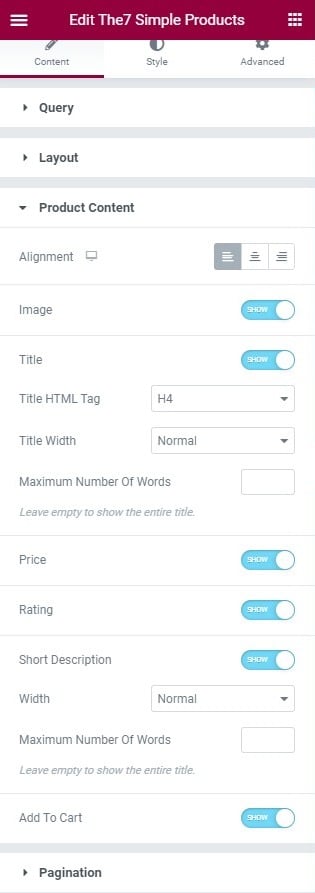
Fig. 1.5. Product Content tab.
“Product Content” tab (fig. 1.5) – here you can adjust content alignment and decide whether to show or hide the following elements:
- image;
- title (and configure its HTML tag, width and word limit);
- price;
- rating;
- short description (and configure its width and word limit);
- “add to cart” button.
“Pagination” tab. Here you can enable different modes of pagination and adjust the number of posts to display, also specify posts offset – to skip the first N posts in the query.
Style
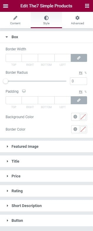
Fig. 2.1. Box tab styling.
In the “Box” tab (fig. 2.1) you can configure the appearance of single box of a product:
- border width;
- border radius;
- border color;
- padding (per device);
- background color.
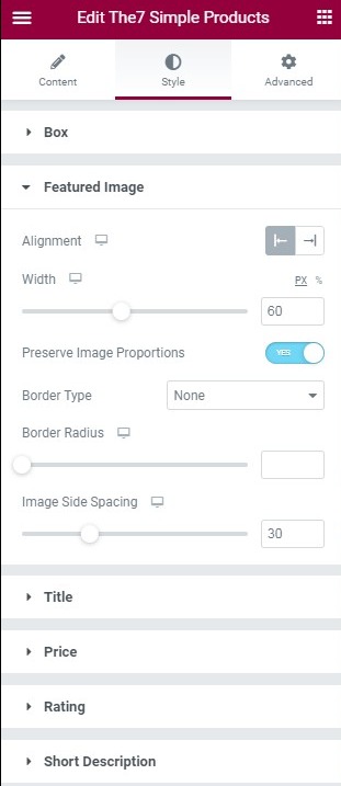
Fig. 2.2. Featured image styling.
In the “Featured Image” (2.2) tab you can configure the image appearance:
- alignment;
- width (per device);
- image proportions – preserve or ratio;
- border type and radius;
- image side spacing – the distance between image and content.
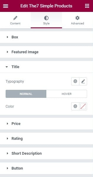
Fig. 2.3. Title styling.
In the “Title” tab (fig. 2.3) you can configure the title of the product – its typography, and color for Normal and Hover states.
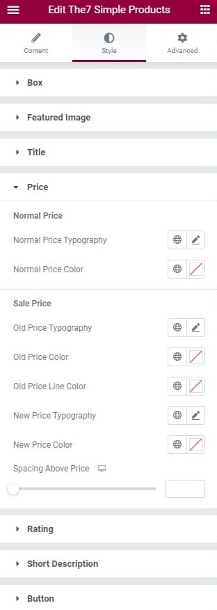
Fig. 2.4. Price styling.
Under the “Price” tab (fig. 2.4), you can adjust the normal and sale prices appearance.
For the Normal Price, you can configure:
- typography;
- color.
For the Sale Price:
- old price typography;
- old price color;
- old price line color;
- new price typography;
- new price color.
Finally, configure the “Spacing”, which determines the space between the ”old” and “new” price (adjustable for different devices).
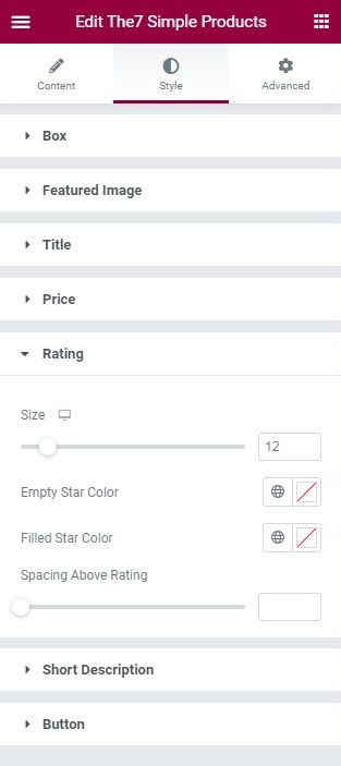
Fig. 2.5. Rating styling.
In the “Rating” tab (fig. 2.5), you can set the appearance of the star rating of the product. You can set:
- size of the stars;
- empty star color;
- filled star color;
- spacing above the stars.
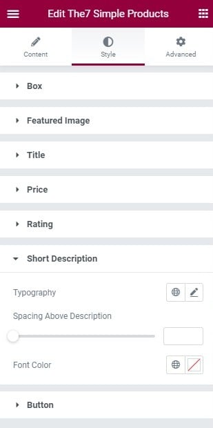
Fig. 2.6. Short Description styling.
In the “Short Description” tab (fig. 2.6), the available settings are:
- typography;
- spacing above the text;
- color.
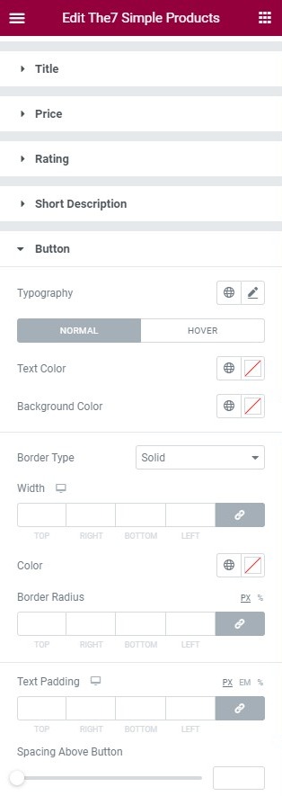
Fig. 2.7. Button styling.
And the last “Button” tab (fig. 2.7) provides all required settings for the “Add to cart” button:
- typography;
- text and background colors (for both idle and hover states);
- border style, width, color and radius;
- text paddings;
- gap above the button.
Advanced
Advanced section contains standard Elementor settings. More info is available here.