This widget allows to add an image into your content (fig. 1):
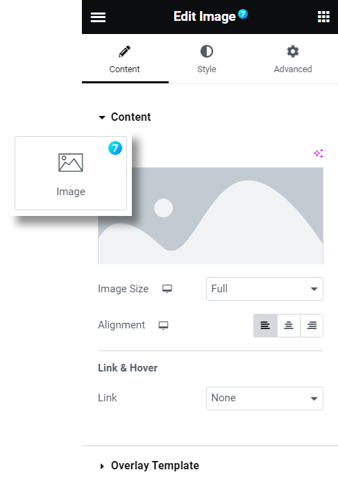
Fig. 1.1. The7 Image Widget.
This widget is very helpful when building Loop Items, because it takes 100% column widget by default (fig. 1.2):
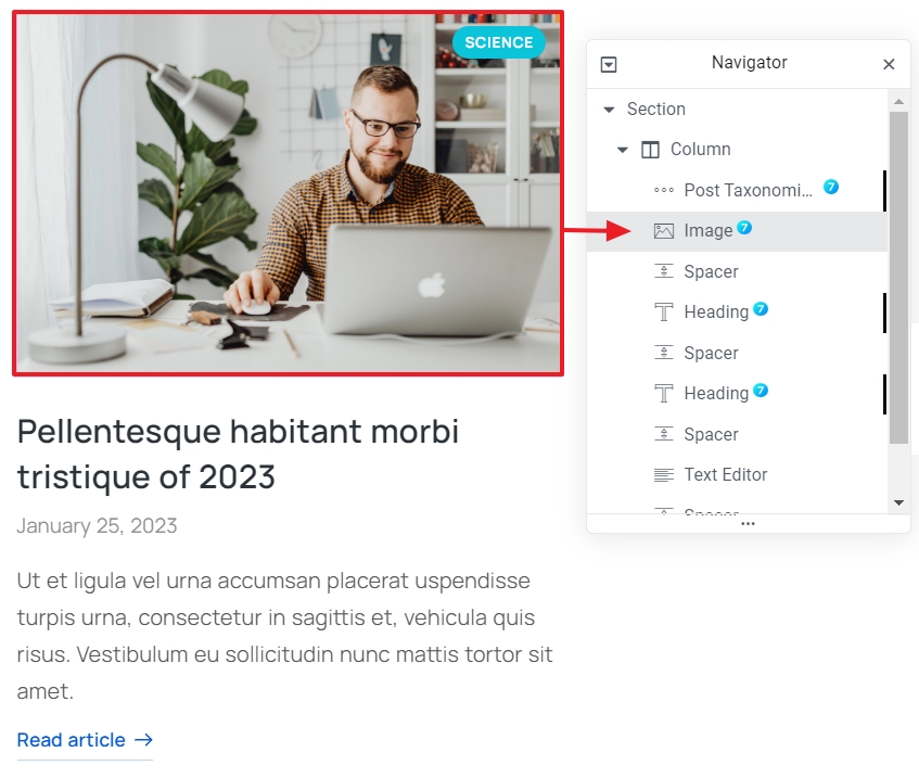
Fig. 1.2. Image Inside of a Loop Item.
Also, The7 Image widget has such a unique setting as a Template Overlay (fig. 1.3):
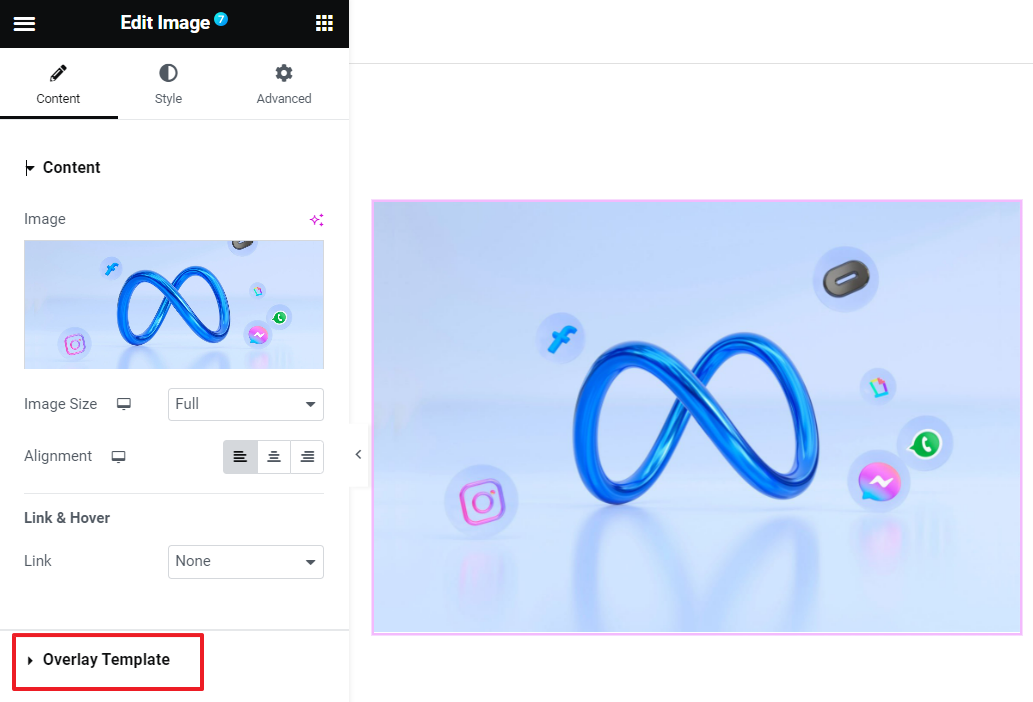
Fig. 1.3. Overlay Template.
Overlay template is a layer which covers an image on hover or constantly. You can create it under Templates -> The7 Overlay (fig. 1.4):
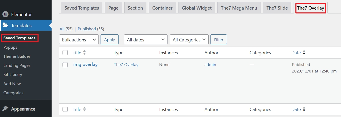
Fig. 1.4. Creating Overlay Template.
When the template is created, you can select in under “Overlay Template” settings tab (fig. 1.5). You can also choose whether this overlay should be displayed always, on hover or never.
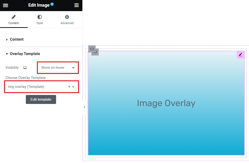
Fig. 1.5. Displaying Image Overlay.
Style
Most of styling options of this widget are the same as in native Elementor “Image” widget, except the size settings (fig. 2.1):
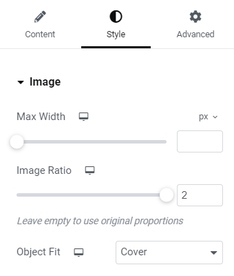
Fig. 2.1. Image Size Settings.
You can limit the max width of an image and configure image width/height ratio. If image ratio is specified, the “Object Fit” setting shows up. It allows to decide how the image should be resized to fit its container with the chosen width/height proportions. You can read more about the Object Fit values in the official documentation.
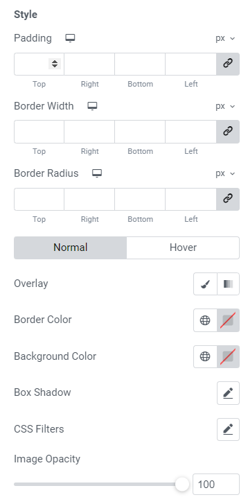
Fig. 2.2. Image Styling Settings.
Style settings (fig. 2.2) look quite standard. You can alter:
- padding;
- border width, color and radius;
- colors of the overlay, background and box shadow for normal and hover state. As well as CSS filters and image opacity.
The7 Image widget allows to control image animation on hover (fig. 3.1):
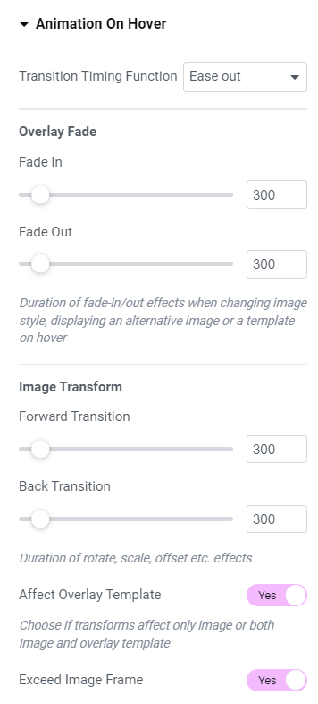
Fig. 3.1. Animation Settings.
- timing function. Read more here;
- duration of fade-in/out effects when changing image style, displaying an alternative image or a template on hover;
- duration of rotate, scale, offset etc. effects;
- choose if transforms affect only image or both image and overlay template;
- configure image visibility outside the initial image box when applying rotate, scale, shadow, etc. effect.
You can also adjust rotate, scale, etc. transforms for the normal and hover states (fig. 3.2):
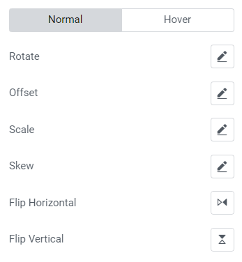
Fig. 3.2. Normal/Hover Settings.