As the name suggests, the Multipurpose carousel widget allows the create different types of carousel layouts (fig. 1):
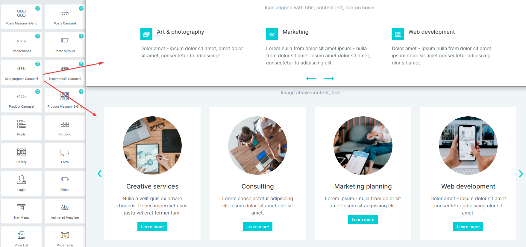
Fig. 1. Multipurpose carousel.
Content
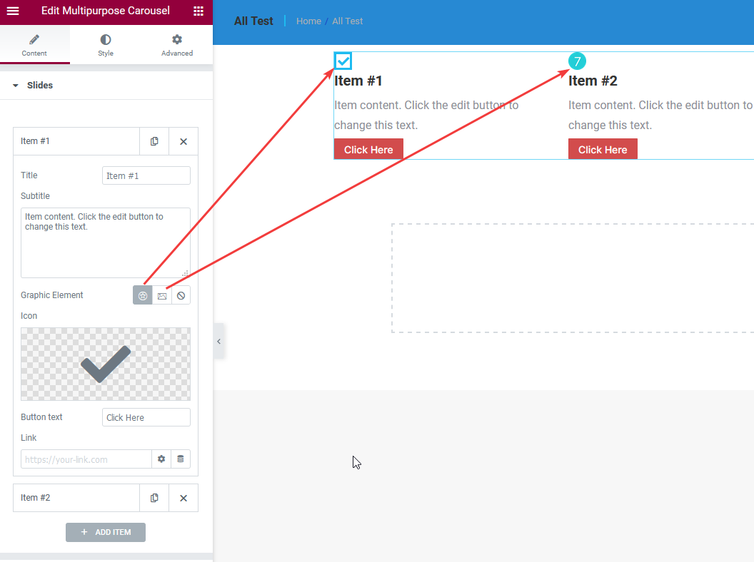
Fig. 2. Slides tab.
In the “Slides” tab (fig. 2), you can set create the slides and configure:
- slide title;
- subtitle;
- graphic element (icon, image or none);
- button text and link.
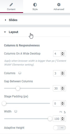
Fig. 3. Layout tab.
“Layout” tab (fig. 3) allows to select:
- the number of columns for different devices;
- gap between columns;
- stage padding (the padding on the left and right of the carousel);
- width of the carousel for different devices;
- adaptive height (to automatically adjust the height of the carousel depending on the content height of each slide).
In the “Scrolling” tab, you can configure:
- scrolling mode (one slide at a time OR all slides in the viewport);
- transition speed;
- autoplay.
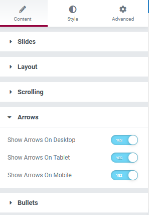
Fig. 4. Arrows tab.
In the “Arrows” and “Bullet” tabs, you can enable/disable arrows and bullets for different devices. Consider, the icon, size, style, size, color, position, etc. can be configured under the Style tab (fig. ).
Style
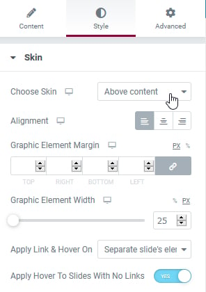
Fig. 5.1. Layout tab.
In the “Skin” tab (fig. 5.1), you can choose from four available skins (icon position layout) for the slides:
- Above content
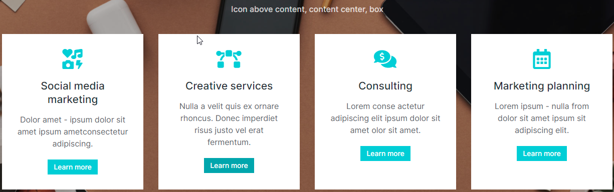
Fig. 5.2. Above content.
- Aligned with title
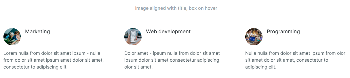
Fig. 6.3. Aligned with title.
- Left aligned with content
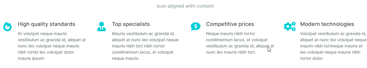
Fig. 6.4. Left aligned with content.
- Right aligned with content
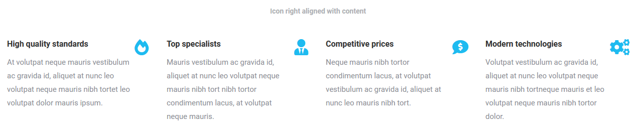
Fig. 6.5. Right aligned with content.
As well as configure the following settings:
- alignment;
- margins of the graphic;
- width of the graphic;
- how the link should be applied;
- hover effect for items without links.
In the “Box” tab, you can configure the aspects of the carousel item box (fig. 7):
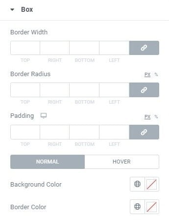
Fig.7. Box styling.
- its border and border radius;
- padding;
- background and border colors for the idle and hover states.
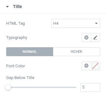
Fig. 8. Title styling.
In the “Title” tab (fig. 8), you can configure the aspects of the carousel item title:
- its HTML tag;
- typography;
- color (normal and hover);
- gap below the title.
In the “Text” tab (fig. 9), you can configure the aspects of the text content of carousel item: typography, color (normal and hover) and gap below the text.
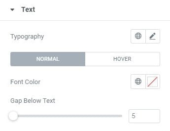
Fig. 9. Text styling.
If the icon is enabled, you can adjust its size, border and border radius in the “Icon” tab (fig. 10):
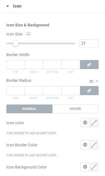
Fig. 10. Icon tab.
If you have chosen an image as the graphic element, you can adjust its settings in the “Image” tab (fig. 11).
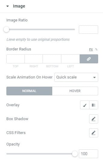
Fig. 11. Image styling.
Configure the following options:
- ratio;
- border radius;
- animation;
- overlay;
- shadow;
- CSS filters;
- opacity for normal and hover states.
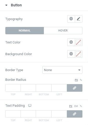
Fig. 12. Button styling.
Configure the “Button” in the appropriate tab (fig. 12):
- typography;
- text color (for normal and hover state);
- background color (for normal and hover state);
- border radius;
- border type;
- padding of the button’s text.
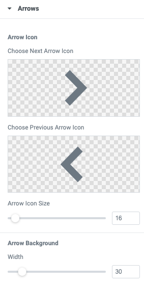
Fig. 13. Arrows styling.
In the “Arrows” tab (fig. 13), you can select icons for the carousel navigation, as well as control the entire appearance of the arrows:
- color;
- size;
- margins;
- paddings;
- position and much more.
Control the appearance of “Bullets” in the appropriate tab:
- style;
- size;
- margins;
- paddings;
- position, etc.
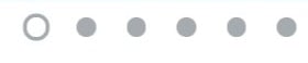
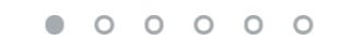
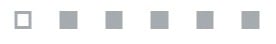
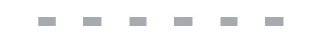
Bullet Styles:
- Small dot stroke

- Scale up

- Stroke
- Fill in
- Square
- Rectangular
Advanced
Advanced section contains standard Elementor settings. More info is available here.