The Filter By Brand is widget (fig. 1.1) allows to filter WooCommerce products by brand. This widget will only work in WooCommerce shop and archive pages.
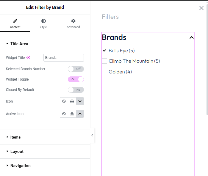
Fig. 1.1. Filter By Brand Widget.
Content
The Content tab is where you define the structural elements and behavior of the brand filter. It is divided into several expandable sections:
In the Title Area section (fig. 1.2), you can configure the main heading and the toggle functionality of the widget.
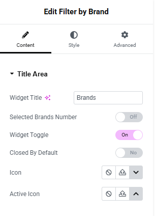
Fig. 1.2. Title Area – Filter By Brand Widget.
- widget title: Enter the text you want to display at the top of the filter;
- selected brands number: Toggle On/Off to display a counter next to the title indicating how many brands the user has currently selected;
- widget toggle: Toggle On/Off to make the filter section collapsible. When enabled, users can click the title to hide or reveal the brand list;
- closed by default: Select Yes if you want the filter list to be collapsed when the page initially loads, or No to keep it expanded;
- icon: Choose an icon from the Icon Library or upload a custom SVG to indicate the default (or closed) state of the toggle;
- active icon: Choose an icon from the Icon Library or upload a custom SVG to indicate the active (or expanded) state of the toggle.
In the Items section (fig. 1.3), you can configure the logical behavior and the visual display settings for the individual brand items within your filter:
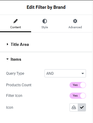
Fig. 1.3. items – Filter By Brand Widget.
- query type: Choose the relational logic for how products are filtered when multiple brands are selected. You can choose between:
- AND: Displays only products that are assigned to all of the selected brands simultaneously;
- OR: Displays products that are assigned to any of the selected brands;
- products count: Toggle to Yes to display the number of available products in parentheses next to each brand name (e.g., “Bulls Eye (5)”). Toggle to No to hide this counter;
- filter icon: Toggle to Yes to display a specific icon (such as a checkbox indicator) next to each brand item in the list. Toggle to No to display text only;
- icon: (Visible only when Filter Icon is set to Yes) Allows you to define the visual symbol used next to the items. You can choose a pre-designed icon by clicking Icon Library or upload a custom graphic by clicking Upload SVG.
The Layout section (fig. 1.4) allows you to define the structural arrangement and spacing of the brand items within the filter list:
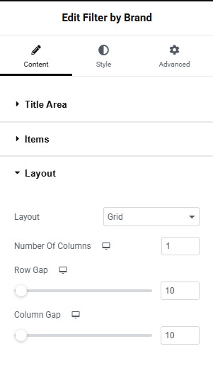
Fig. 1.4. layout – Filter By Brand Widget.
- layout: Choose the primary structure for displaying your brand items. You can select either Grid or Inline;
- number of columns: (Available when Layout is set to Grid) Specify how many columns the brands should be distributed into. This setting is responsive, meaning you can adjust the number of columns independently for desktop, tablet, and mobile devices;
- row gap: Adjust the vertical spacing between rows of brand items using the slider or numeric input field. This setting is responsive;
- column gap: Adjust the horizontal spacing between columns of brand items using the slider or numeric input field. This setting is responsive.
The Navigation section (fig. 1.5) allows you to manage how the brand list is displayed when you have a large number of items, helping to save space and maintain a clean layout on your page.
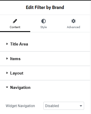
Fig. 1.5. navigation – Filter By Brand Widget.
Choose the display behavior for long lists of brands from the dropdown menu. The available options are:
-
- disabled: The default setting. Displays all available brand items at once without any scrollbars or hidden elements;
- scroll: Constrains the height of the brand list and adds a vertical scrollbar, allowing users to scroll through the items within a fixed area. (Selecting this may reveal additional settings to control the max-height of the scrollable area);
- show more items: Displays a specific number of brands initially, hiding the rest behind a toggle button (e.g., “Show more”). Clicking the button expands the list to reveal the hidden brands. (Selecting this may reveal additional settings to specify the number of visible items and customize the button text).
Style
The Title Area section (fig. 2.1) allows you to customize the visual appearance of the filter’s header, including its typography, spacing, and colors across different interaction states:
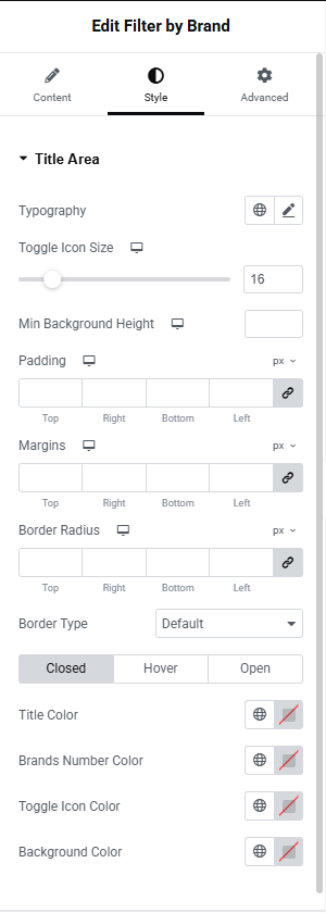
Fig. 2.1. Title Area styling
- typography: Click the pencil icon to adjust the font family, size, weight, and other typographic properties of the widget title;
- toggle icon size: Use the slider or numeric input field to adjust the size of the expand/collapse icon;
- min background height: Set a minimum vertical height for the title area’s background container;
- padding: Define the inner spacing (Top, Right, Bottom, Left) between the title content and the edges of its container. You can link the values to apply uniform padding;
- margins: Define the outer spacing (Top, Right, Bottom, Left) around the entire title area to position it relative to other elements on the page;
- border radius: Adjust these values (Top, Right, Bottom, Left) to round the corners of the title area’s background;
- border type: Choose a border style from the dropdown (Default, None, Solid, Double, Dotted, Dashed, or Groove);
- state colors (Closed, Hover, Open): This block allows you to define specific color schemes based on the toggle’s current state. For each state tab, you can configure:
- title Color: The text color of the main “Brands” heading;
- brands Number Color: The text color of the selected brands counter (if enabled);
- toggle Icon Color: The color of the expand/collapse arrow icon;
- background Color:The background color of the title area block.
The Content Area section (fig. 2.2) allows you to adjust the appearance and spacing of the main container that holds the list of brand items:
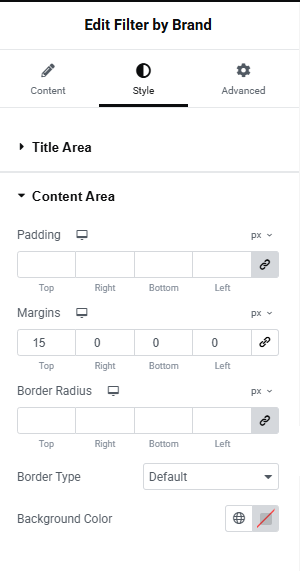
Fig. 2.2. Content Area styling
- padding: Define the inner spacing (Top, Right, Bottom, Left) between the brand items and the edges of the content area container. Click the link icon to apply uniform padding across all sides, or unlink to set them individually;
- margins: Define the outer spacing (Top, Right, Bottom, Left) around the content area to control its distance from the Title Area above it or other elements below it.
- border radius: Adjust these values (Top, Right, Bottom, Left) to round the corners of the content area’s background box;
- border type: Choose a border style for the container from the dropdown menu (Default, None, Solid, Double, Dotted, Dashed, or Groove). Selecting a visible border style will reveal additional settings for Border Width and Color;
- background color: Use the color picker tool to apply a background color to the area containing the brand list.
The Items section (fig. 2.3) allows you to completely customize the visual appearance of the individual brand names, their product counts, and their interactive states within the list:
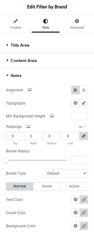
Fig. 2.3. Items styling
- alignment: Use the alignment icons to align the brand items to the Left, Center, or Right within their container;
- typography: Click the pencil icon to adjust the font family, size, weight, line height, and other typographic properties of the brand names;
- min background height: Set a minimum vertical height for each brand item’s background using the slider or numeric input;
- paddings: Define the inner spacing (Top, Right, Bottom, Left) between the brand text and the edges of its individual container. You can link the values to apply uniform padding or unlink them to set custom values for each side;
- border radius: Adjust these values to round the corners of the individual item backgrounds.
- border type: Choose a border style for the items from the dropdown menu (Default, None, Solid, Double, Dotted, Dashed, or Groove). Selecting a visible border style will reveal additional settings for Border Width and Color;
- state colors (Normal, Hover, Active): This block allows you to define specific color schemes based on how the user interacts with the brand items. For each state tab, you can configure:
- text Color: The color of the brand name text;
- count Color: The text color of the product count number displayed next to the brand name (if enabled in the Content tab);
- background Color: The background color of the individual brand item.
The Filter Icon section (fig. 2.4) allows you to customize the sizing, spacing, and visual styling of the icons (like checkboxes or custom SVGs) displayed next to each brand item, provided they are enabled in the Content tab:
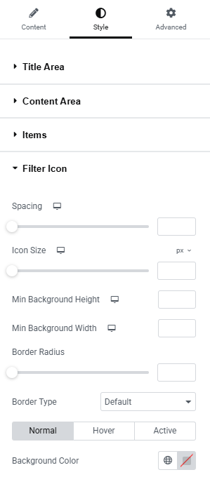
Fig. 2.4. Filter Icon styling
- spacing: Adjust the horizontal distance between the filter icon and the brand name text using the slider or numeric input. This setting is responsive across different device views.
- icon size: Use the slider or numeric input field to increase or decrease the physical size of the icon itself. This setting is also responsive;
- min background height & width: Define the minimum dimensions for the background container behind the icon. Setting equal values here is useful for creating perfectly square or circular icon backgrounds;
- border radius: Adjust these values to round the corners of the icon’s background. Link the values to apply a uniform radius (e.g., applying a high value to make a square background perfectly circular);
- border type: Choose a border style for the icon from the dropdown menu (Default, None, Solid, Double, Dotted, Dashed, or Groove). Selecting a visible border style will reveal additional settings to control Border Width and Border Color;
- state colors (Normal, Hover, Active): This block allows you to define specific color schemes for the icon based on its current interaction state (e.g., when unselected, when hovered over, or when actively selected). Under each tab, you can typically configure:
- background Color: The background color applied behind the icon symbol;
- (Note: Additional color settings such as Icon Color or Border Color may appear in this area depending on your setup and border selections).
Advanced
Advanced section contains standard Elementor settings. More info is available here.