This widget allows to create Tabs (vertical/horizontal) (fig.1) or Accordion, also to convert Tabs to Accordion on mobile devices.
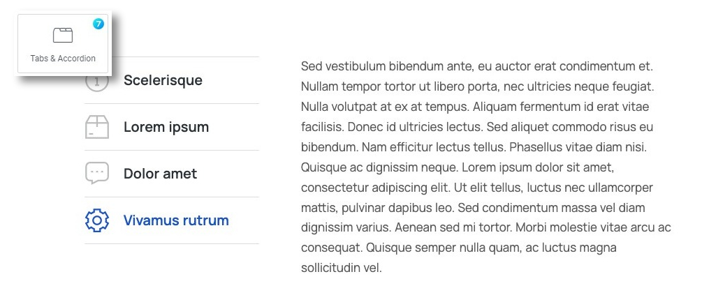
Fig. 1. The7 Tabs widget. Appearance.
Content
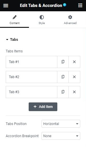
Fig. 2.1. Tabs content.
Tab Items allows to add/remove/edit tab items (fig. 2.1), each tab can have Title, Content and Icon (fig. 2.2). The icon can be uploaded, or picked from the icon library.
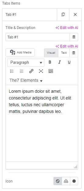
Fig. 2.2. Adding tab content.
Please note you can also insert Elementor template in the tab content in order to build more complicated layouts. Select a previously created template (fig. 2.3.1) as a dynamic content of the tab (fig. 2.3.2):
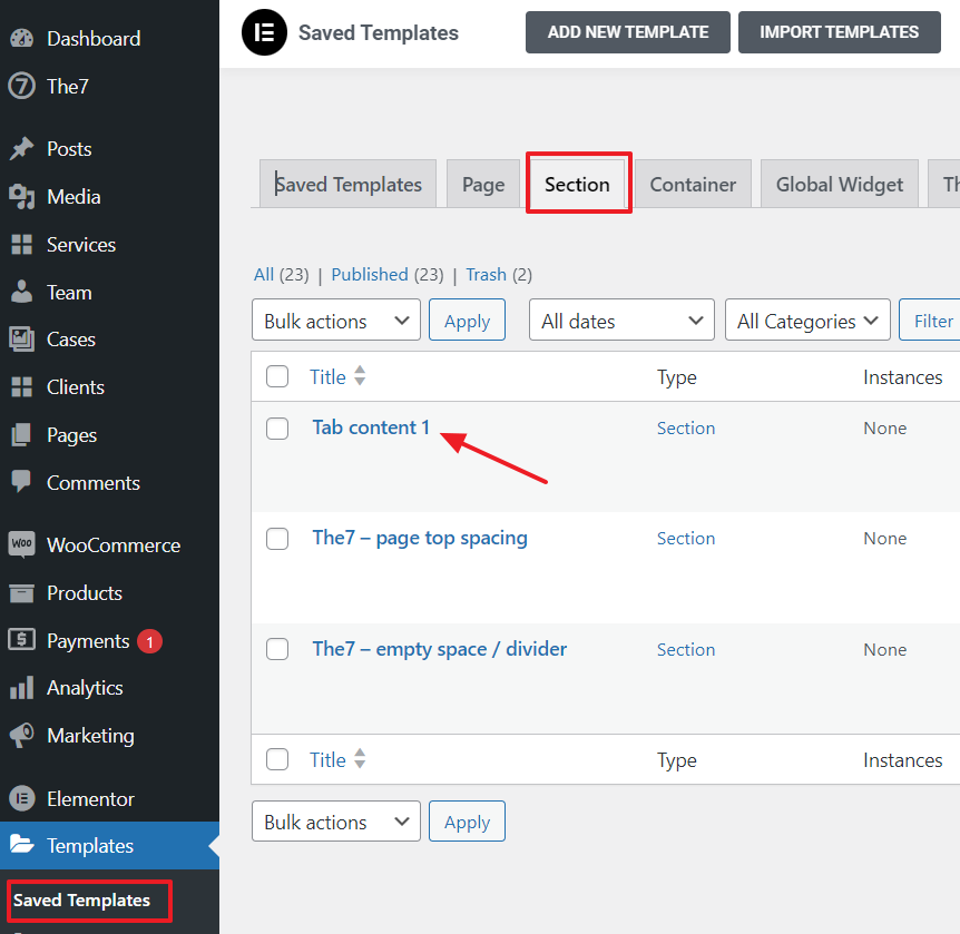
Fig. 2.3.1. Create a template for a tab.
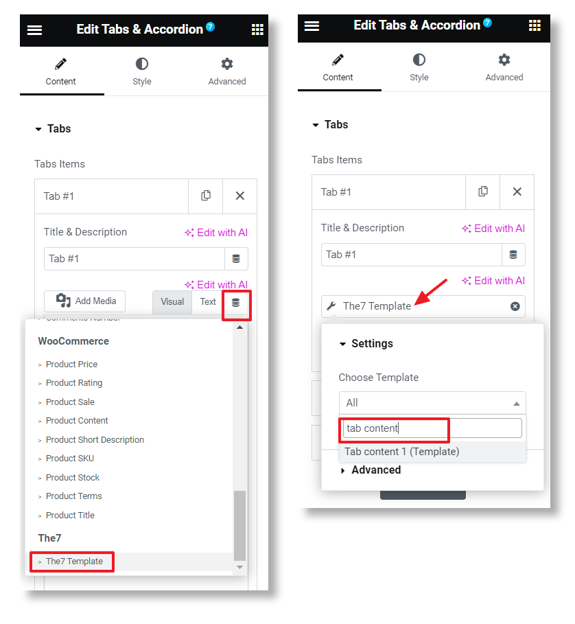
Fig. 2.3.2. Inserting a template into a Tab.
Available tabs positions are Horizontal (fig. 2.4.1) and Vertical (fig. 2.4.2):
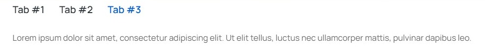
Fig. 2.4.1. Horizontal Tabs.
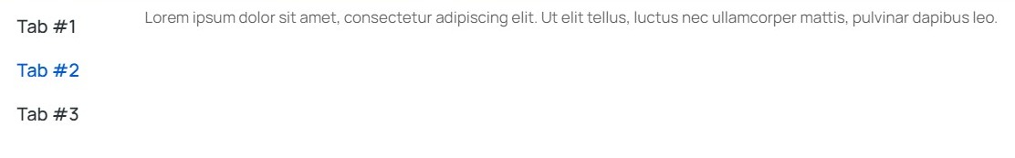
Fig. 2.4.2. Vertical Tabs.
Accordion Breakpoint allows to set the point where the Tabs should change to Accordion (fig. 2.5). This exists because on some designs, the Tabs may not look good on mobile. Also, when you pick “Desktop”, the element will become Accordion on all devices:
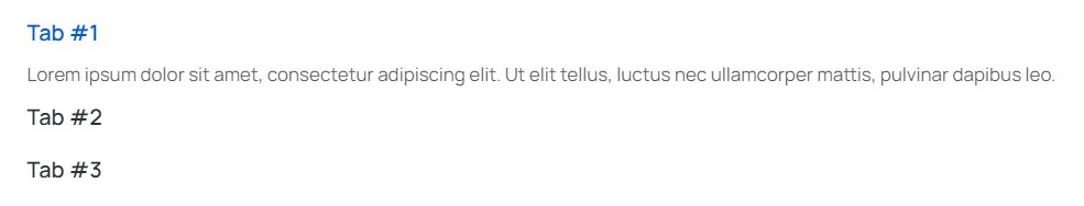
Fig. 2.5. Tabs Turn into Accordion.
Style
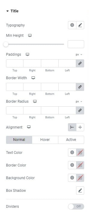
Fig. 3.1. Title Styling.
Title tab (fig. 3.1) controls the styling for:
- typography (allows to set the font and other aspects of the title’s text);
- min-height (allows to set the height of the tab, its background around the text);
- paddings;
- border and border radius;
- alignment (title inside the tab, mostly useful for accordion);
- colors for normal/hover/active states (text, border, background, box shadow);
- dividers (fig. 3.2). It allows to enable and style the dividers between the tabs – also to disable the first, or the last divider.
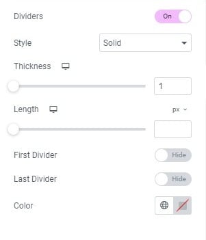
Fig. 3.2. Dividier Styling.
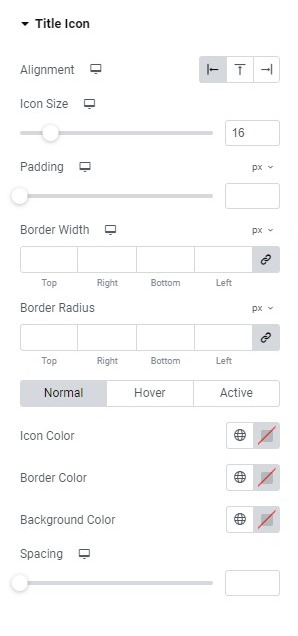
Fig. 3.3. Title Icon Styling.
Title Icon tab has the following set of options:
- alignment of the icon: left/above/right side of the title;
- icon size;
- padding;
- border width;
- border radius;
- colors for normal/hover/active states (for the icon, border, background);
- spacing (between the icon and the title).
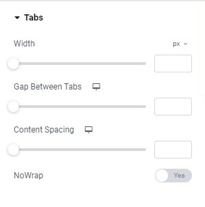
Fig. 3.4. Tabs Styling.
Tabs section allows to control:
- width of the tab;
- gap between tabs (between the tabs);
- content spacing (between the tab and the content);
- nowrap (yes/no). If the title of the tab is long, user can decide if it should break into few lines, or to keep it in one line.
In the Accordion section you can configure:
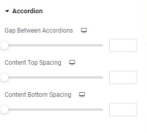
Fig. 3.5. Accordion Styling.
- gap between accordions;
- content top spacing;
- content bottom spacing.
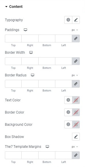
Fig. 3.6. Content Styling.
Content tab has the following set of options:
- typography (allows to set the font and other aspects of the content’s text);
- paddings;
- border width and radius;
- text color;
- border color;
- background color;
- box shadow;
- The7 Template margins (allow to set margins for the template, if user used the template in tab’s content, fig. 3.7)
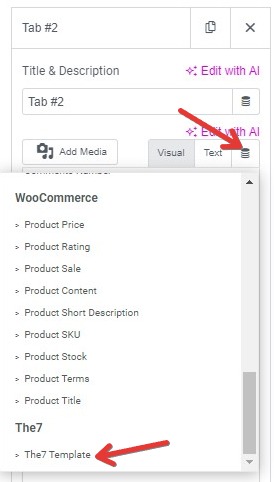
Fig. 3.7. The7 Template Margin.
Advanced
The advanced section contains standard Elementor settings. More info is available here.