“Masonry&Grid Loop” widget (fig. 1) has more advanced settings comparing to the native Elementor “Loop Grid” widget. In general, it allows to create custom layout of a single post using Elementor Loop Items.
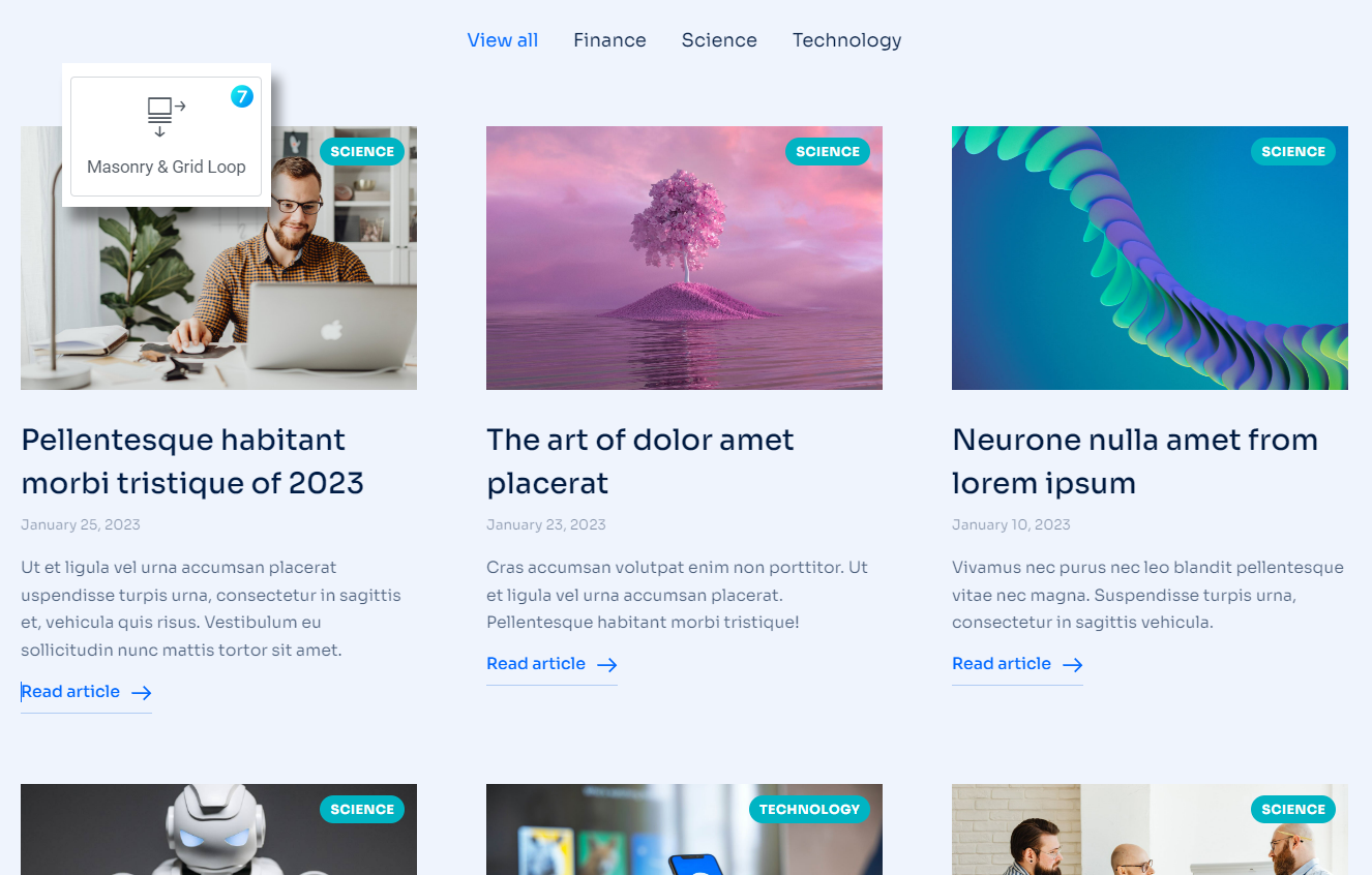
Fig. 1. The7 Masonry&Grid Loop.
Content
First of all, you need to create a Loop Template for an individual post under Templates -> Saved Templates -> Loop Item (fig. 2.2). You can also create the template directly in the page editor (fig. 2.1):
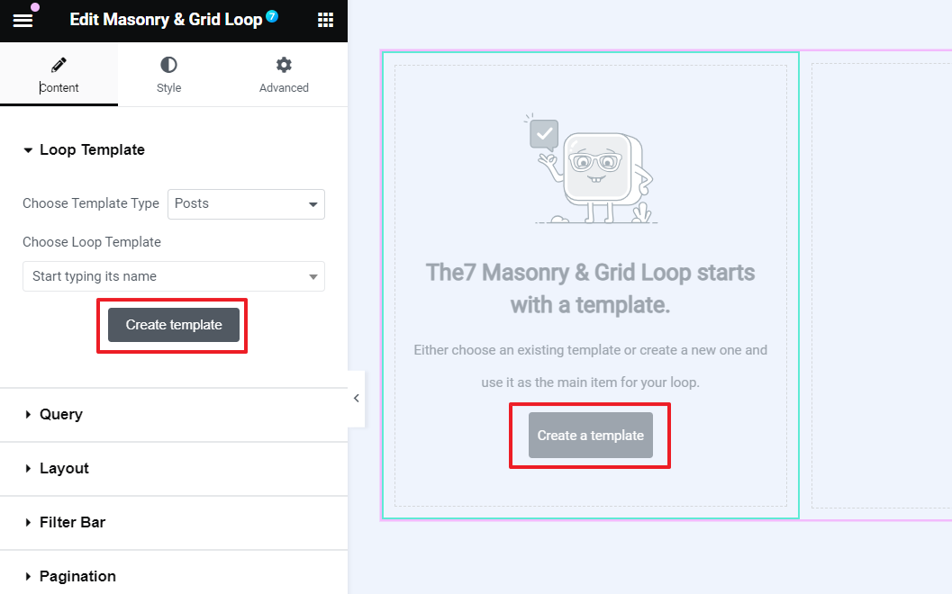
Fig. 2.1. Creating Loop Template.
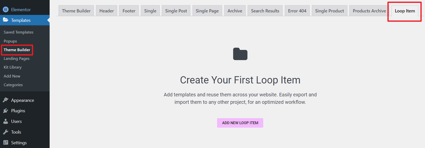
Fig. 2.2. Loop Item Template.
The idea of building a template is the same as for native Elementor Loop Items: you can insert Featured image widget, the Post Title widget, the Post Excerpt widget, etc. And style them in your own way.
Second “Query” tab in widget settings offers to select which posts to display (fig. 2.3):
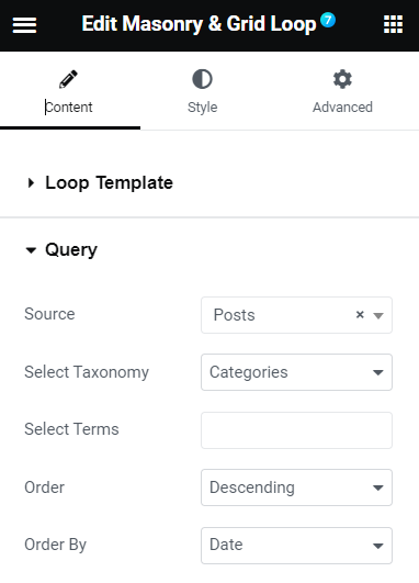
Fig. 2.3. Query tab.
“Layout” (fig. 2.4) tab allows to select:
- Masonry or Grid layout;
- loading effect (Fade in, Move up, Scale up, etc.);
- number of columns for an ordinary desktop, tablet and mobiles;
- gap between columns. If, for example, 10px is applied, it means the gap will be 20px.
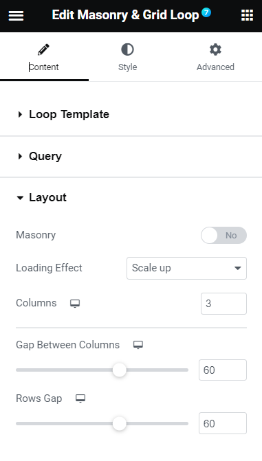
Fig. 2.4. Layout Tab.
In the “Filter Bar” (fig. 2.5) you can enable a category filter, decide whether the “View all” button should be displayed. As well as activate navigation by URL, which means you can activate specific filter category on page load by adding “?term=__your_term__” in the end of page URL. For example: https://domain.com/?term=finance/
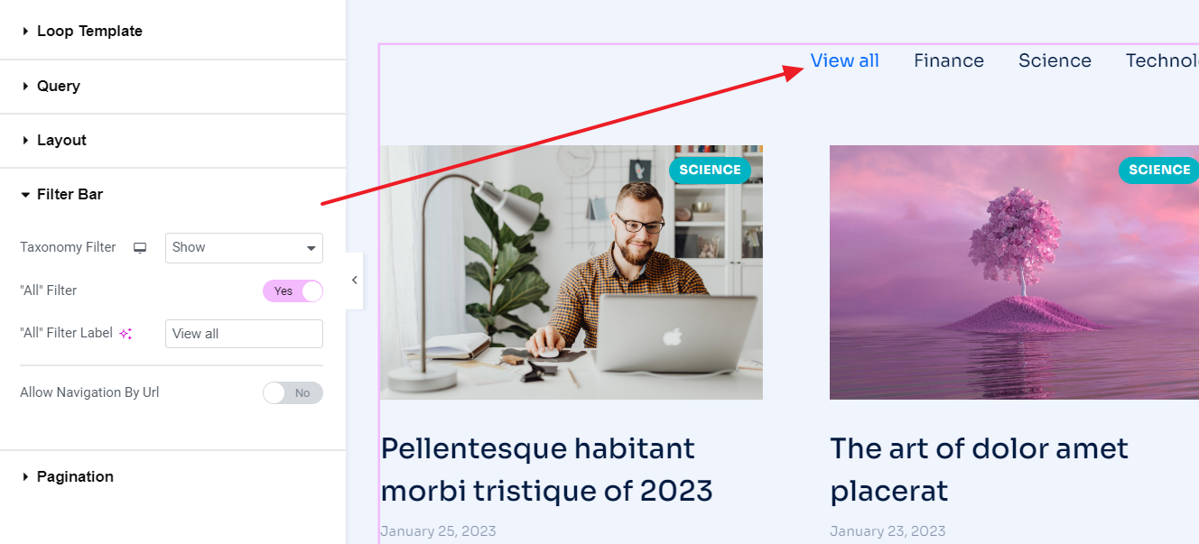
Fig. 2.5. Filter Bar Settings.
This tab will not be available when selecting “Current query” in the query tab (fig. 2.3).
It is possible to enable different modes of pagination and adjust the number of posts to display in the “Pagination” tab (fig. 2.6)
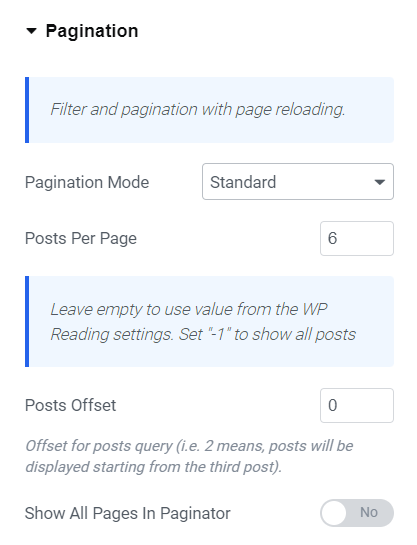
Fig. 2.6. Pagination Settings.
You can also specify posts offset – to skip the first N posts in the query; as well as display all pages in the paginator or only few ones.
Style
The “Box” tab allows to style the area behind the entire box (fig. 3.1):
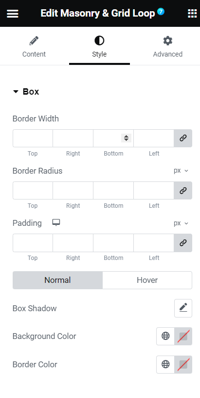
Fig. 3.1. Box Styling Settings.
You can adjust border width, color and radius, as well as background color and padding. Box shadow setting is also available here.
“Filter bar” tab (fig. 3.2) gives a possibility to style this part of the grid:
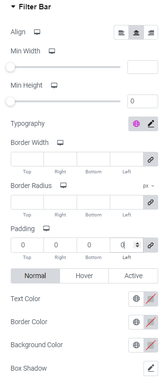
Fig. 3.2. Filter Bar Styling.
- align categories to the left/center/right;
- specify width and height of categories buttons;
- configure items typography;
- apply border width, radius and color;
- set items paddings;
- configure colors of text, background and shadow.
And for the entire filter area (fig.3.3), you can specify distance between items and margins of the filter bar area in general.
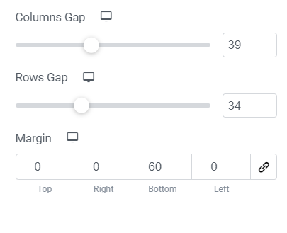
Fig. 3.3. Filter Area Styling.
Under the “Pagination” tab (fig. 3.4), you can find almost the same settings as for the Filter bar items:
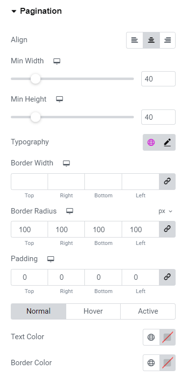
Fig. 3.4. Pagination Styling.
- align page buttons to the left/center/right;
- specify width and height of page buttons;
- configure items typography;
- apply border width, radius and color;
- set items paddings;
- configure colors of text, background and shadow.
And for the entire pagination area (fig.3.5), you can specify distance between items and margins of the filter bar area in general.
Fig. 3.5. Pagination Area Styling.
Advanced
Advanced section contains standard Elementor settings. More info is available here.