This widget allows to display WooCommerce product featured image and its gallery (fig. 1.1 – 1.2). It’s useful for designing single product page, or products’ template in Theme Builder.
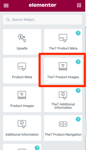
Fig. 1.1. Product images. Widget.
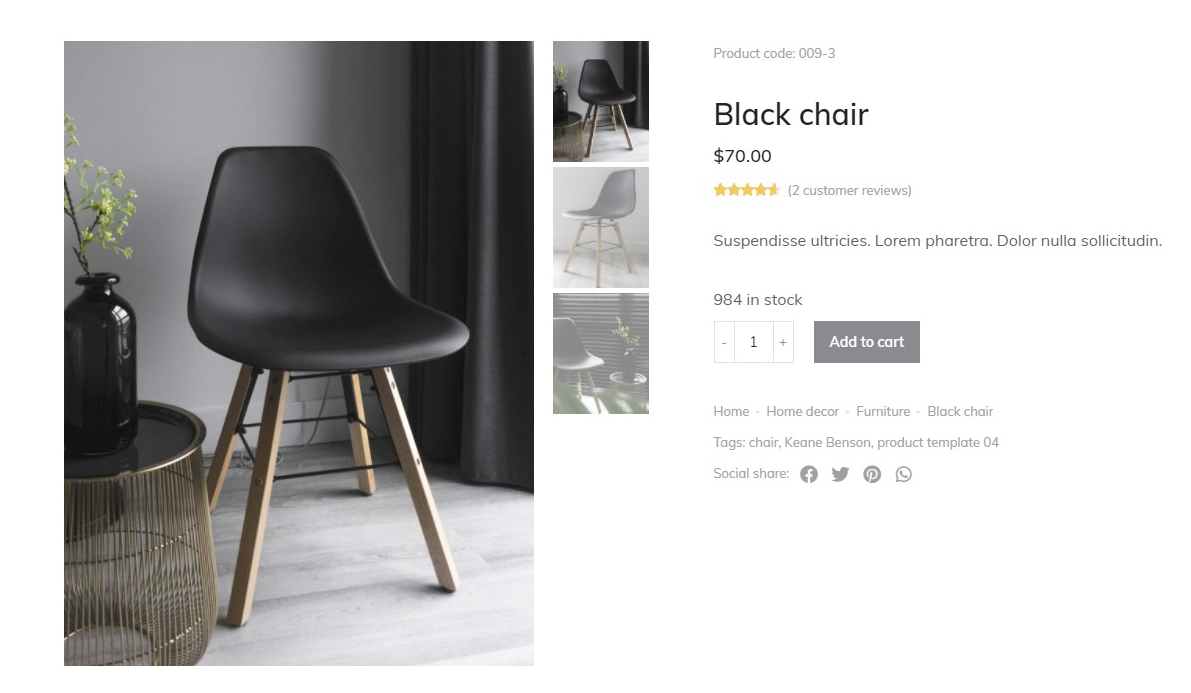
Fig. 1.2. Product images. Appearance.
Content
“Big Image” tab: it contains settings for the main image of the gallery.
You can set there:
- preserve image proportions (yes/no). It allows you to decide if you want to show the image covering the gallery container, or in its specific proportions (fig. 2.1 – 2.2):

Fig. 2.1. Preserve image proportions = ON.
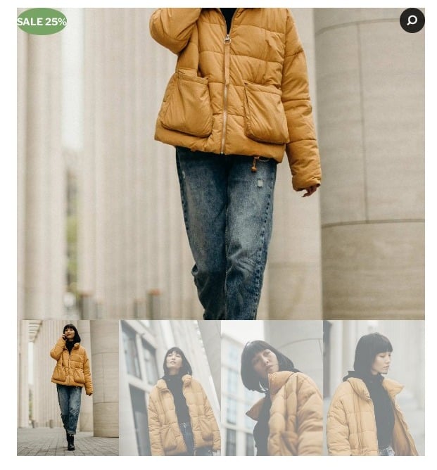
Fig. 2.2. Preserve image proportions = OFF.
- big image container ratio. Allows you to control the proportions of the main image of the gallery;
- animation on scroll (slide/fade). Allows you to set the type of transition effect when browsing the images from gallery;
- zoom image on hover. Allows you to enable/disable the image zoom effect, when you hover over the main image;
- open lightbox on click (yes/no), determines if the big image should open in lightbox when you click on it;
- sale flash. Enables/disables the “Sale” badge on the image;
- zoom flash. Enables/disables the Zoom badge on the image, with possibility to select an icon of the badge.
“Thumbnails” tab. Displays the thumbnail gallery of the product. Adjust the following settings:
- position – you can set the position of the gallery: left (vertical) – fig. 3.1, right (vertical) – fig. 3.2, bottom (horizontal) – fig. 3.3;
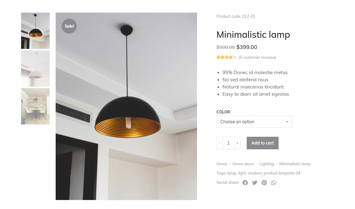
Fig. 3.1. Left position.
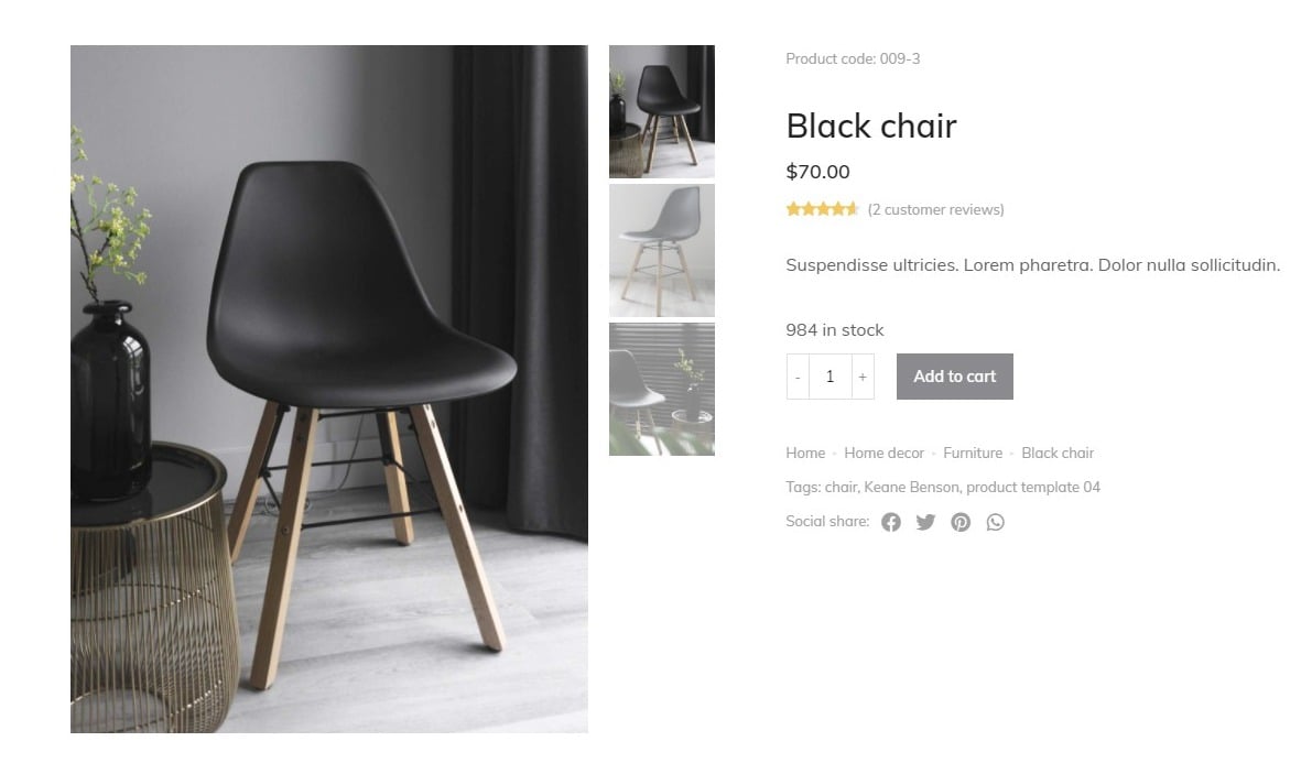
Fig. 3.2. Right position.
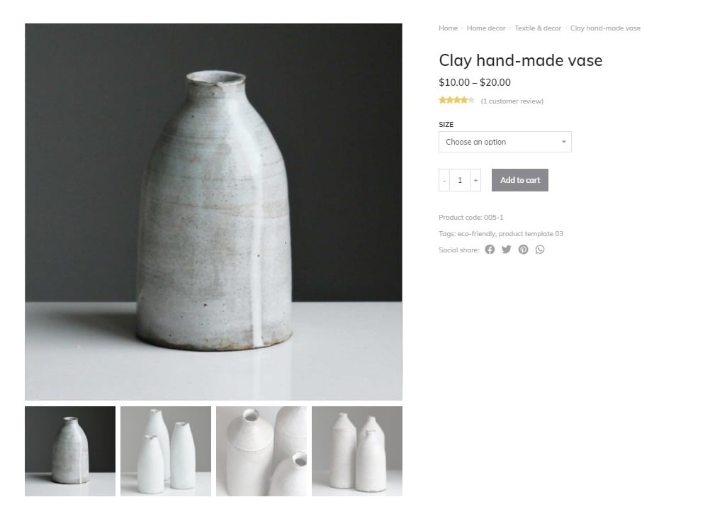
Fig. 3.3. Bottom position.
- number of thumbnails in a row;
- preserve image proportions (yes/no). It allows you to decide if you want to show the image in the original, or in specific proportions.
“Arrows” tab. Allows you to enable, and pick the icons of the arrows in Thumbnails gallery, and Big image. You can also set their appearance: disable, always, on hover.
Style
“Big image” – you can set the appearance of the main image – it’s border radius, and distance from the thumbnails.
“Thumbnails” – appearance of thumbnails, their border radius, and space between them.
“Sale Flash” – you can set the Sale Badge if it’s enabled. You can configure its:
- color;
- background color;
- border radius;
- width;
- height;
- position.
“Zoom Flash” – you can set the Zoom Icon if it’s enabled. You can configure its:
- color;
- background color;
- border radius;
- width;
- height;
- position.
“Arrows” – you can adjust the appearance of big image arrows and thumbnail gallery. You can configure their size, position and color (normal and hover).
Advanced
Advanced section contains standard Elementor settings. More info is available here.