This widget (fig. 1.1 – 1.2) allows to structure content by means of collapsible tabs, within “Accordion” or “Toggle” mode.

Fig. 1.1. Accordion & Toggle. Widget.
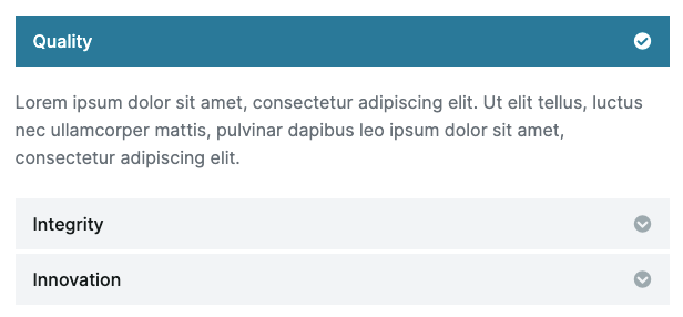
Fig. 1.2. Accordion & Toggle. Appearance.
Content
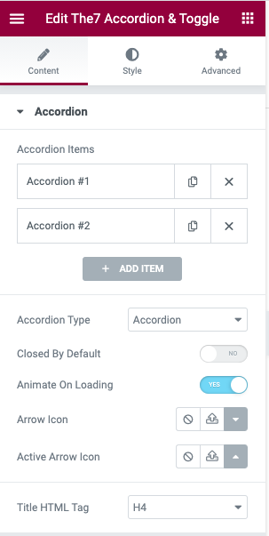
Fig. 1.3. Accordion tab. Content.
Under the “Accordion” tab (fig. 1.3), you can:
- add the content itself: title, description and icon(fig. 3.3);
- select “accordion” vs. “toggle” mode;
- decide whether it should be closed by default;
- decide whether the first active tab should be animated on page load;
- select icons for the open and closed state;
- select HTML tag for the accordion title (H1, H2, …).
Style
You can style borders of the entire widget box under the “Accordion” tab (fig. 3.1):
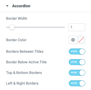
Fig. 3.1. Accordion styling. Borders.
“Title” styling options (fig. 3.2) allow to configure accordion title text and background colors (for idle, hover and open states), adjust its typography and padding.
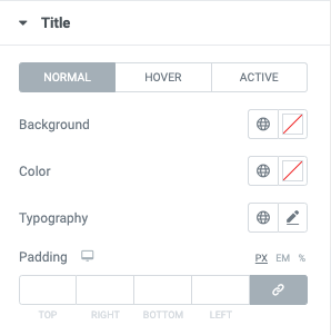
Fig. 3.2. Title styling.
“Icons” tab provides options for styling the “open/close” accordion icon (fig. 3.3 – 3.4):
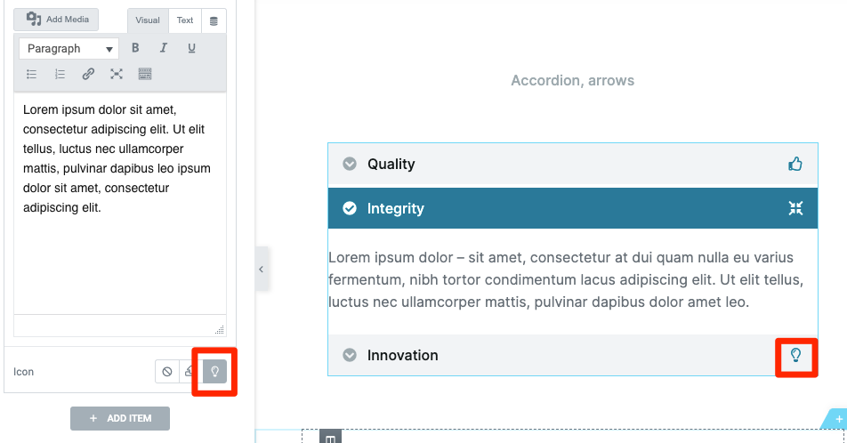
Fig. 3.3. Accordion icon.
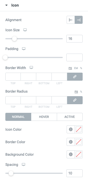
Fig. 3.4. Icon styling.
- icon size;
- paddings;
- border width, radius and color;
- icon and its background color;
- gap between the icon and title.
Styling for the “open/close” arrow (fig. 3.5) is available under the appropriate “Arrow” tab (fig. 3.6):
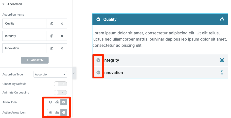
Fig. 3.5. “Open/close” arrow.
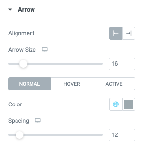
Fig. 3.6. Arrow styling.
This section allows to control arrow alignment, size, color and its distance to the tab title.