Fig.1. Products Categories List
The widget allows showing the list of product categories.
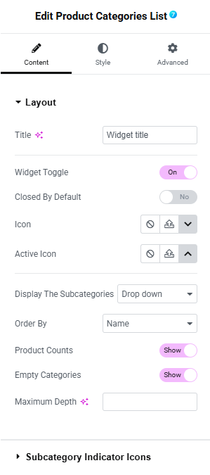
Fig. 2. Layout Settings
In the “Content” tab, user can configure the layout and behavior of the Product Categories List.
Layout Section
This section allows user to set how the category list appears and functions.
- Title – sets the heading of the widget (e.g. “Widget title”).
- Widget Toggle – enables or disables collapsible functionality for the category list.
- Closed By Default – if enabled, the list will be collapsed when the page loads.
- Icon – allows user to select a custom icon that indicates a collapsed state.
- Active Icon – allows user to select an icon that indicates an expanded (active) state.
-
Display the Subcategories – choose how subcategories are revealed:
- Standard, All categories at once, Only children of category or Drop down.
-
Order By – defines the sorting order of categories:
- Name, Slug, ID, Menu Order, etc.
- Product Counts – toggle to show or hide the number of products next to each category.
- Empty Categories – toggle to show or hide categories with no products.
- Maximum Depth – limit how many levels of nested subcategories are shown.
Subcategory indicator icons
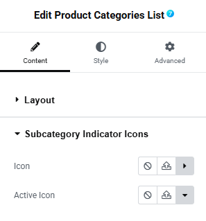
Fig. 3. Subcategory Indicator Icons
- Icon – allows user to select a custom icon that indicates a collapsed state.
- Active Icon – allows user to select an icon that indicates an expanded (active) state.
In the “Style” tab, user can style the appearance of the Product Categories List widget.
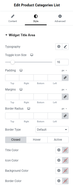
Fig. 4. Style Tab – Widget Title Area
Widget Title Area Section
The “Widget Title Area” section allows user to customize the look and spacing of the widget’s title bar and toggle icon.
- Typography – lets user set the font style, weight, size, line height, and other typography settings for the title text.
- Toggle Icon Size – adjust the size of the icon used to expand/collapse the category list.
- Padding – control the inner spacing (inside the title area).
- Margins – control the outer spacing (outside the title area).
- Border Radius – round the corners of the title area box.
- Border Type – select the style of the border.
Title State Styles (Closed / Hover / Active)
User can define different styles depending on the widget’s state:
- Title Color – set the color of the title text.
- Icon Color – set the color of the toggle icon.
- Background Color – set the background color of the title area.
- Border Color – set the border color of the title area.
Widget Content Area Section
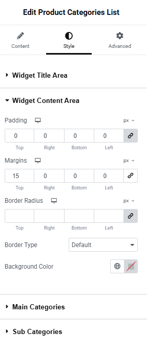
Fig. 5. Style Tab – Widget Content Area
The “Widget Content Area” section allows user to adjust spacing, borders, and background for the entire categories list content block.
- Padding – defines the inner space within the widget content area.
- Margins – controls the outer space around the content area.
- Border Radius – lets user round the corners of the content box.
- Border Type – select the style of the border.
- Background Color – set the background color of the widget content area.
Main Categories Section
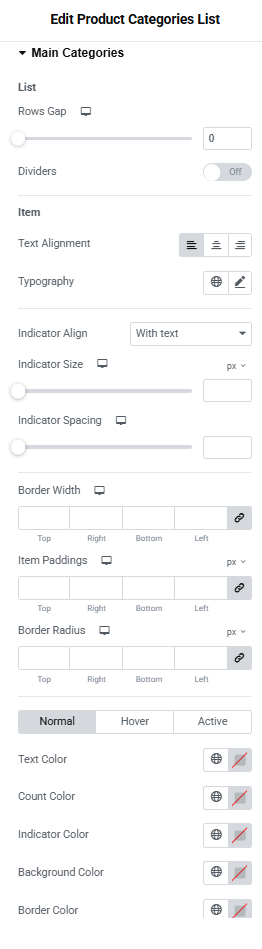
Fig. 6. Style Tab – Main Categories
In the “Main Categories” section, user can configure the display of product categories in a list format.
- Rows Gap – controls spacing between list items
- Dividers – enables/disables visual separators between items
The “Item” section allows user to customize individual category entries:
- Text Alignment – sets horizontal alignment
- Typography – adjusts font settings
- Indicator Align With Text – positions markers
- Indicator Size – controls marker size
- Indicator Spacing – adjusts spacing
- Border Width – defines border thickness
- Item Paddings – sets padding
- Border Radius – configures rounding
Main Category Name State Styles (Closed / Hover / Active)
- Text Color – category name color
- Count Color – product counter color
- Indicator Color – marker color
- Background Color – item background
- Border Color – outline color
Sub Categories Section
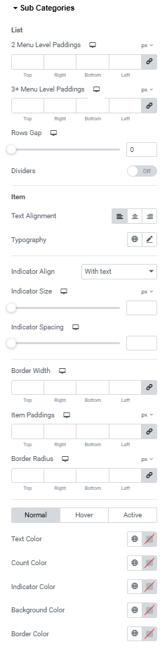
Fig. 7. Sub Categories Settings
In the “Sub Categories” section, user can configure multi-level category listings.
List Configuration:
-
Menu Level Paddings – allows setting different spacing:
- 2 Menu Level Paddings – controls padding for second-level items
- 3+ Menu Level Paddings – adjusts padding for deeper levels
- Rows Gap – sets spacing between items
- Dividers – toggle separators
Item Styling:
- Text Alignment – horizontal positioning
- Typography – font controls
- Indicator Align – marker alignment
- Indicator Size – marker size
- Indicator Spacing – spacing control
- Border Width – border thickness
- Item Paddings – inner spacing
- Border Radius – rounding
Subcategory Name State Styles (Closed / Hover / Active)
- Text Color – category name color
- Count Color – product counter color
- Indicator Color – marker color
- Background Color – item background
- Border Color – outline color