The7 “Photo Scroller” widget allows showcasing images nicely (fig. 1):
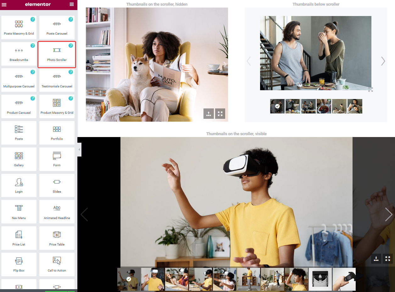
Fig. 1. Photo Scroller.
Content
Under the “Images” tab (fig. 2.1), you can select the images, filling mode, max width, min-width, etc.
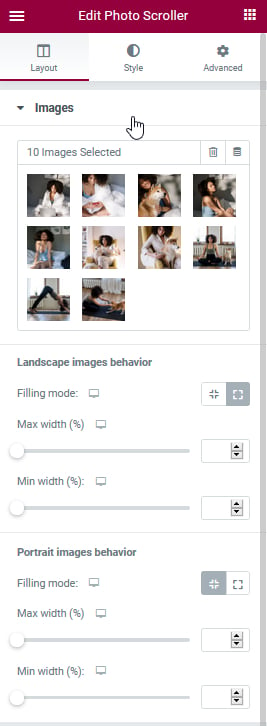
Fig. 2.1. Image tab.
Filling mode:
- contain – the image fits inside the container, and there may be some blank spaces;
- cover – the image covers the entire container, but the image may get cropped.
You can configure this accordingly for landscape and portrait images and for different devices to match your needs.
“Scroller” tab allows to configure scroller height (fig. 2.2):
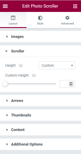
Fig. 2.2. Scroller tab.
“Arrows” tab allows to enable/disable arrows for different devices.
“Thumbnails” tab gives an ability to show/hide thumbnails and select thumbnails position and size (fig. 2.3).

Fig. 2.3. Thumbnails settings.
Configure if you want to display title, description, alt, etc. in the “Content” tab (fig. 2.4):
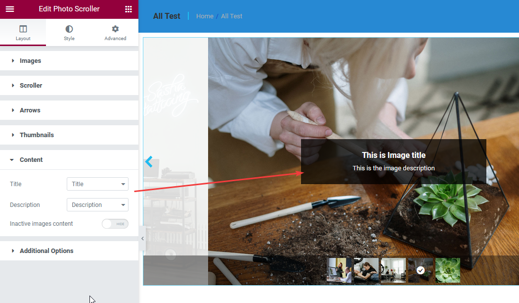
Fig. 2.4. Content settings.
“Additional options” tab allows to configure autoplay settings.
Style
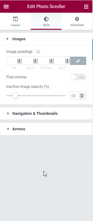
Fig. 3.1. Style settings.
Under the “Image” tab (fig. 3.1), you can configure the:
- image paddings for different devices;
- pixel overlay;
- inactive image opacity.
“Navigation & Thumbnails” allows to configure:
- thumbnail background;
- button background;
- icon color.
Under the “Arrows” tab, you can select arrow icon images, size, style and position (fig. .3.2):

Fig. 3.2. Arrows tab.
Advanced
Advanced section contains standard Elementor settings. More info is available here.