The widget (fig. 1) allows the creation of a product navigation that lets user browse through other products (also related).
Fig. 1. The7 Product Navigation.
Content
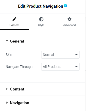
Fig. 2. The7 Product Navigation Content Tab General Settings.
Content tab (fig. 2) includes the following general settings:
- skin of the navigation:
- popup – the next/previous product pops up after hovering over the arrow;
- normal – the next/previous product is visible all the time;
- navigate through:
- all products;
- the same category as the current product;
- the same tag as the current product;
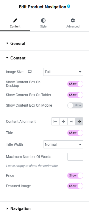
Fig. 3. The7 Product Navigation Content Tab Content Settings.
Content section (fig. 3) allows to configure:
- size of product image;
- visibility on different devices (desktop/tablet/mobile);
- alignment of the content;
- title of the product (show/hide);
- title width (normal – full title or limit below/crop to one line);
- maximum number of words when the title width is set to normal (leave empty to show full title);
- price of the product (show/hide);
- featured image (show/hide);
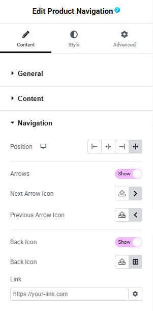
Fig. 4. The7 Product Navigation Content Tab Navigation Settings.
Navigation section (fig. 4) allows to configure:
- position of the navigation (left/right/center/stretched);
- arrows (show/hide);
- next arrow icon (from media library or icon collection);
- previous arrow icon (from media library or icon collection);
- back icon (show/hide);
- back icon graphic element (from media library or icon collection);
- link – the URL where the back button should take the user;
Style
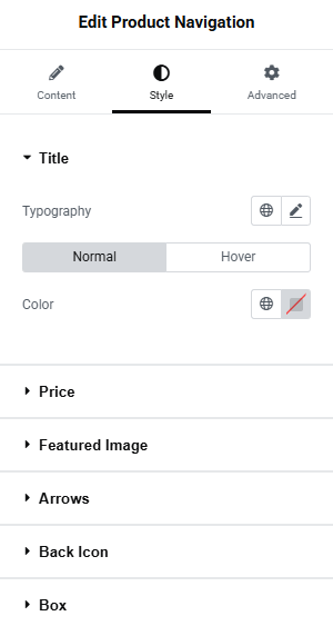
Fig. 5. The7 Product Navigation Style Tab Title Settings.
Title section (fig. 5) allows to configure:
- typography;
- color (normal/hover);
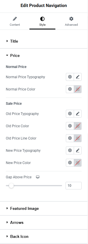
Fig. 6. The7 Product Navigation Style Tab Price Settings.
Price section (fig. 6) allows to configure the appearance of product price:
normal price:
- typography;
- color;
sale price (when the product is discounted):
- old price typography;
- old price color;
- old price line color;
- new price typography;
- new price color;
- spacing above the price;
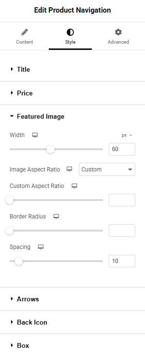
Fig. 7. The7 Product Navigation Style Tab Featured Image Settings.
Featured Image section (fig. 7) allows to configure:
- width of the image;
- aspect ratio (custom/original);
- custom aspect ratio;
- border radius;
- spacing between the image and the content;
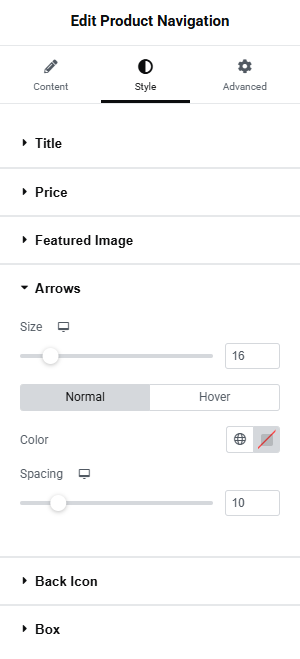
Fig. 8. The7 Product Navigation Style Tab Arrows Settings.
Arrows section (fig. 8) allows to configure:
- size of the arrows;
- color (normal/hover);
- spacing;
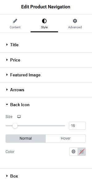
Fig. 9. The7 Product Navigation Style Tab Back Settings.
Back Icon section (fig. 9) allows to configure:
- size of the icon;
- color (normal/hover);
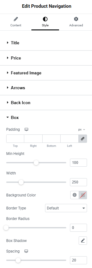
Fig. 10. The7 Product Navigation Style Tab Box Settings.
Box section (fig. 10) allows to configure:
- padding;
- minimum height of the box;
- width of the box;
- background color;
- border type;
- border radius;
- box shadow;
- spacing;
Advanced
The advanced section contains standard Elementor settings. More info is available here.