This widget (fig.1) allows a user to implement horizontal menu in his header template, or in any other place of a page:
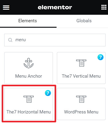
Fig. 1.1. The7 Horizontal Menu. Widget.

Fig. 1.2. The7 Horizontal Menu. Appearance.
Content
“Layout” settings (fig. 2.1):
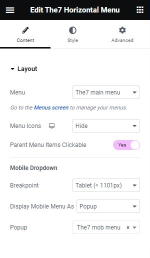
Fig. 2.1. Layout Tab.
- Menu – allows user to pick which menu the element should show. You can pick from menus created in <strong>Appearance -> Menus</strong>;
- Menu Icons (Hide/Show) – if you designed the menu with icons, here you can decide, if you want the element to show them;
- Parent Menu Items Clickable (Yes/No) – allows to decide if the parent menu items should be clickable, and lead to their own pages, or not be clickable, and serve only as a base for the submenus. If you set “No” – you can also pick, if the submenu should show on click, or on hover (fig. 2.2):
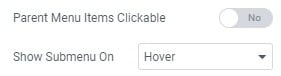
Fig. 2.2. Show Submenu on Hover.
“Mobile Dropdown” settings:
- Breakpoint – allows you to pick the breakpoint below which the menu should collapse to mobile menu;
- Display menu as (Popup/Dropdown) – select what layout of should the mobile menu have. The Dropdown will expand the list of the menu items. The Popup will show the popup you’ve picked. Remember to design your popup before in Dashboard -> Templates -> Popups.
Style
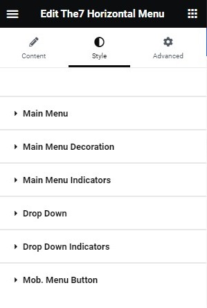
Fig. 2.1. Style Tab.
“Main Menu” (fig. 2.1) – in this tab, you can set full appearance of the main menu items (parent items): colors, margins, paddings, typography, etc. Worth mentioning is the Change Colors setting (fig. 2.2):
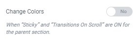
Fig. 2.2. Change Colors.
It allows you to change the colors of the menu items when the header is sticky. It’s very useful with Transparent header.
“Main Menu Decoration” allows to set the decoration of the main menu items. It also has the “Change colors” setting.
“Main Menu Indicators” – it allows you to set the indicators (icons) on the main menu when it has sub-items. You can set the icon, color, size, space. Also change colors when sticky.
”Drop Down” provides possibility to configure the entire appearance of the submenus.
”Drop Down Indicators” – it allows you to set the indicators (icons) on the sub-menu item, when it has further sub-items. You can set the icon, color, size, space.
”Mob. Menu Button” provides possibility to configure the appearance of the mobile menu button, when it appears below the breakpoint you’ve set in the Mobile Dropdown Settings. You can set the appearance of the open menu button, as well as the close menu button.
Advanced
Advanced section contains standard Elementor settings. More info is available here.