“The7 Loop Slider” widget allows to represent your posts as a slideshow/carousel with advanced layout and animation (fig. 1):
Fig. 1.1. The7 Loop Slider. Widget.
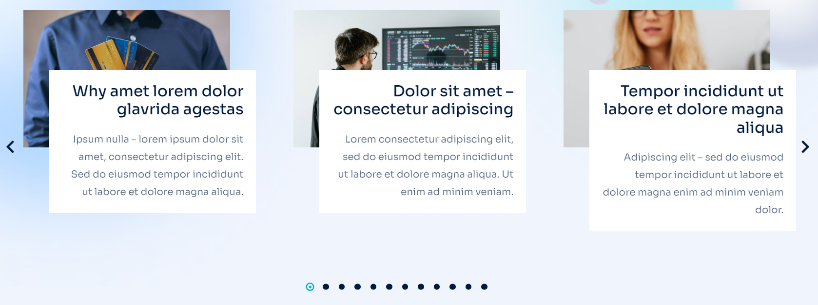
Fig. 1.2. The7 Loop Slider. Appearance.
Content
First of all, you need to create a Loop Template for an individual post under Templates -> Saved Templates -> Loop Item (fig. 2.2). You can also create the template directly in the page editor (fig. 2.1):
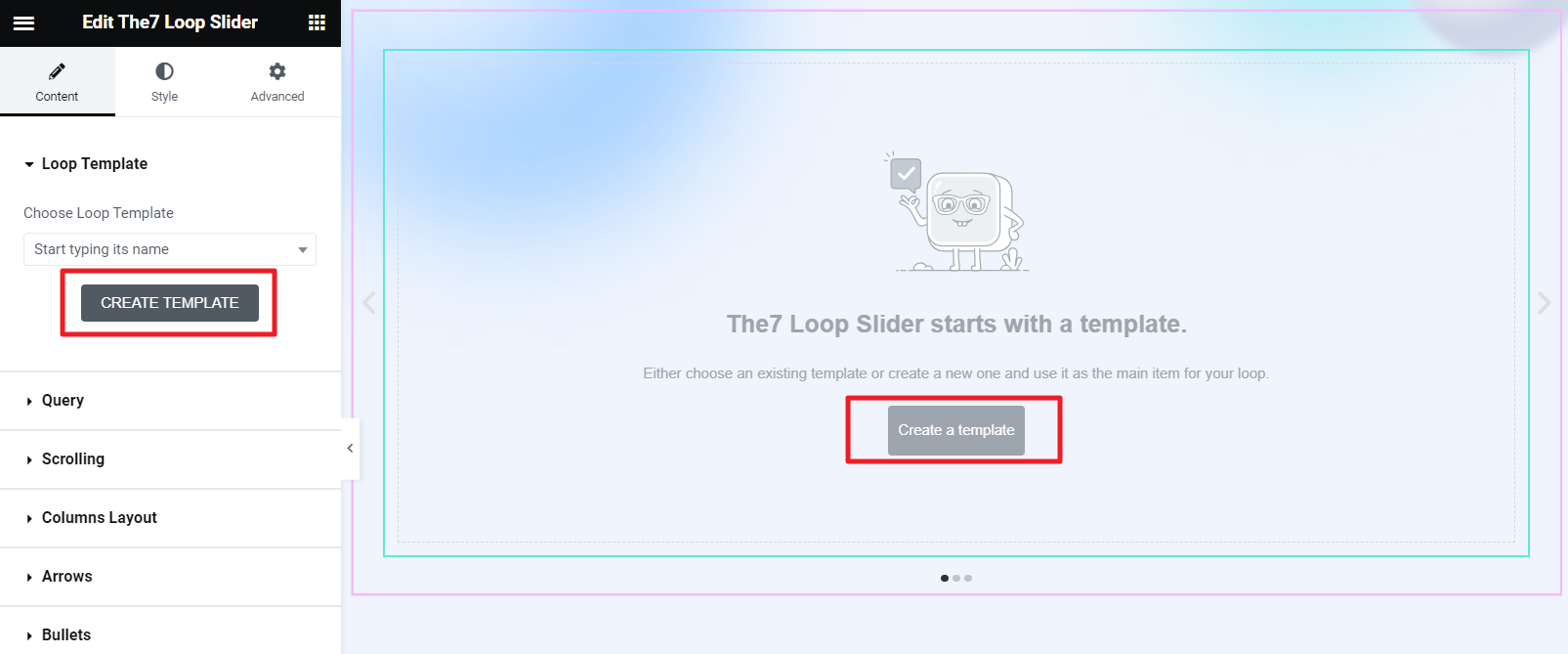
Fig. 2.1. Creating Loop Template.
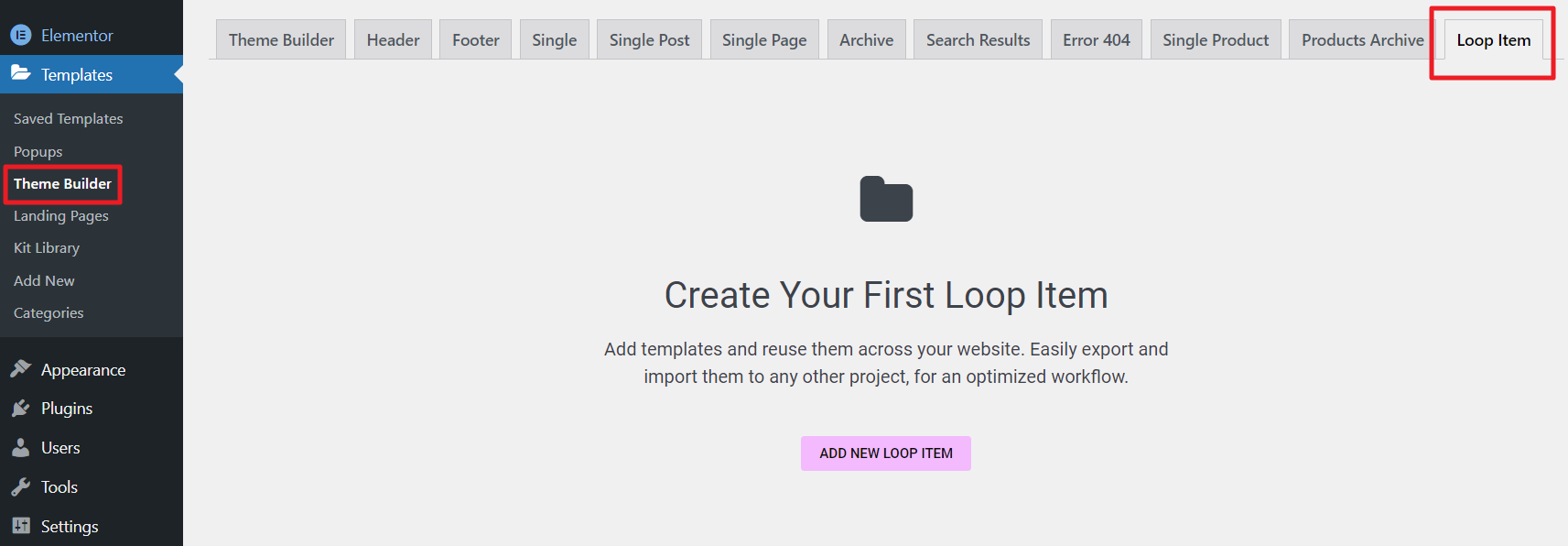
Fig. 2.2. Loop Item Template.
The idea of building a template is the same as for native Elementor Loop Items: you can insert Featured image widget, the Post Title widget, the Post Excerpt widget, etc. And style them in your own way.
Second “Query” tab in widget settings offers to select which posts to display (fig. 2.3):
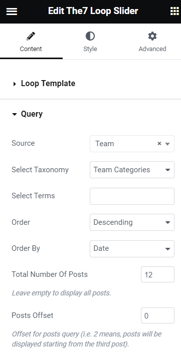
Fig. 2.3. Query tab.
In the Content tab, you can also find “Scrolling” settings (fig. 2.4), which allow to:
- enable autoplay, infinite loop and pause on hover;
- specify autoplay speed;
- configure transition animation and speed.
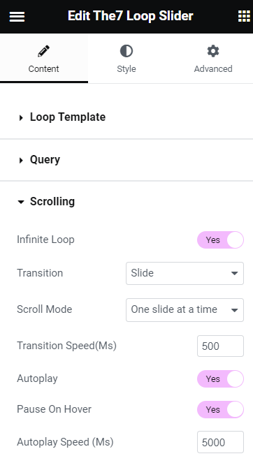
Fig. 2.4. Scrolling tab.
“Layout” tab (fig. 2.5) allows to select:
- number of columns for different devices;
- gap between columns;
- breakpoint in-between Wide Desktop to Desktop layouts.
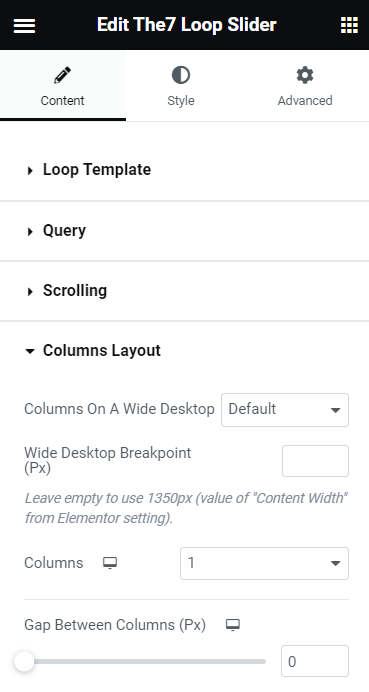
Fig. 2.5. Columns Layout tab.
You can also decided whether you want to show/hide or display on hover slider Arrows and Bullets (fig. 2.6). These options are responsive.
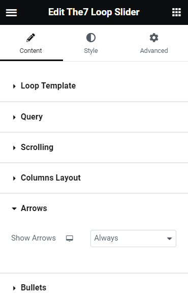
Fig. 2.6. Arrows and Bullets settings.
Style
This tab allows to configure appearance of slider navigation: arrows and bullets. Under the “Arrows” tab (fig. 3.1), you can:
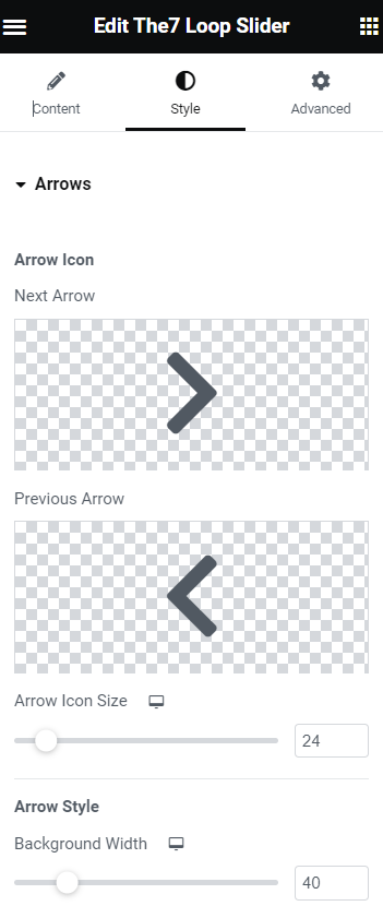
Fig. 3.1. Arrows styling.
- select arrows icons;
- configure their size;
- specify arrows background width, height and border;
- select colors;
- adjust arrows position.
“Bullets” tab (fig. 3.2) has almost the same settings. But instead of selecting icons, you can choose bullets style: small dot stroke, scale up, stroke, fill in, square or rectangular.
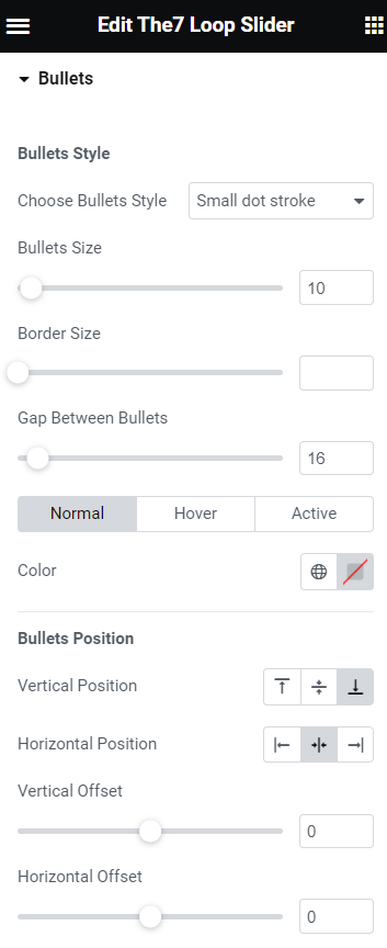
Fig. 3.2. Bullets styling.