The widget (fig. 1.1) allows user to insert image with title and description, and optionally link it.
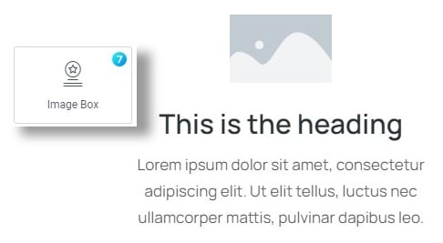
Fig. 1.1. Image Box.
Content
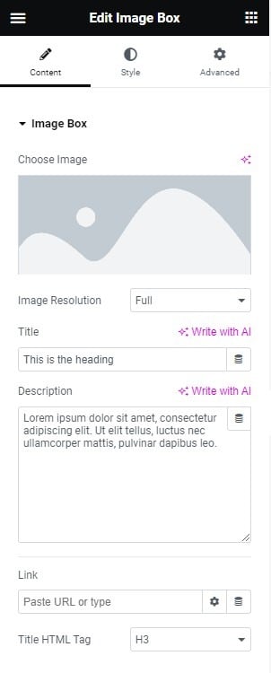
Fig. 1.2. Content Tab.
Content tab (fig. 1.2) includes the following settings:
- image. Allows a user to pick an image from the media library;
- image resolution. Allows a user to pick the size of the source image. Note, It is not the same as the size of the image visible on the page. It allows user to pick a smaller source image, if in general the element is smaller, so it will have a good impact on performance;
- title;
- description text;
- link (URL where the box should link);
- title tag (HTML tag of the title).
Style
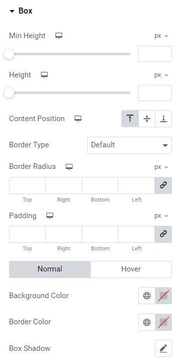
Fig. 2.1. Box Settings.
Box tab (fig. 2.1) allows to configure:
- height;
- minimum height;
- content position: top/middle/bottom;
- border type, width and radius;
- padding;
- colors for background, border and box shadow (normal/hover states).
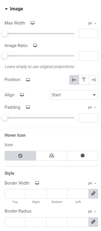
Fig. 2.2. Image Settings Tab.
One of the most important section is Image (fig. 2.2):
- max-width of the image;
- image ratio;
- image position (left/top/right of the text);
- image align;
- padding;
- displaying icon on hover (its size and color);
- border width and radius;
- colors (normal and hover states) of overlay, border, background, box shadow. As well as CSS filters and opacity;
- spacing (between image and the content).
Title section (fig. 2.3) has quite standard settings: typography and colors for the normal and hover states.
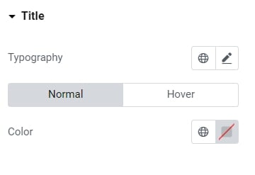
Fig. 2.3. Title Settings.
Description section (fig. 2.4) has almost the same settings as the Title:
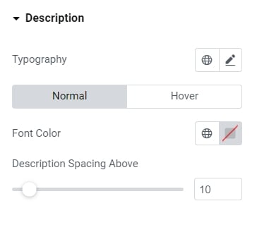
Fig. 2.4. Description Settings.
- typography;
- font color (normal/hover);
- spacing above the description.
Finally, Button tab (fig. 2.5) allows to configure:
- size of the button;
- icon (icon font or custom SVG);
- typography;
- min width;
- min height;
- padding around button text;
- border type, width and radius;
- colors of text, icon, background, border and box shadow (for normal and hover state);
- spacing between the button and description.
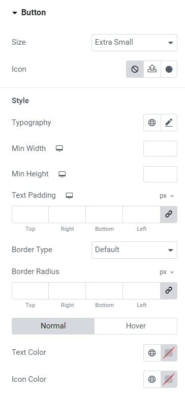
Fig. 2.5. Button Settings.
Advanced
The advanced section contains standard Elementor settings. More info is available here.