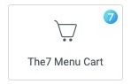
Fig. 1.1. Cart Menu. Widget.

Fig. 1.2. Cart Menu. Appearance.
The element allows to show the cart icon with basic information. Useful when designing shop header.
Content
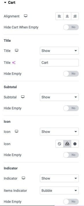
Fig. 2.1. Content Settings.
“Content“ (fig. 2.1) allows user to set alignment of the cart, and if it should be visible when the cart is empty.
“Title” tab makes possible to:
- show/hide the title;
- title’s text;
- show/hide the title when the cart is empty.
“Subtotal” tab allows to show or hide the subtotal itself. And decide whether it should be visible when the cart is empty.
“Icon” tab has the following settings:
- show/hide the icon;
- pick the icon from the library, or upload own SVG icon;
- show/hide the icon when the cart is empty.
“Indicator” tab has such a set of options:
- shows the number of products in the cart;
- show/hide the indicator;
- type of the indicator Bubble/Text;
- show/hide the indicator when the cart is empty.
“Popup” tab allows user to pick the popup that will be shown after clicking on the cart in the header. Note that the popup should be designed first. User also can decide if the popup should be open when adding product to the cart.
Style
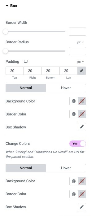
Fig. 3.1. Box Tab Settings.
In the “Box” tab (fig. 3.1), you can configure the appearance of the box around the cart. Please note that for the box to be visible, you need to set padding that will create the box.
You can configure:
- border width, border radius;
- padding of the box;
- normal/hover settings for background and border colors, as well as box shadow.
The “Change Colors” setting allows you to set different box colors when the header is floating.
“Title” tab allows you to set the appearance of the title and subtotal. You can set:
- typography;
- title color (normal/hover);
- subtotal color (normal/hover).
“Cart Icon” tab (fig. 3.2) allows you to configure the icon of the cart.
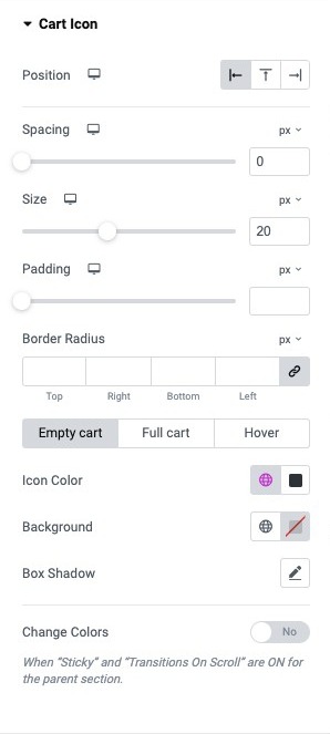
Fig. 3.2. Cart Icon Settings.
You can configure:
- position of the icon (right/left/above the title);
- space between icon and title;
- size of the icon;
- icon padding (you can create a box around the icon);
- border radius (for the box).
Also, for Empty Cart/Full Cart/Hover states you can specify icon and background colors, as well as box shadow.
“Indicator” tab (fig. 3.3) allows you to set the appearance of the indicator:
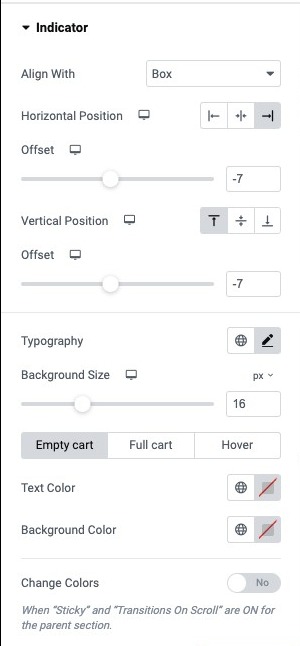
Fig. 3.3. Indicator Tab.
You can choose:
- alignment of the indicator, if you want it to be on the icon, or beside the entire cart box;
- horizontal position (left/center/right);
- offset, if you want the indicator to overlay the icon or box;
- vertical position (top/middle/bottom);
- typography;
- background size.
Also, for Empty Cart/Full Cart/Hover states you can specify text and background colors.
Advanced
The advanced section contains standard Elementor settings. More info is available here.