Under General Appearance tab (fig. 1), you can configure:
- accent color;
- dividers color (separators in posts and icons grids);
- content boxes background color (backgrounds behind products navigation, menus and other widgets);
- accessibility settings like links outline and user scalable attribute (so called “pinch-to-zoom”).
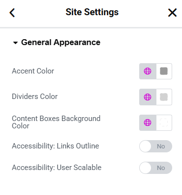
Fig. 1. General Appearance
Also, you can define styles for the Beautiful Loading (fig. 2) which shows up on page loading. You can turn it off or on, select spinner color and form (ring, bars, etc.), and configure the entire preloader screen background.
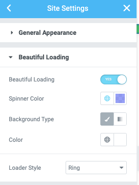
Fig. 2. Beautiful Loading Styles.
You can also design your own custom “Scroll to Top” button (fig. 3.1) using Elementor theme styles (fig. 3.2):
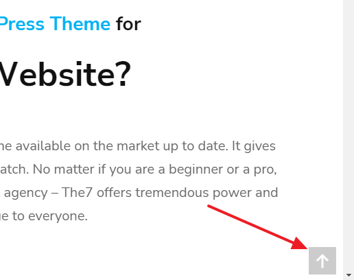
Fig. 3.1. Scroll To Top button.
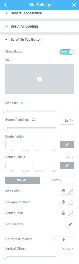
Fig. 3.2. Scroll To Top Settings.
The general settings are:
- show/hide button;
- icon (you can pick it from the library or upload your own SVG icon);
- size of the icon;
- icon paddings (they also determine the entire size of the button);
- border width and radius.
You can also configure normal/hover color settings for: icon, background, border and box shadow. Talking about the button position, it is controlled by horizontal position settings (left/center/right) and horizontal offset (which is useful if you wish to push the button a little from the edge of the screen).
When using anchor navigation, you can adjust the distance between the top of a browser and the target anchor (fig. 3.3). Anchor Scroll allows to consider your header height.
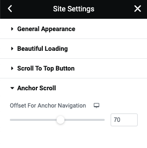
Fig. 3.3. Scroll Offset.