Fig. 1.1. Vertical navigation. Widget.
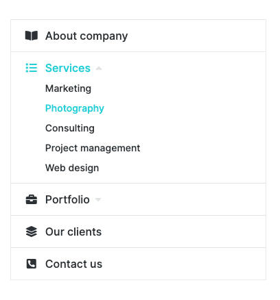
Fig. 1.2. Vertical navigation. Appearance.
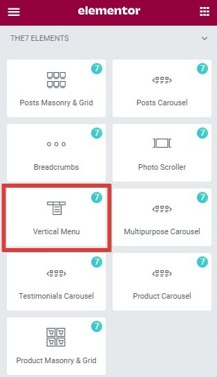
This widget allows you to add a menu on the page (fig. 1.1 – 1.2).
Content
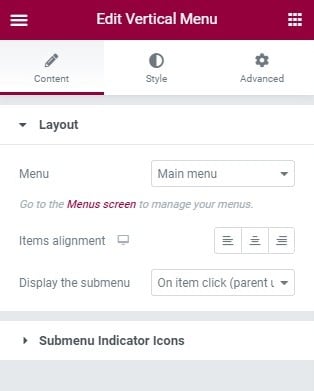
Fig. 2.1. Layout tab.
First “Layout” tab (fig. 2.1) in widget settings offers to:
- pick the menu that you wish to show with the widget, in the “Menu” setting. The menu can be created in Appearance -> Menus;
- set the alignment of the entire widget within the “Items alignment” option;
- set how the submenu should be displayed with help of “Display the submenu” setting.
Talking about the last setting, you can choose among three types of behaviour there:
- Always – the submenu is always visible.
- On icon click (parent clickable) – the submenu is collapsed, and it rolls out when you click the icon. The parent item opens its link.
- On item click (parent unclickable) – the submenu is collapsed, and it rolls out when you click the entire parent item. The parent item does not open any link.

Fig. 2.2. Submenu Indicator Icons.
In the “Submenu Indicator Icons” tab (fig. 2.2), you can select an icon for the parent menu: when it contains the submenu, and when it’s active and displays the submenu.
Also, the alignment of the indicators: before or after the item.
Style
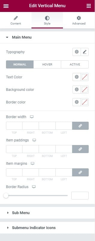
Fig. 3.1. Main Menu styling.
You can configure appearance of the parent menu items here:
- typography
- text color, background color, border color for all states (normal, hover, active);
- border width;
- item’s paddings;
- item’s margins;
- border radius.
In the “Sub Menu” tab, you can configure appearance of sub-menu items (fig. 3.2):
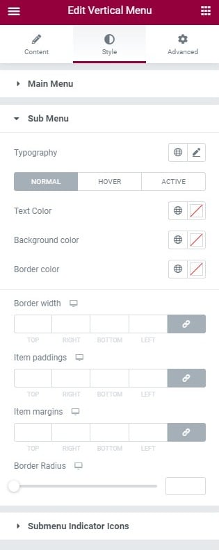
Fig. 3.2. Submenu styling.
- typography;
- text color, background color, border color for all states (normal, hover, active);
- border width;
- item’s paddings;
- item’s margins;
- border radius.
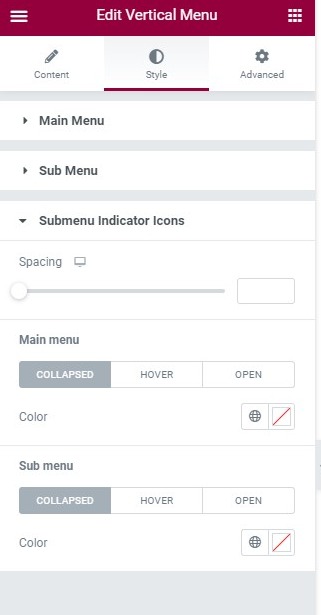
Fig. 3.3. Submenu indicator icons styling.
Submenu Indicator Icons – you can configure appearance of the indicators here (fig. 3.3):
- space between indicator and menu text;
- color of the parent menu indicator for all states(normal, hover, active);
- color of the sub-menu indicator for all states(normal, hover, active).
Advanced
Advanced section contains standard Elementor settings. More info is available here.