This widget (fig. 1.1 – 1.2) allows to to show icon with text, an optional link and a button.
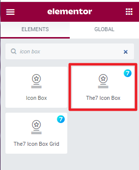
Fig. 1.1. The7 Icon Box. Widget.
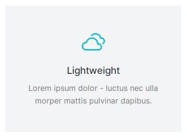
Fig. 1.2. The7 Icon Box. Appearance.
Content
This tab (fig. 2.1) allows you to configure:
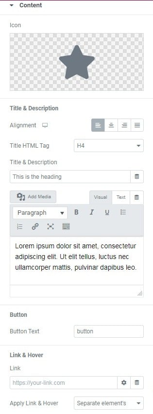
Fig. 2.1. Content Tab.
- icon from the library, or you can upload your own icon;
- alignment of the Title, Description and Button;
- content of the title and description;
- text of the button (if empty, the button will not be shown);
- URL of the link;
- link appliance (Separate elements, Whole box):
a) separate elements will apply the link separately to icon, title and button;
b) whole box, will apply the link to the entire element.
Style
Box tab (fig. 3.1) allows to configure:
- minimum height of the box;
- height of the box, which won’t go below the value of the min-height setting;
- position of the icon and text inside the box
- border type, border width (if the border is enabled), border radius;
- padding;
- colors of background, border and box shadow (for normal and hover state).
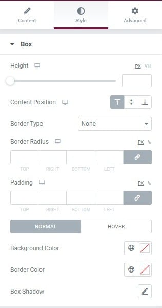
Fig. 3.1. Box Styling.
You can configure the following styling options under the Icon tab (fig. 3.2):
- position of the icon, on the left, above or on the right of the box;
- align (position of the icon in relation to the box);
- size of the icon;
- min width of the box/background around the icon;
- min height of the box/background around the icon;
- padding;
- border width and width;
- colors of background, border and box shadow (for normal and hover state);
- spacing between icon, and the content.
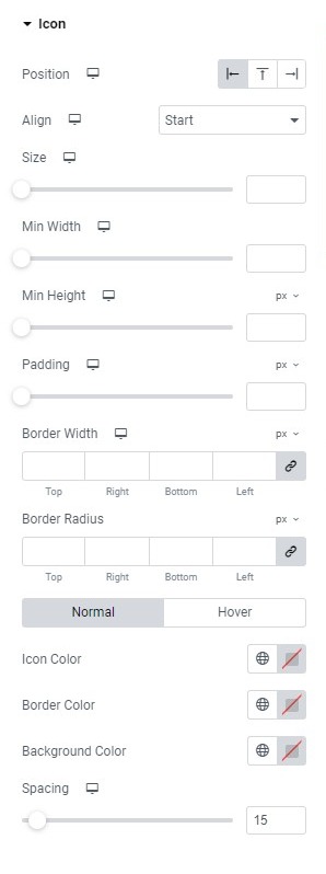
Fig. 3.2. Icon Styling.
Title tab (fig. 3.3) – here you can adjust:
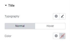
Fig. 3.3. Title Styling.
- typography;
- text shadow;
- colors for normal/hover states.
Description tab (fig. 3.4) offers the following set of options:
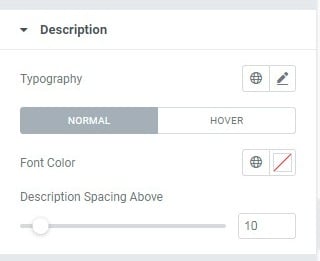
Fig. 3.4. Description Styling.
- typography;
- text shadow;
- colors for normal/hover states;
- space between description and the title.
Finally, Button tab (fig. 3.5) allows to configure:
- size of the button;
- icon (icon font or custom SVG);
- typography;
- min width;
- min height;
- padding around button text;
- border type, width and radius;
- colors of text, icon, background, border and box shadow (for normal and hover state);
- spacing between the button and description.
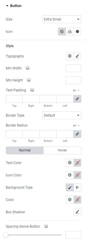
Fig. 3.5. Button Styling.
Advanced
The advanced section contains standard Elementor settings. More info is available here.