This widget allows inserting a link with an icon, which changes depending on if user is logged-in or logged-out (fig. 1):
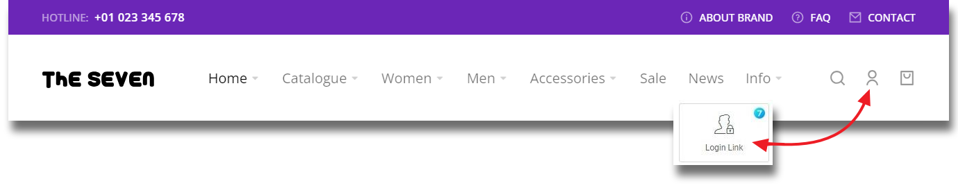
Fig.1. Login Link Widget.
Content
In the “Content” tab, user can set the appearance for both states (logged in/out) separately:
- icon;
- text;
- link;
- content alignment.
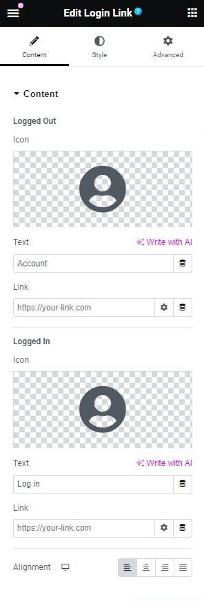
Fig. 2.1. Login Link Content Settings.
Style
In the “Box” tab (fig.2.2), user can configure the general appearance of the box:
- height of the box;
- content position within the box (top/middle/bottom);
- border type;
- border radius (adjustable per device);
- padding (adjustable per device).
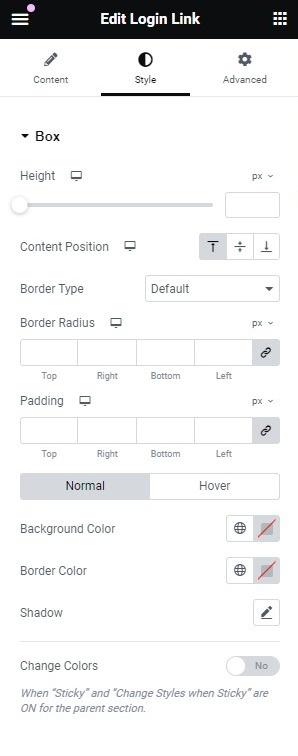
Fig. 2.2. Box Style Settings.
For Normal and Hover states:
- background and border colors;
- shadow.
“Change Colors” settings allows changing the colors of the elements when The7 Login Link is in the Sticky Section.
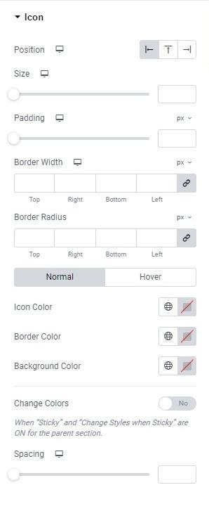
Fig. 2.3. Icon Styling.
“Icon” section (fig. 2.3) allows user to set the appearance of the icon:
- position of the icon (left/top/right of the text);
- size of the icon;
- padding;
- border width (adjustable per device);
- border radius (adjustable per device).
For Normal and Hover states you can control colors of the icon, border and background.
“Change Colors” setting allows changing the colors of the icon when The7 Login Link is placed inside of the Sticky Section.
Spacing (adjustable per device) setting controls distance between the icon and text.
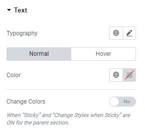
Fig. 2.4. Text Styling.
“Text” tab allows to configure the appearance of the text:
- typography;
- color of the text for Normal and Hover states.
“Change Colors” setting allows altering the color of the text when The7 Login Link is placed inside of the Sticky Section.
Advanced
Advanced section contains standard Elementor settings. More info is available here.