This widget allows to display Breadcrumbs (fig. 1.1 – 1.2):
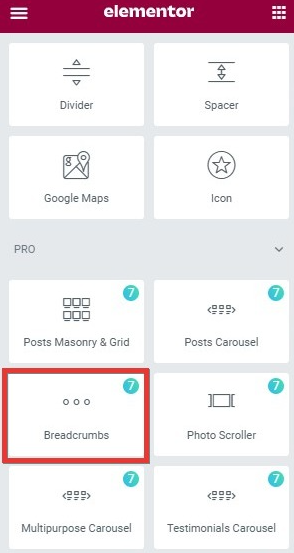
Fig. 1.1. Breadcrumbs. Widget.
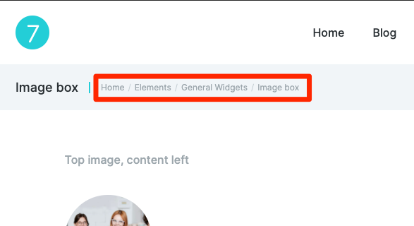
Fig. 1.2. Breadcrumbs. Appearance.
Style
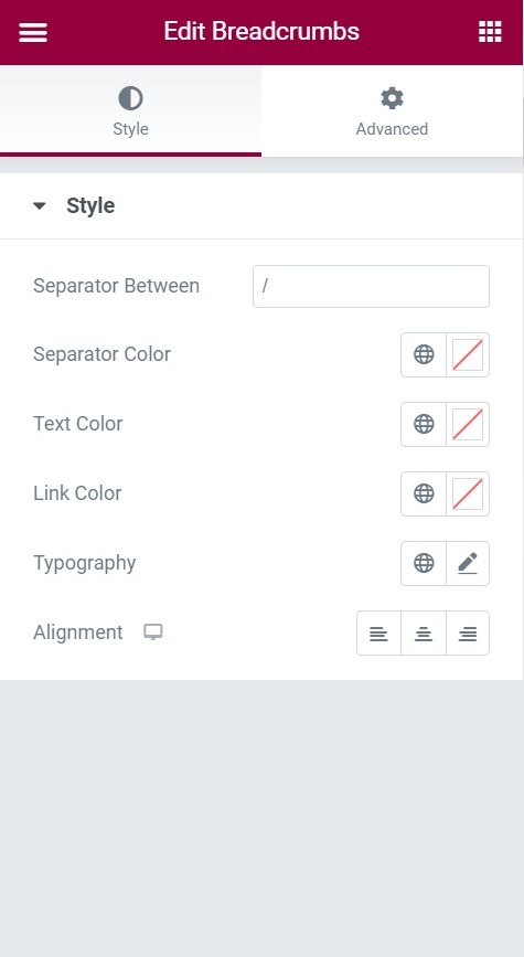
Fig. 2.1. Style tab.
Breadcrumbs widget does not have the usual “Content” tab, and can be completely configured through the “Style” tab (fig. 2.1).
“Separator“. You can set the sign that will separate the breadcrumbs items (fig. 2.2):

Fig. 2.2. Separators in the front-end.
“Separator color” allows to set the color of the separator icon.
“Text color” – the color is applied for entire breadcrumbs, if you don’t set individual colors for other breadcrumb elements. If you set other colors, it will apply only for the last item of the breadcrumbs.
You can also configure the color of the linked breadcrumbs items in the “Link color” setting.
“Typography setting“. Here you can configure all the font aspects of the breadcrumbs, such as:
- font family
- size
- weight
- style
- decoration
- line height
- letter spacing
Advanced
Advanced section contains standard Elementor settings. More info is available here.