This widget allows to display WooCommerce product data tabs (fig. 1.1 – 1.2). It’s useful for designing single product page, or products’ template in Theme Builder.
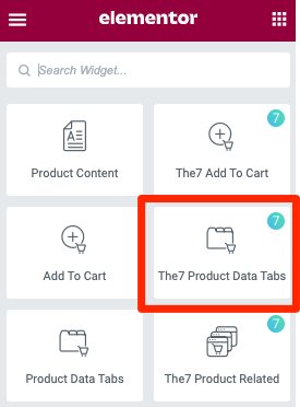
Fig. 1.1. Product Data Tabs. Widget.
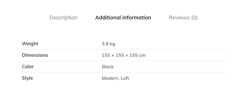
Fig. 1.2. Product Data Tabs. Appearance.
“Description” tab content can be added when editing product itself with Elementor (fig. 2.1). It is important to understand the difference: editing single product content, and not Elementor template. Since each product has its own unique description, which can’t be stored in a template.
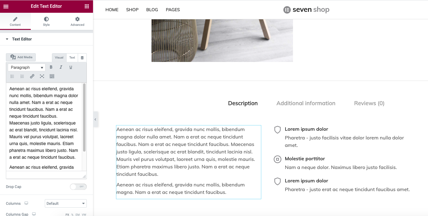
Fig. 2.1. Description tab content.
“Additional info” tab (fig. 1.2) represents Shipping weight and dimensions values, as well as available content from the Attributes section (fig. 2.2):
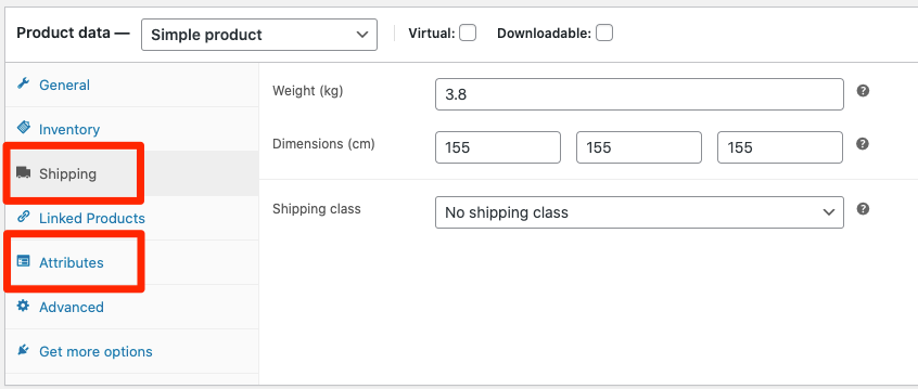
Fig. 2.2. Additional Information tab content.
“Reviews” tab represent the feedback posted by visitors, as usually (fig. 2.3):
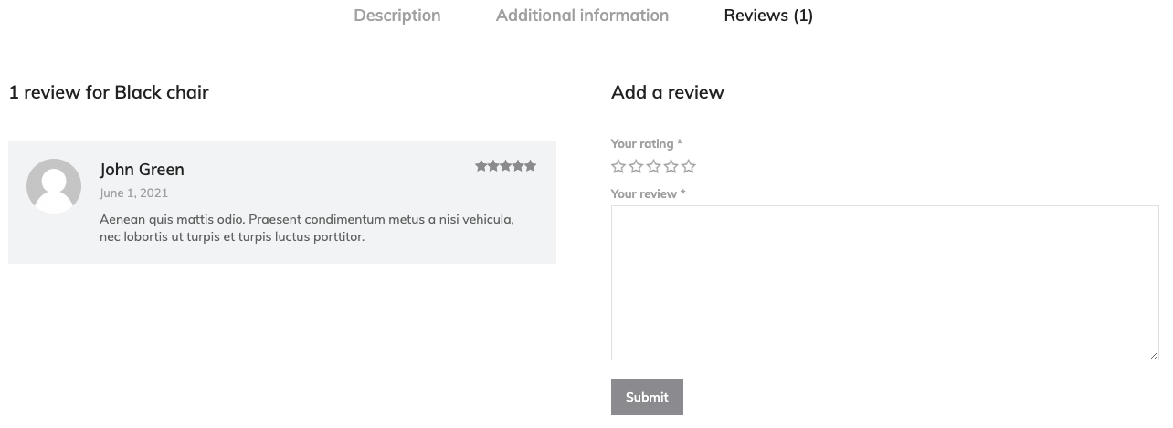
Fig. 2.3. Reviews tab.
Content
First “Content” section allows to choose tabs orientation and decide which tabs you want to display (fig. 3.1):
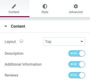
Fig. 3.1. Content tab options.
Available layouts are illustrated below (fig. 3.2 – 3.4):
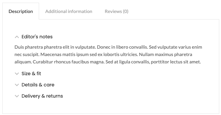
Fig. 3.2. Top tabs alignment.
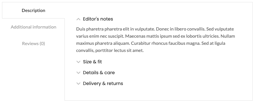
Fig. 3.3. Side tabs alignment.
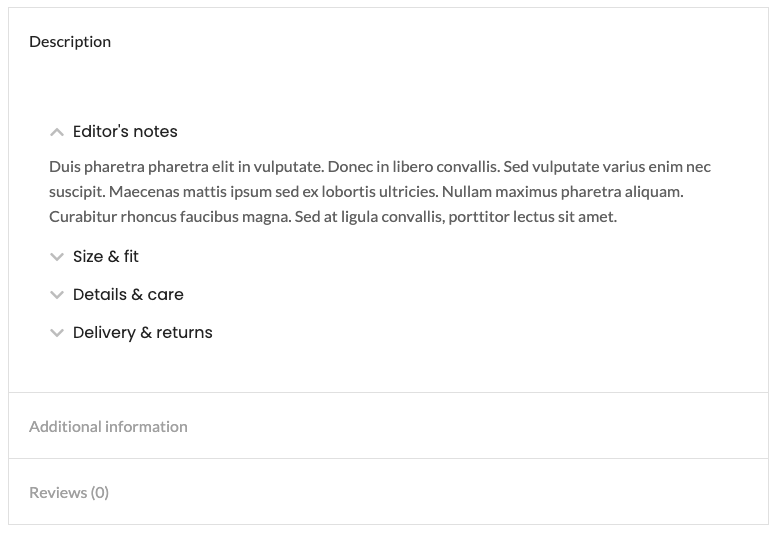
Fig. 3.4. Accordion layout.
You can configure “Top tabs” alignment (tab. 4.1) and choose among: left, center, right and justified.
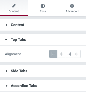
Fig. 4.1. Top tabs alignment.
For the “Side tabs” (fig. 4.2), you can choose between left and right tabs position. As well as establish tabs titles width.
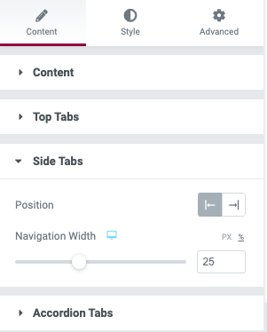
Fig. 4.2. Side tabs settings.
“Accordion tabs” allows to align titles inside of a tab (fig. 4.3):
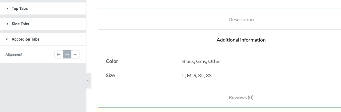
Fig. 4.3. Accordion tabs.
Style
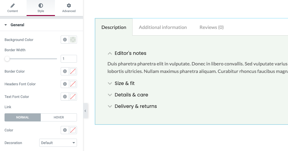
Fig. 5. General style settings.
“General” tab (fig. 5) in the Style section provides the following settings:
- background color of an active tab;
- width and color of a tab border;
- colors for the tab title and content;
- links normal/hover colors and decoration (underline, overline, etc.).
You can configure tabs titles in “Tabs” section (fig. 6):
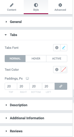
Fig. 6. Tabs titles options.
Configure titles typography, color and paddings around them.
“Description” setting (fig. 7.1) allow to adjust this tab paddings only. Remember that the content of this tab can be altered when editing a product itself, not the template.
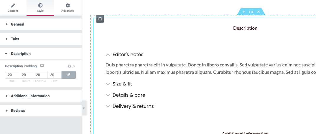
Fig. 7.1. Description tab settings.
“Additional information” tab (fig. 7.2) settings have much wider range of settings:
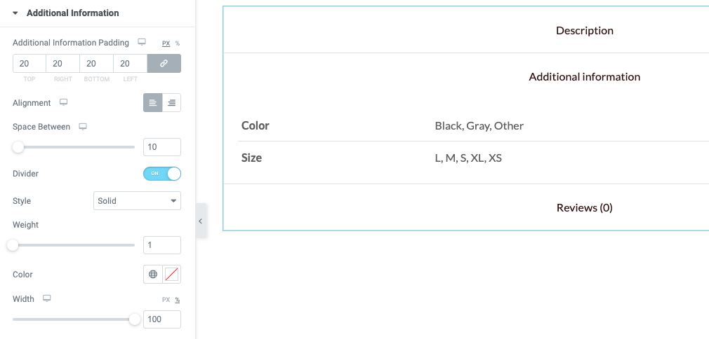
Fig. 7.2. Additional info tab settings.
- tab paddings;
- attributes values alignment;
- space between attributes;
- divider between attributes (on/off, style, color, thickness, width).
“Reviews” tab contains settings for the product rating and feedback section (fig. 7.3):
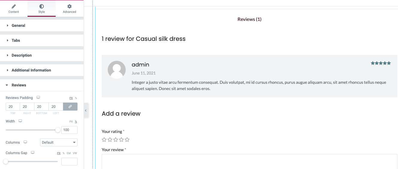
Fig. 7.3. Review tab settings.
- tab paddings;
- inner content width;
- select 1 or 2 columns layout;
- distance between columns.
Advanced
Advanced section contains standard Elementor settings. More info is available here.