The element serves to show Product’s additional information (like products attributes) on a WooCommerce single product page (fig. 1.1 – 1.2):
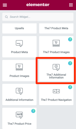
Fig. 1.1. Additional Information. Widget.
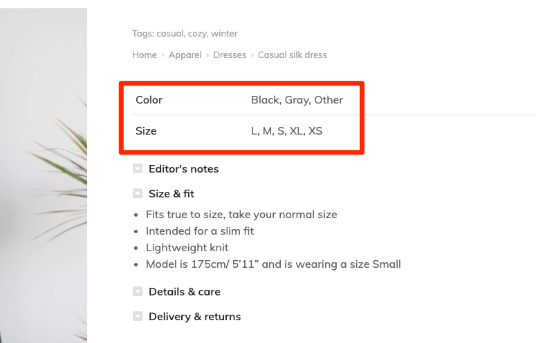
Fig. 1.2. Additional Information. Appearance.
It’s useful for designing single product page, or products’ template in Theme Builder.
Style
The Attribute Title tab allows to control the appearance of the Titles of the attributes – color and typography (fig. 2.1).
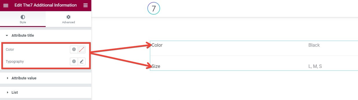
Fig. 2.1. Additional Information. Appearance.
The Attribute Value tab (fig. 2.2):
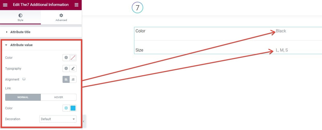
Fig. 2.2. Attribute Value tab.
It allows to control the appearance of the values of the attributes:
- color;
- typography;
- alignment.
Also, if the value contains link:
- color;
- decoration;
- both values can be set for the Normal and Hover state.
The List tab (fig. 2.3):
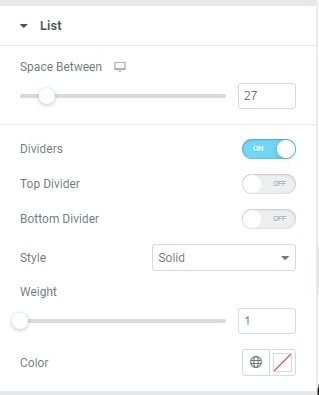
Fig. 2.3. List tab.
It allows you to configure the general appearance of the attributes list:
- space between list items;
- dividers between list items;
- dividers above the list (Top Divider);
- dividers below the list (Bottom Divider);
- style of the dividers (solid, double, dotted, dashed);
- weight of the dividers;
- color of the dividers.
Advanced
Advanced section contains standard Elementor settings. More info is available here.