This widget allows to display posts (blog, portfolio, etc.) as a grid (fig. 1.1 – 1.2). Comparing to Posts Masonry & Grid, this widget has simplified layout and settings (no category filter, hover icon, skins, etc.).
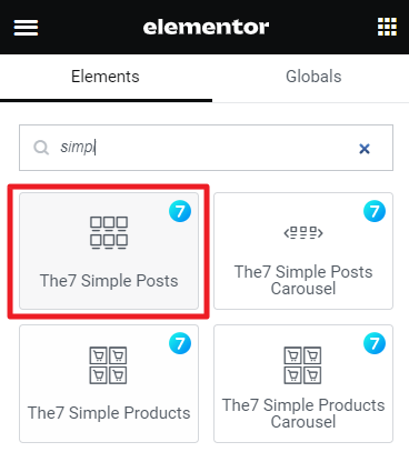
Fig.1.1. Simple Posts. Widget.
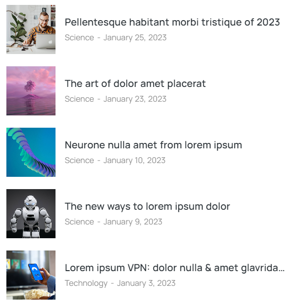
Fig. 1.2. Simple Posts. Appearance.
Content
First “Query” tab in widget settings offers to select which posts to display (fig. 2.1):
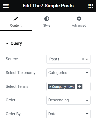
Fig. 2.1. Query Tab.
You can select posts basing on their:
- post type: blog post, portfolio, your CPT from The7 Post Type Builder. There are also options “Archive (current query)” – for displaying current query of posts, when building an archive template; and “Related” – for displaying so called “Related Posts” section on a single post page;
- taxonomy (category, tag, etc.);
- terms (type-in the specific category or tag you’d like to display);
- option for ordering posts by date, name, etc.
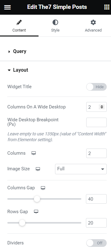
Fig. 2.2. Layout Tab.
“Layout” (fig. 2.2) tab allows to:
- show or hide widget title;
- select a breakpoint, when the layout should switch to the “wide desktop” mode;
- specify number of columns for the “wide desktop”;
- specify number of columns for the rest devices;
- choose image size (large, medium small thumbnails, etc.);
- define gap between columns and rows;
- show or hide dividers.
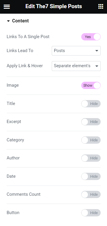
Fig. 2.3. Content Tab.
- links across the post (including a custom link specified in a custom field of a CPT – fig. 2.4);
- title (also select h1/h2/h3/… tag for the title and specify its max width);
- featured image;
- excerpt (specify the number of words);
- meta info: category, author, date, number of comments;
- “Read more” button (also specify the button label).
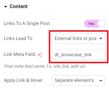
Fig. 2.4.1. Making posts link to a custom link.
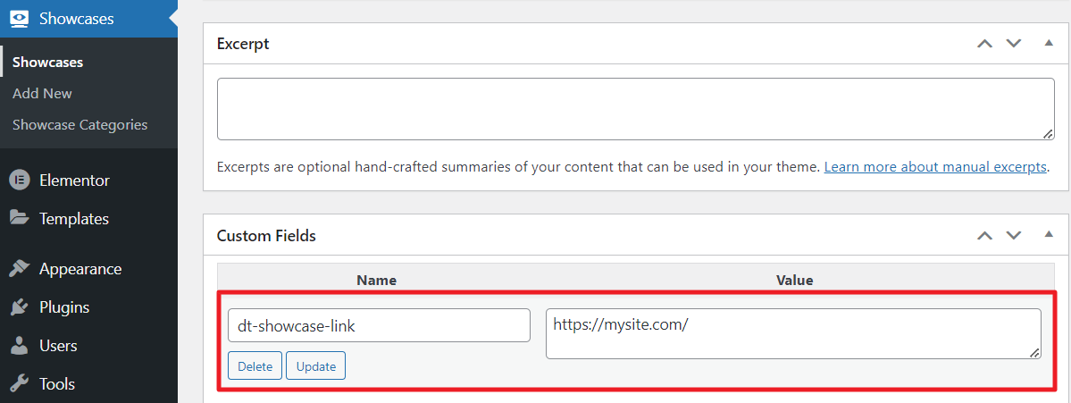
Fig. 2.4.2. Applying Custom Link to a Single Post.
It is possible to enable different modes of pagination and adjust the number of posts to display in the “Pagination” tab (fig. 2.5).
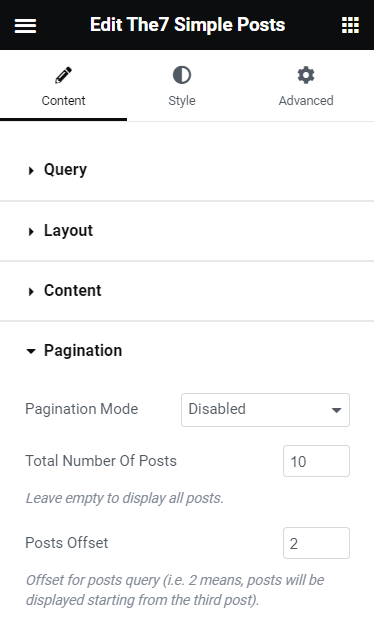
Fig. 2.5. Pagination Settings.
You can also specify posts offset – to skip the first N posts in the query.
Style
The “Box” tab allows to style the area behind the entire box (fig. 3):
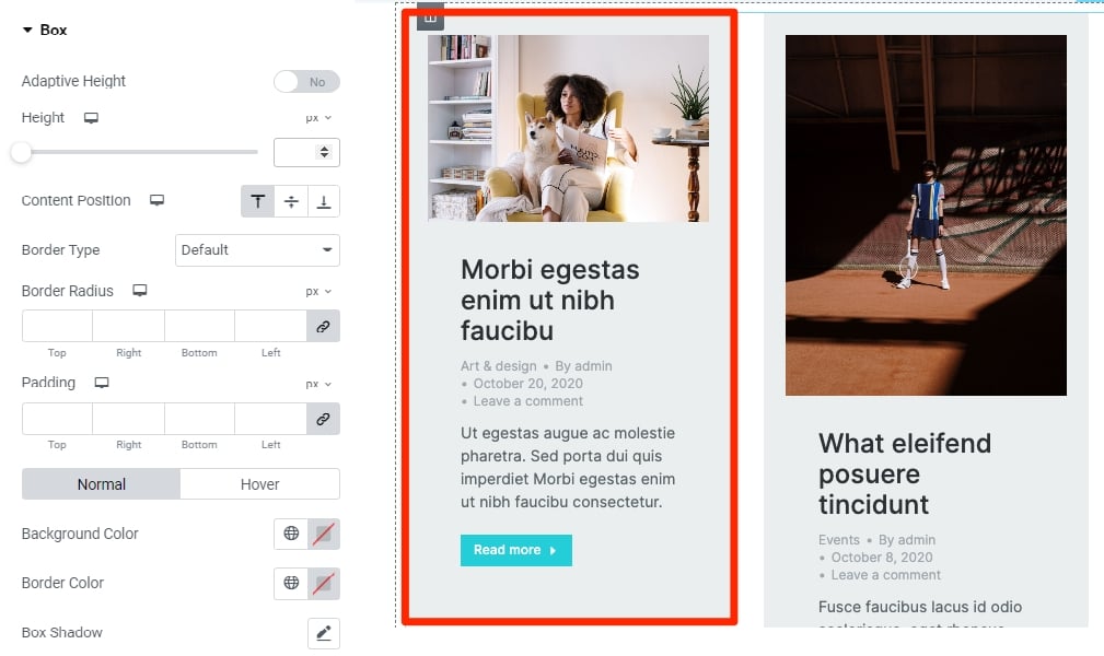
Fig. 3. Box Behind the Text.
You can adjust:
- content position inside of the box;
- height or adaptive height (to automatically adjust the height of the box depending on the content height of each post);
- border width, color and radius;
- background color and padding;
- box shadow.
Within the “Featured Image” tab, it is possible to configure the following settings of posts featured images (fig. 4):
- vertical and horizontal alignment;
- gap between the image and text;
- max width and image width/height ratio (leave empty to keep the original image proportions). When choosing specific ratio, you can also select “object fit” (fill, cover or contain);
- hover icon and its styling;
- border width, color and radius;
- box shadow;
- overlay for normal and hover conditions;
- CSS filters;
- image opacity for normal and hover conditions.
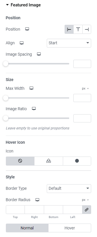
Fig. 4. Image Tab.
“Content” tab allows to adjust appearance of the area behind text content: title, excerpt, etc. (fig. 5). In particular, its alignment and paddings.
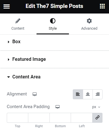
Fig. 5. Content Tab
Configure Post Title color and typography in the appropriate tab (fig. 6):
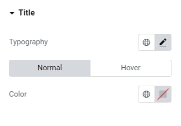
Fig. 6. Title Settings.
Same settings are available for the “Meta information” tabs. But this tab also offers to specify a delimiter sign and its spacing (fig. 7):
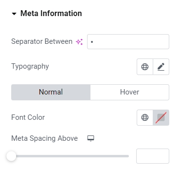
Fig. 7. Meta Information Settings.
And the last “Button” tab (fig. 8) provides all required settings for the “Read more” button:
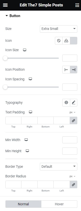
Fig. 8. Button Settings.
- button size;
- icon appearance and position;
- button min width and height;
- typography;
- text and background colors (for both idle and hover states);
- text paddings;
- border style, width, color and radius;
- box shadow;
- gap below the button.
Advanced
Advanced section contains standard Elementor settings. More info is available here.