This widget allows to arrange filter functionality at your WooCommerce store (fig. 1.1 – 1.2). It filters products by an attribute: size, color, etc.
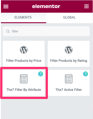
Fig. 1.1. Filter by Attributes. Widget.
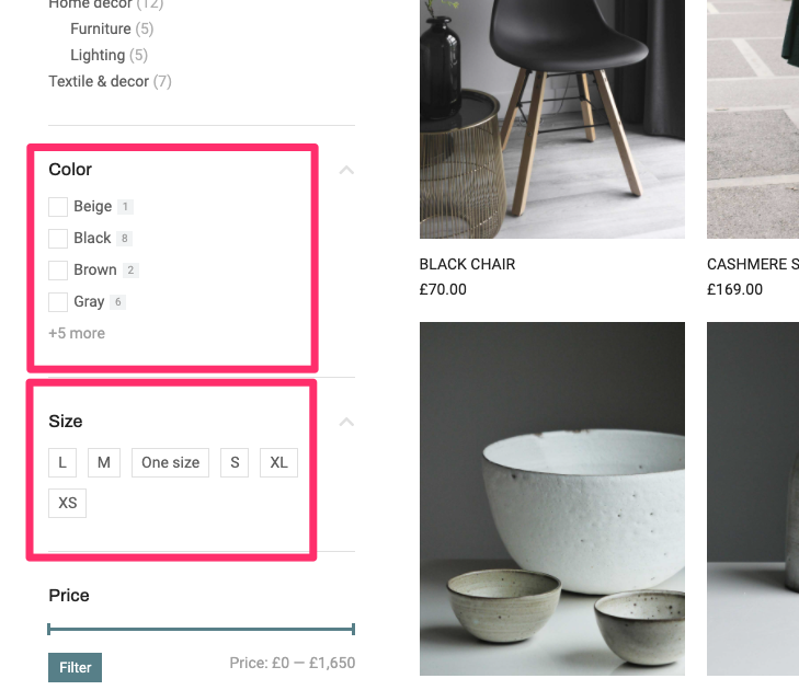
Fig. 1.1. Filter by Attributes. Appearance.
It’s useful for designing products archive page in Theme Builder and can be used within a section (fig. 1.3):
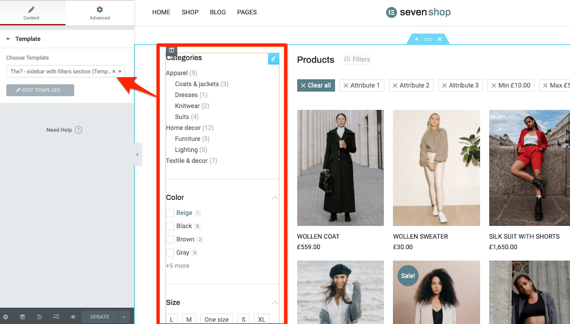
Fig. 1.3. Sidebar filter. Section template.
Content
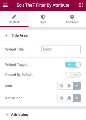
Fig. 3.1. Title area.
In the “Title Area” (fig. 2.1), you can specify the name of the widget, decide whether the widget should be a toggle or to be always open (fig. 2.2). If the Toggle is selected, you can also select icons for the open and closed toggle state.
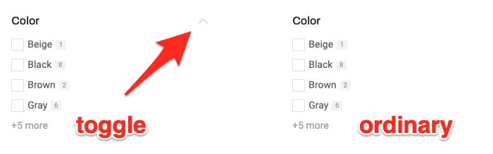
Fig. 2.2. Toggle vs. Ordinary filter layout.
In the “Attributes” tab (fig. 2.3), you can:
- specify which attribute you are going to filter the products by. It can be color, size, brand, etc. You can read more about the attributes here.
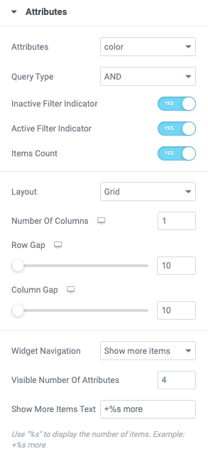
Fig. 2.3. Attributes tab.
-
- choose between ‘OR‘ / ‘AND‘ logic. ‘OR’ option means it will display products which have at least one of the chosen attributes. For example, ‘black’ OR ‘white’ attributes chosen will display products which are available in black, or white, or both black and white colors. ‘AND’ option means that only products available in both black and white colors will be displayed;
- configure “Inactive Filter Indicator” setting. It allows to hide checkboxes for not selected attributes (fig. 2.4):

Fig. 2.4. Inactive filter indicator.
- configure “Active Filter Indicator” setting. It works the same way, but for attributes which have been chosen. If this setting is set to “No”, active filter will be highlighted with color only;
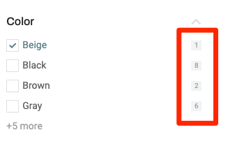
Fig. 2.5. Items Count.
- select Inline or Grid layout (fig. 2.6). For the Inline layout margins setting is available. In case with the Grid layout, you can configure number of columns, gaps between rows and columns;
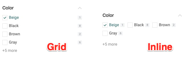
Fig. 2.6. Grid vs Inline layout.
- configure “
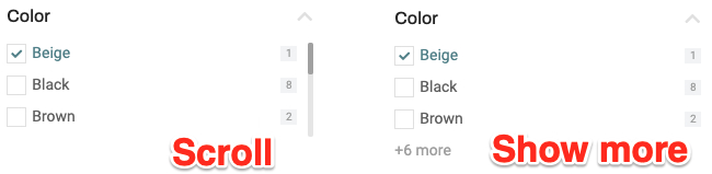
Fig. 2.7. Scroll vs Show more items.
Style
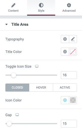
Fig. 1.3. Title Area.
Under the “Title Area” tab, you can configure title typography, color, title icon size and color, as well as the gap below this title.
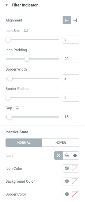
Fig. 3.2. Filter Indicator.
You can configure “Filter Indicator” in the appropriate tab. You can adjust its alignment (fig. 3.3), size, padding, border width and radius, as well as the gap between the indicator and attribute title.
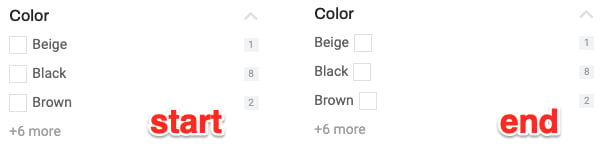
Fig. 3.3. Indicator alignment.
You can also choose indicator icons for the active and inactive states; configure the colors of such an icon, its background and border – for both idle and hover states.
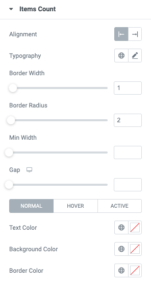
Fig. 3.4. Items Count.
“Items Count” tab allows to configure counter:
- alignment,
- typography,
- border width and radius,
- minimal width of icon background,
- gap between the icon and attribute title area,
- colors of text, background and border. For inactive, active and hover state.
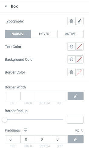
Fig. 3.5. Box settings.
Under the “Box” tab (fig. 3.5), you can configure attributes text typography and color, background, borders and paddings.
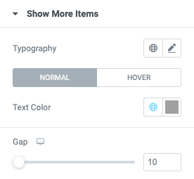
Fig. 3.6. Show More Items.
The “Show More Items” tab (fig. 3.6) allows to style appropriate link (fig. 3.7), if one is enabled in Content -> Attributes -> Widget Navigation.
Fig. 3.7. “Show more items” link. Appearance.
You can adjust its typography, color and distance to the attributes list.
Advanced
Advanced section contains standard Elementor settings. More info is available here.