“The7 Slider” widget allows to build a slideshow with advanced layout and animation (fig. 1):
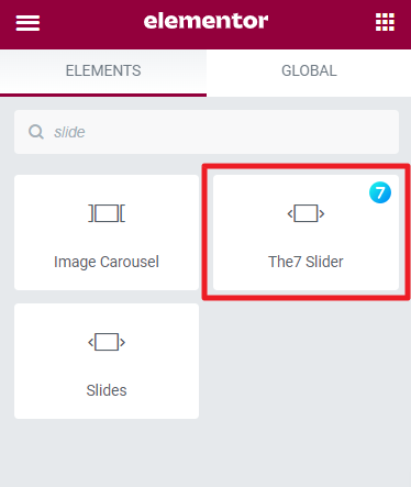
Fig.1.1. The7 Slider. Widget.

Fig. 1.2. The7 Slider. Appearance.
Content
First of all, you need to create individual slides under Templates -> Saved Templates -> The7 Slide (fig. 2.2). You can also find a link to this section when adding “The7 Slider” widget to a page (fig. 2.1):
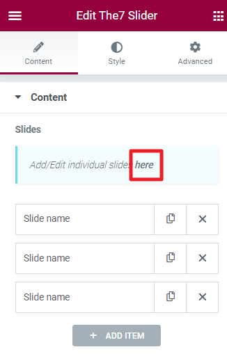
Fig. 2.1. Link to The7 Slides templates.
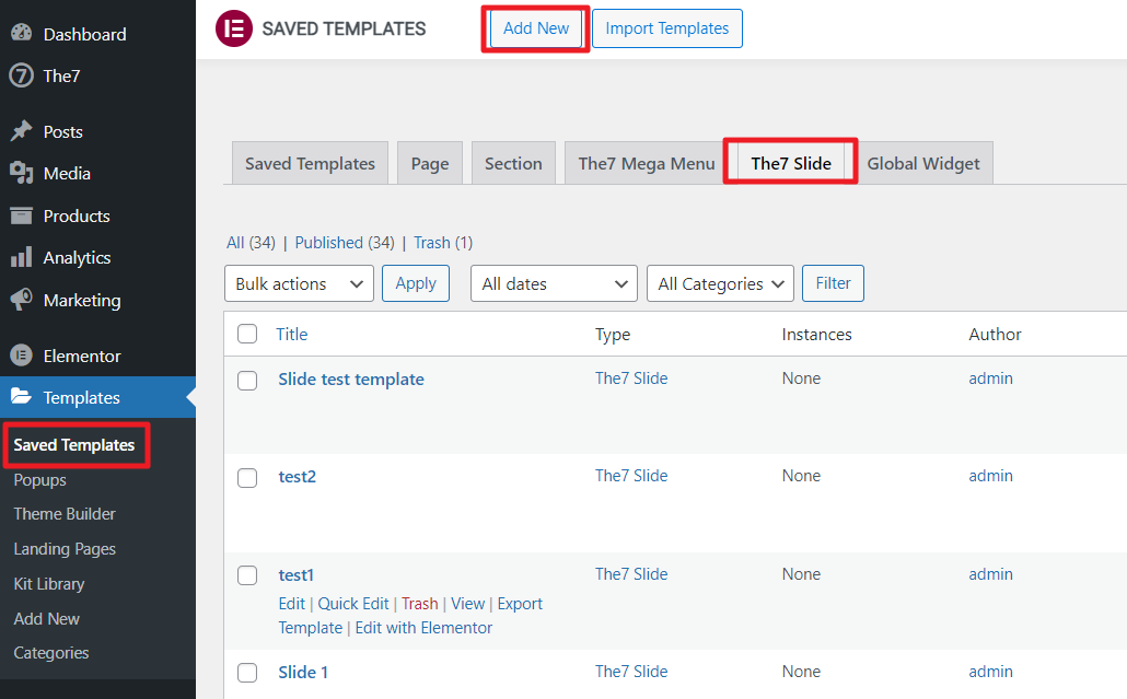
Fig. 2.2. Adding individual Slides.
Basically, the individual slide is an ordinary Elementor section (fig. 2.3). It means you have almost no limits on the elements which can be added to the slide.
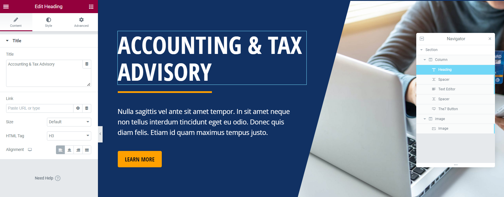
Fig. 2.3. Individual slide.
You can also edit global Slide settings (fig. 2.4.) like:
- сontent alignment;
- slide background and overlay;
- slide name and status.

Fig. 2.4. Global Slide Settings.
When the slides are ready, you can select them in “The7 Slider” widget under the Content tab (fig. 2.5). You can also assign a unique name to each slide.
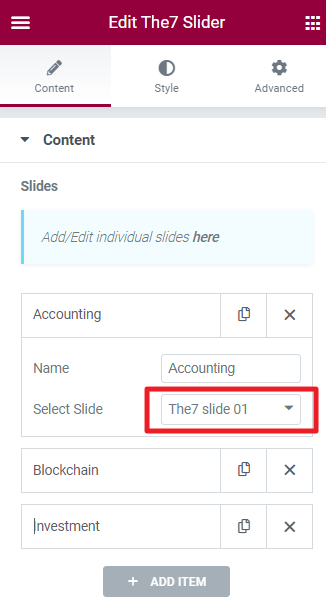
Fig. 2.5. Adding slides to a slider.
It is recommended to create slides with the same height. Otherwise, you can specify slider height globally, in the “Height” section (fig. 2.6):
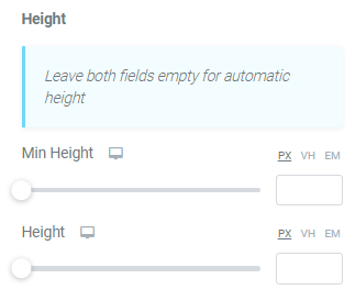
Fig. 2.6. Slider height settings.
In the bottom of the Content tab, you can find “Scrolling” settings (fig. 2.7), which allow to:
- enable autoplay, infinite loop and pause on hover;
- specify autoplay speed;
- configure transition animation and speed.
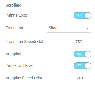
Fig. 2.7. Autoplay, loop, scrolling settings.
You can also decided whether you want to show/hide or display on hover slider arrows and bullets (fig. 2.8). These options are responsive.
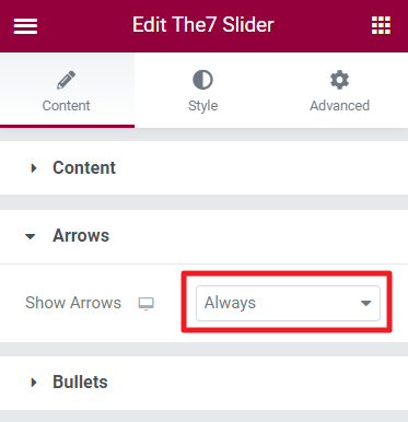
Fig. 2.8. Arrows and Bullets settings.
Style
This tab allows to configure appearance of slider navigation: arrows and bullets. Under the “Arrows” tab (fig. 3.1), you can:
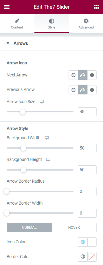
Fig. 3.1. Arrows styling.
- select arrows icons;
- configure their size;
- specify arrows background width, height and border;
- select colors;
- adjust arrows position.
“Bullets” tab (fig. 3.2) has almost the same settings. But instead of selecting icons, you can choose bullets style: small dot stroke, scale up, stroke, fill in, square or rectangular.
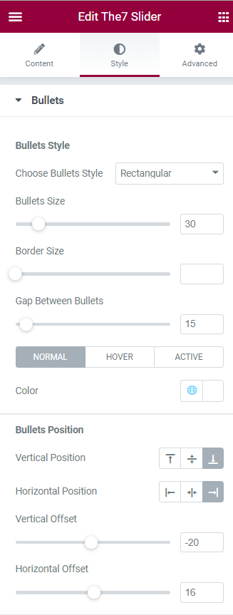
Fig. 3.2. Bullets styling.