This widget allows to create a grid with icons, optionally with links (fig. 1):
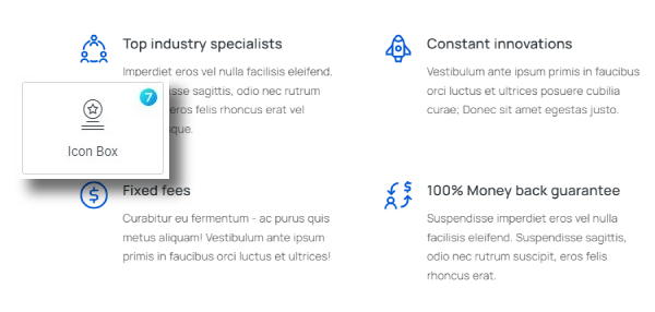
Fig. 1. The7 Icon Box Grid Widget.
Content
Items tab – here user can add Icon Boxes, each box can have Icon, Title, Content, Button, Link (fig. 2.1):
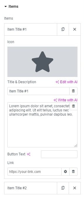
Fig. 2.1. Grid Content.
User can set an HTML tag for the title and the alignment of the entire content of the Icon Boxes in the Content section (fig. 2.2):
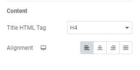
Fig. 2.2. Content Settings.
Layout tab (fig. 2.3) allows to configure:
- widget title (show/hide);
- columns on a wide desktop (allows to set number of Icon Boxes in one row on wide screens);
- wide desktop breakpoint (allows to determine over what width screens are treated as the wide screens);
- columns, number of elements per row for standard screens, adjustable for mobile devices;
- columns gap (space between each Icon Box in a row);
- rows gap (space between each row of Icon Boxes);
- dividers;
- apply link & hover. Determines if the link and hover effect should be applied for each element separately, or for the entire box.
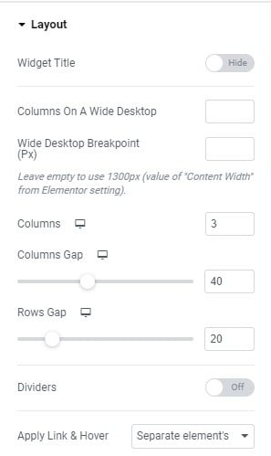
Fig. 2.3. Layout Settings.
Style
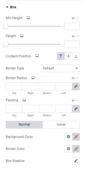
Fig. 3.1. Box Styling.
Box tab (fig. 3.1) allows to configure:
- minimum height of the box;
- height of the box, which won’t go below the value of the min-height setting;
- position of the icon and text inside the box
- border type, border width (if the border is enabled), border radius;
- padding;
- colors of background, border and box shadow (for normal and hover state).
Adjust settings for the Dividers (style, width, color) in the appropriate section (fig. 3.2):
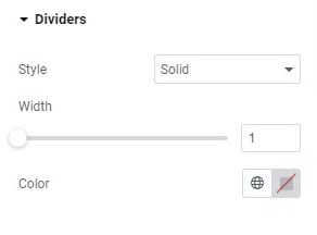
Fig. 3.2. Divider Settings.
You can configure the following styling options under the Icon tab (fig. 3.3):
- position of the icon, on the left, above or on the right of the box;
- align (position of the icon in relation to the box);
- size of the icon;
- min width of the box/background around the icon;
- min height of the box/background around the icon;
- padding;
- border width and width;
- colors of background, border and box shadow (for normal and hover state);
- spacing between icon, and the content.
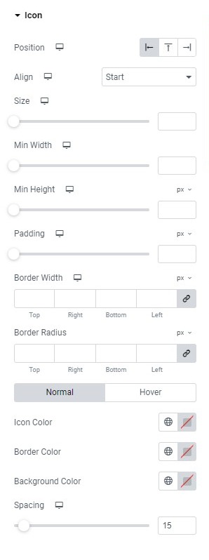
Fig. 3.3. Icon Styling.
Title tab (fig. 3.4) – here you can adjust:
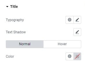
Fig. 3.4. Title Styling.
- typography;
- text shadow;
- colors for normal/hover states.
Description tab (fig. 3.5) offers the following set of options:
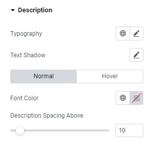
Fig. 3.5. Description Styling.
- typography;
- text shadow;
- colors for normal/hover states;
- space between description and the title.
Finally, Button tab (fig. 3.6) allows to configure:
- size of the button;
- icon (icon font or custom SVG);
- typography;
- min width;
- min height;
- padding around button text;
- border type, width and radius;
- colors of text, icon, background, border and box shadow (for normal and hover state);
- spacing between the button and description.
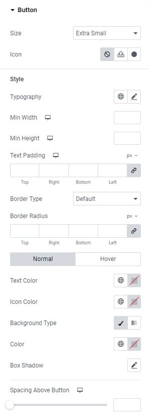
Fig. 3.6. Button Styling.
Advanced
The advanced section contains standard Elementor settings. More info is available here.