This widget allows to insert and link single icon (fig. 1):
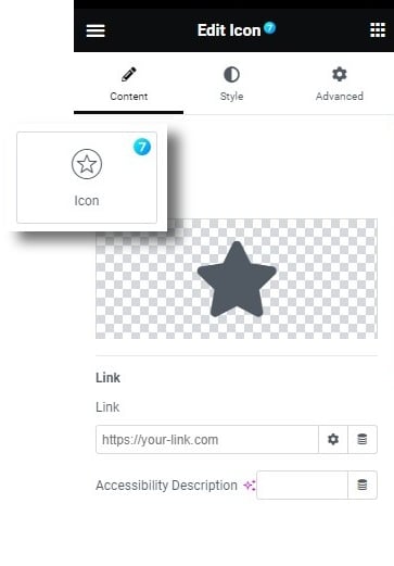
Fig. 1. The7 Icon Widget.
Content
Content: Selecting the icon from icon library, or upload your own SVG. User can also add custom icons to library in Elementor -> Custom Icons.
Set the Link or other custom action for the icon (for example, popup). Accessibility Description allows to set a description for accessibility purposes.
Style
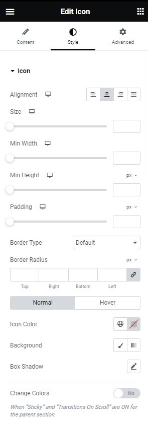
Fig. 2.1. Icon Styling.
The “Icon” tab (fig. 2.1.) allows to control:
- alignment of the icon in the column;
- size of the icon, may be adjusted for each device;
- minimum width of the box around the icon (background) adjustable for each device;
- minimum height of the box around the icon (background) adjustable for each device;
- padding around the icon, adjustable for each device;
- border type, width (if the border is enabled);
- border radius;
- colors for normal and hover state (icon, border, background, box shadow).
Change colors (yes/no) allows changing the colors above, when the icon is in sticky section (fig. 2.2):
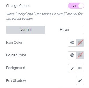
Fig. 2.2. “Sticky” Effect Styling.
Advanced
The advanced section contains standard Elementor settings. More info is available here.