The Categories List widget allows you to display post taxonomies across your site in a clean, customizable list layout. Beyond standard blog post categories, it supports custom taxonomies for various Custom Post Types (CPTs).
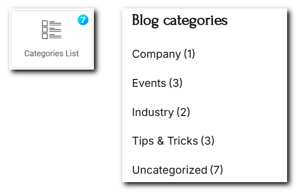
Fig. 1. Categories List Widget.
Content
“Layout” tab (fig. 2.1) includes settings for both widget title and the list itself:
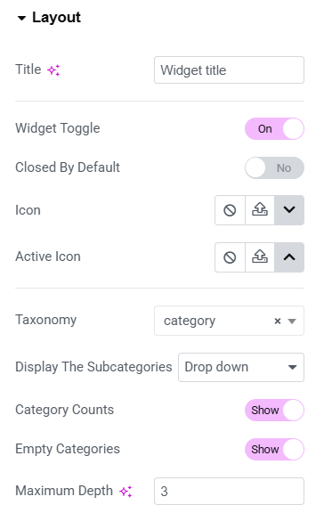
Fig. 2.1. Layout Settings.
The first part allows to set:
- heading of the widget (e.g. “Widget title”);
- enables or disables collapsible functionality for the category list;
- decide whether the will be collapsed when the page loads;
- custom icon that indicates a collapsed state;
- icon that indicates an expanded (active) state.
In the second part you can choose:
- taxonomy which will be displayed in the list;
- how to display the subcategories (standard, all categories at once, only children of category or drop down);
- sorting order of categories (Name, Slug, ID, Menu Order, etc.);
- to show or hide the number of products next to each category;
- to show or hide categories with no products;
- limit how many levels of nested subcategories are shown.
“Subcategory indicator icons” (fig. 2.2) can be selected in the appropriate tab for both collapsed and active states.
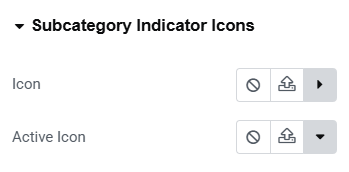
Fig. 2.2. Subcategory Indicators.
Style
Under the “Widget Title Area” tab (fig. 3.1), you can configure:
- title typography;
- toggle icon size;
- title padding and margin;
- border type, width and radius;
- colors for closed/hover/active states (for the title, icon, background and border).
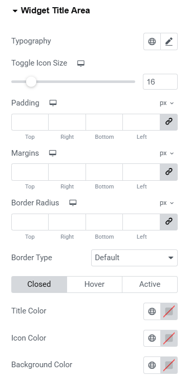
Fig. 3.1. Title Area Styling.
“Widget Content Area” tab allows to adjust appearance of the area behind the widget (fig. 3.2). In particular paddings, margins, borders and background color.
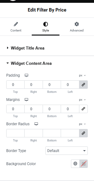
Fig. 3.2. Widget Content Area.
In the “Main Categories” section (fig. 3.3), user can configure the display of parent categories in a list format. Specify:
- rows gap – controls spacing between list items;
- dividers – enables/disables visual separators between items.
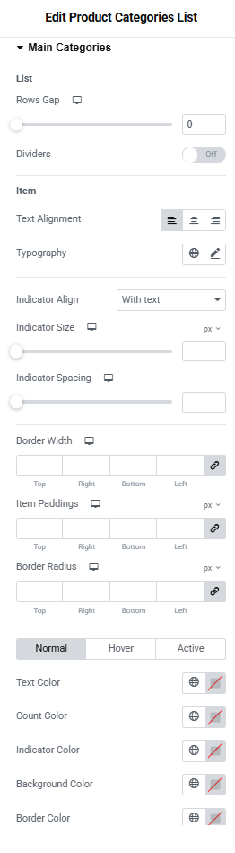
Fig. 3.3. Style Tab – Main Categories
The Item subsection allows user to customize individual category entries:
- text alignment;
- typography;
- indicator alignment with text;
- indicator size and Spacing;
- border width and radius;
- item paddings.
You can also select colors for normal, hover and active states of text, counter, indicator, background and borders.