The Brand Logos (fig.1.1) widget is a powerful element included with The7 theme, designed to help you beautifully display WooCommerce product Brands. It supports images, titles, descriptions, and dynamic product counts, (fig.1.2) making it an excellent choice for e-commerce shops and corporate portfolios.
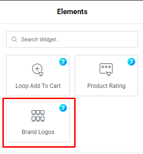
Fig. 1.1. The7 Brand Logos Widget.
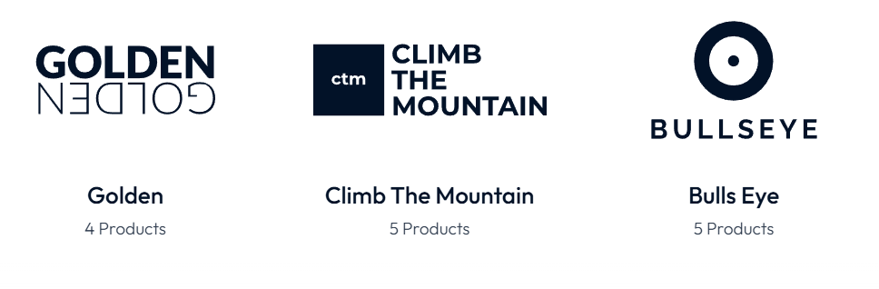
Fig. 1.2. The7 Brand Logos Widget Appearance.
Content Tab
This is the primary tab for controlling what data is displayed and how the fundamental structure of the widget behaves. It contains several expandable sections:
Query (fig. 2.1) section controls which brands are fetched from your database and how they are sorted.
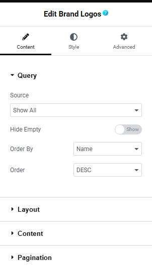
Fig. 2.1. Brand Logos Query
- source: Determines the specific criteria for which brands to display, suhc as Show All, Manual Selection etc.;
- hide empty: A toggle switch that allows you to either show or hide brands that currently have zero products associated with them;
- order by: Determines the parameter used to sort the displayed brands. You can sort by Name, Slug etc.;
- order: Sets the direction of your sorting choice. Options are DESC, ASC.
Layout section (fig. 2.2) provides controls for the grid or structural arrangement of the logos, such as the number of columns, spacing between items, and alignment.
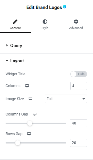
Fig. 2.2. Brand Logos Layout
- widget title: A toggle button to quickly Hide or Show a title above the brand grid;
- columns: Defines how many columns the grid should have. Currently set to 4 for desktop view. You can adjust this for different devices using the responsive icon next to it;
- image size: Determines the resolution of the logos loaded on the page to help with site performance and layout scaling. Available standard and WooCommerce-specific;
- columns gap: Adjusts the horizontal spacing (in pixels) between the brand columns;
- rows gap: Adjusts the vertical spacing (in pixels) between rows if the grid wraps to a second line.
The Content section (fig. 2.3) allows you to configure the specific elements displayed for each brand in the grid. Below is a breakdown of the available settings:
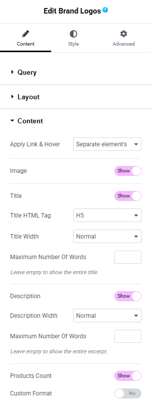
Fig. 2.3. Brand Logos content
- apply Link & Hover: Defines the clickable area and hover effect trigger for the brand item. Separate element’s or Whole box;
- image: A toggle (Show/Hide) to display or remove the brand’s logo image;
- title: A toggle (Show/Hide) to display or remove the brand’s name;
- title HTML tag: Sets the HTML heading tag used for the brand title (H1, H2, H3, H4, H5, H6) for SEO and structural purposes;
- title width: Controls how the title text behaves if it exceeds the container width;
- maximum number of words (Title): A numeric field to limit the title length by word count. Leave this empty to show the entire title;
- description: A toggle (Show/Hide) to display or remove the brand’s description or excerpt;
- description width: Controls how the description text behaves. Options are Normal or Crop to one line;
- maximum number of words (Description): A numeric field to limit the description length by word count. Leave this empty to show the entire excerpt;
- products count: A toggle (Show/Hide) to display or remove the number of products associated with the brand (e.g., “4 Products”);
- custom format: A toggle (Yes/No) that allows you to apply a custom text format to the product count when enabled.
Pagination section (fig. 2.4) allows you to configure how visitors navigate through your brand logos when you have a large number of items to display.
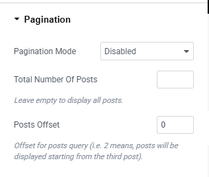
Fig. 2.4. Brand Logos pagination
- pagination mode: Choose the style of pagination you want to use, from the available options suhc as Standard, Load more etc.;
- total number of posts: Specifies the maximum overall number of brand logos to load. Note: Leave this field empty to display all available posts;
- posts offset: Allows you to skip a certain number of brand logos at the beginning of your query. For example, entering
2means the logos will begin displaying from the third post, skipping the first two.
Style Tab
This tab is used to customize the visual appearance of the widget.
Image section (fig. 3.1) allows you to customize the proportions and visual appearance of the brand logos within your grid. Below is a breakdown of the available settings:
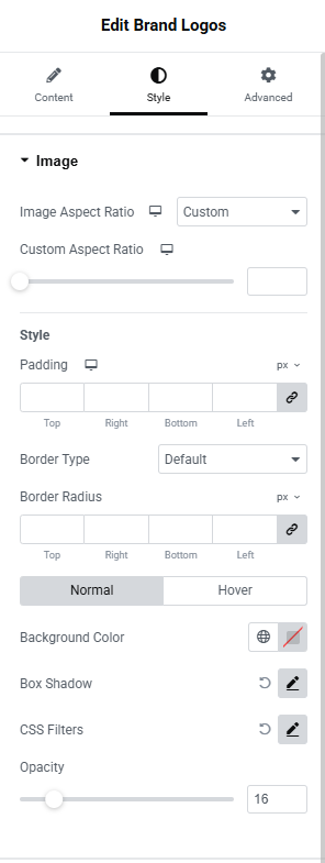
Fig. 3.1. Brand Logos Image Styles
- aspect ratio defines the proportional relationship between the width and height of the images. Options include Original and Custom;
- custom aspect ratio: (Appears when Custom is selected) A slider and numeric input field that allows you to manually adjust and fine-tune the aspect ratio of the logos;
- padding: Controls the inner spacing between the image and its outer bounding box. You can assign individual values for Top, Right, Bottom, and Left, or click the “Link values together” icon to apply a uniform padding across all sides;
- border type: Choose the style of the border surrounding the image. Available options are Default, None, Solid, Double, Dotted, Dashed, and Groove;
- border radius: Rounds the corners of the image or its container. You can specify values for Top, Right, Bottom, and Left, and link them for uniform corner rounding.
Normal & Hover States
You can define different styles for when the image is in its default state (Normal) versus when a user interacts with it (Hover). The following settings can be adjusted for both states:
- background color: Opens a color picker to set a solid or transparent background color behind the logo image;
- box shadow: Click the edit icon (pencil) to add and configure a shadow effect around the image box (controls typically include color, blur, spread, horizontal, and vertical offsets);
- CSS filters: Click the edit icon to apply visual adjustments directly to the image, such as blur, brightness, contrast, saturation, and hue;
- opacity: A slider to control the transparency level of the image.
The Title section (fig. 3.2) allows you to customize the typography and color of the brand names displayed in your grid. Below are the available settings:
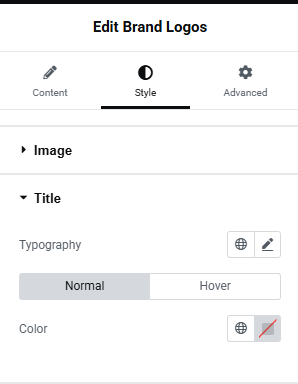
Fig. 3.2. Brand Logos Title Styles
- typography: Click the pencil icon to access the typography controls. Here, you can adjust the font family, size, weight, line height, letter spacing, and other text styling options for the brand title. You can also click the globe icon to apply a predefined global font style;
- cormal & hover states: You can define distinct styles for how the title looks by default (Normal) and how it looks when a user hovers over it (Hover);
- color: Use the color picker to select a custom text color for the title, or click the globe icon to apply a predefined global color from your site’s design system.
Content Area section (fig. 3.3) allows you to configure the alignment and spacing of the textual content (such as the brand title, description, and product count) displayed underneath each brand logo. Below is a breakdown of the available settings:
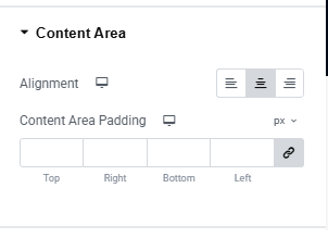
Fig. 3.3. Brand Logos content Styles
- alignment: Controls the horizontal justification of the text within the brand card. You can choose to align the content to the Left, Center, or Right by clicking the respective formatting icons. This setting includes responsive controls (the device icon), allowing you to set different text alignments for desktop, tablet, and mobile views;
- content area padding: Adjusts the inner spacing between the outer boundary of the text area and the text itself.
Products Count section (fig. 3.4) allows you to customize the visual appearance and spacing of the text that indicates how many products belong to a specific brand. Below is a breakdown of the available settings:
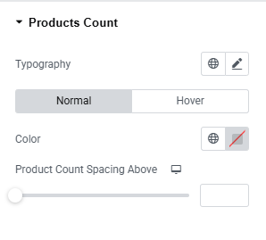
Fig. 3.4. Brand Logos Product count Styles
- typography: Click the pencil icon to customize the font family, size, weight, line height, letter spacing, and other text properties for the product count. Alternatively, click the globe icon to apply a predefined global typography style;
- normal & hover states: Toggle between the Normal and Hover tabs to assign different styles for the default state and the state when a user hovers their mouse over the brand item;
- color: Click the color swatch (pencil icon) to choose a specific text color for the product count. You can also click the globe icon to link this setting to your site’s global color system;
- product count spacing above: Use the slider or the numeric input field to adjust the vertical space (top margin) between the product count text and the element immediately above it (typically the brand title). Click the device icon next to the setting label to define separate spacing values for Desktop, Tablet, and Mobile views.
Description section (fig. 3.5) allows you to customize the typography, color, and spacing of the description text displayed beneath your brand logos. Below is a breakdown of the available settings:
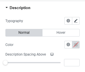
Fig. 3.5. Brand Logos Description Styles
- typography: Click the edit (pencil) icon to adjust the font family, size, weight, line height, letter spacing, and other text properties for the brand description. Alternatively, click the globe icon to apply a predefined global typography style;
- normal & hover states: Toggle between the Normal and Hover tabs to assign different styles for the text’s default appearance and its appearance when a user hovers their mouse over the brand item;
- color: Use the color picker to choose a specific text color for the description, or click the globe icon to link this setting to your site’s global color palette;
- description spacing above: Use the slider or the numeric input field to adjust the vertical space (top margin) between the description text and the element immediately above it. Click the device icon next to the setting to define separate responsive spacing values for Desktop, Tablet, and Mobile screens.
Advanced
Advanced section contains standard Elementor settings applied to the entire widget wrapper. It includes standard controls such as Margins and Padding, Z-index and CSS ID/Classes etc. More info is available here.