The product review widget (fig. 1) displays both customer reviews and the review submission form on individual product pages. It can be added directly to the single product template.
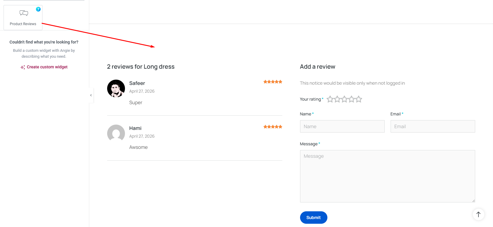
Fig. 1. Product Review Widget.
Content Tab
In the “Layout tab”, (fig 1.1) you can configure:
- columns – ie reviews in one column and review form in another;
- rows(Columns) Gap;
- enable/disable comments Section If Empty.
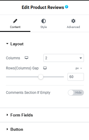
Fig. 1.1. Product Review Layout.
In the “Form field tab”, (fig 1.2) you can configure the form field label, input size, column width etc for:
- your rating;
- name;
- email;
- message.
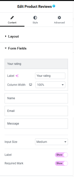
Fig. 1.3. Review Form Fields.
In the “Button tab”, (fig 1.3) you can configure:
- column width;
- alignment;
- text.
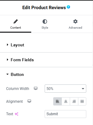
Fig. 1.3. Product Review Button.
Style Tab
In the style tab “Content” section (fig 2.1), you can configure the style of the title and notice:
- title alignment;
- title typography;
- font color;
- bottom Spacing;
- notice typography;
- font color.
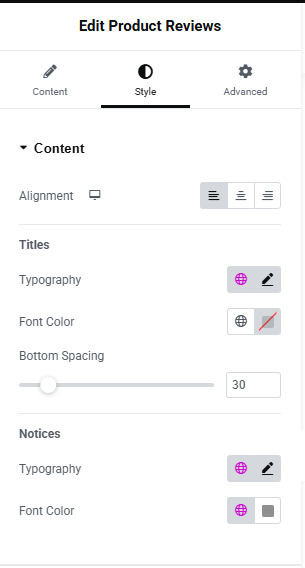
Fig. 2.1. content style.
In the “Form tab”, (fig 2.2) you can configure:
- columns gap;
- rows gap;
- typography;
- text color;
- asterisk ccolor;
- label bottom spacing.
Labels & Content
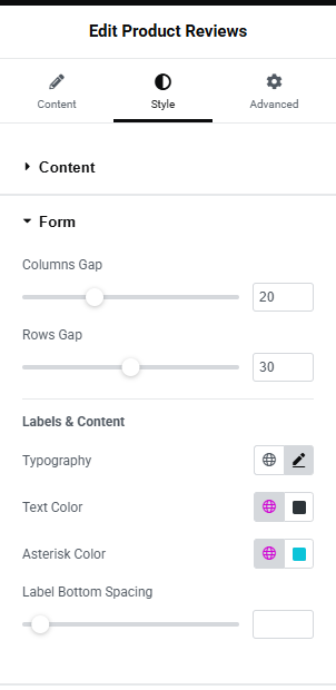
Fig. 2.2. Form style.
In the “Filed tab”, (fig 2.3) you can configure the style of form fields such as:
- typography;
- text color;
- background color;
- border color;
- border width;
- border radius.
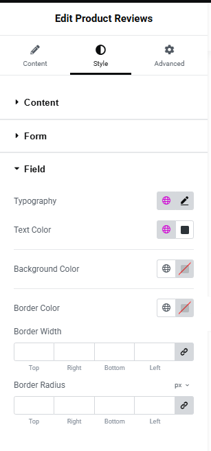
Fig. 2.3. Field style.
In the “Button tab”, (fig 2.4) you can configure the style of the button such as:
- size;
- seelcct icon;
- typography;
- min width;
- min height;
- text padding;
- border type;
- border radius;
- text color;
- icon color;
- background type;
- color;
- box shadow;
- spacing above button.
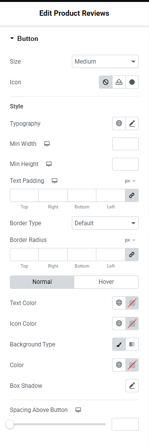
Fig. 2.4. Button style.
In the “Comment Content”, (fig 2.5) section you can configure:
- title typography;
- color;
- date typography;
- color;
- date spacing above;
- color;
- text typography;
- color;
- text spacing above.
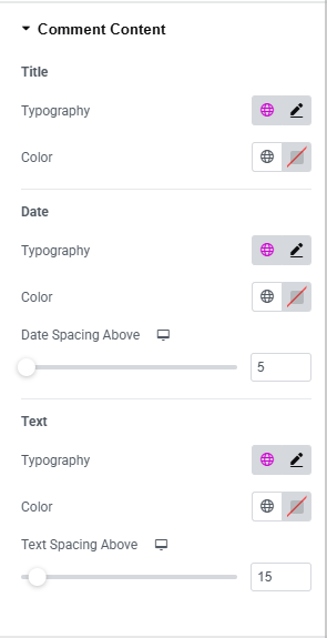
Fig. 2.5. Comment Content Style.
In the “Comment Box”, (fig 2.6) section you can configure:
- background color;
- border type;
- border width;
- border color;
- padding;
- distance between comments.
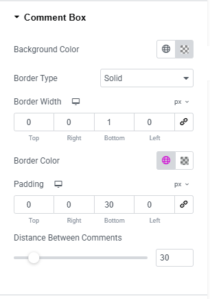
Fig. 2.6. Comment Box Style.
In the “Comment User’s Avatar”, (fig 2.7) section you can configure:
- ahow/hide avatar;
- size;
- border radius;
- avatar side spacing.
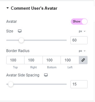
Fig. 2.7. Avatar Style.
In the “Rating ”, (fig 2.8) section you can configure:
- empty star color;
- filled star color;
- stars in form size;
- distance;
- stars in comment size;
- distance;
- size.
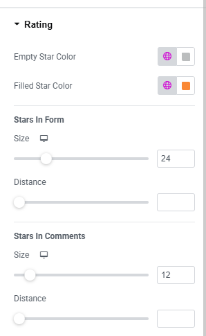
Fig. 2.8. Star Style.
Advanced
The advanced section contains standard Elementor settings. More info is available here.