Filter By Price widget (fig.1) allows to insert live price filter for your woocommerce shop page.
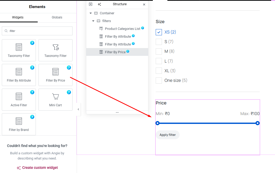
Fig. 1 Filter By Price Widget.
Content Tab
You can enable/disable the title under the “Title Area” tab (fig. 1.1), make the widget a toggle and set toggle icons:
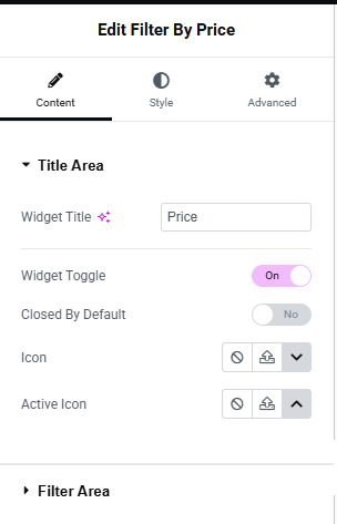
Fig. 1.1. Title Area.
In the “Filter Area” tab (fig. 1.2), you can choose the Price range display potion : Above slider tips or Next to button.
Set Min Price Label, Max Price Label and Button Text.
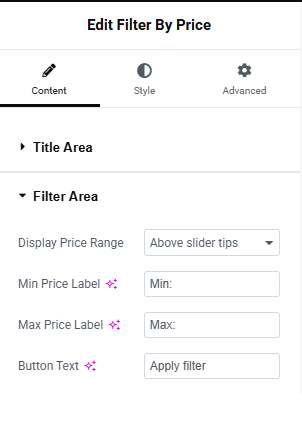
Fig. 1.2. Filter Area.
Style
Under the “Widget Title Area” tab (fig. 2), you can configure:
- title typography;
- toggle icon size;
- title padding and margin;
- border type, width and radius;
- colors for closed/hover/active states (for the title, icon, background and border).
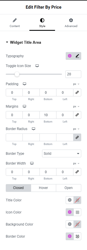
Fig. 2. Widget Title Area.
“Widget Content Area” tab allows to adjust appearance of the area behind the widget (fig. 2.1). In particular paddings, margins, borders and background color.
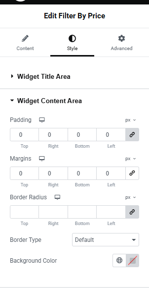
Fig. 2.1. Widget Content Area.
“Slider Line Area” tab (fig. 2.2) allows to adjust the appearance of the Slider Line such as Slider Thickness, Border radius, Active and inactive range color, spacing above and below the Slider line.
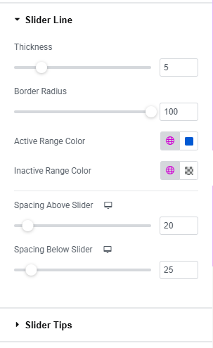
Fig. 2.2. Slider Line Area.
“Slider Tips Area” tab (fig. 2.3) allows to adjust the appearance of two Slider tips such as:
- height;
- width;
- border width;
- border radius;
- background Color;
- border Color;
- box Shadow;
- bcale on hover.
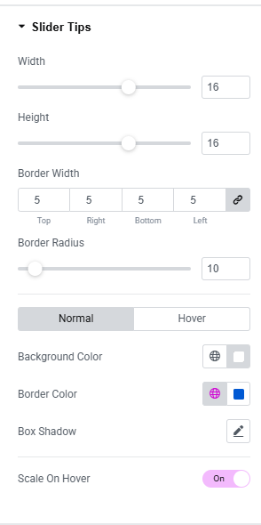
Fig. 2.3. Slider Tips Area.
“Price Area” tab (fig. 2.4) allows to adjust the appearance of Price display such as:
- label Typography;
- label Color;
- price Typography;
- price Color.
- size (extra small/small/medium/large/extra large);
- icon (select from the library, upload your own, or disable it);
- icon size (adjustable per device);
- space between the button’s icon and text;
- typography of the button;
- min width min height;
- padding around the button’s text;
- border type and radius;
- text, icon, background, box shadow colors for normal and hover states.
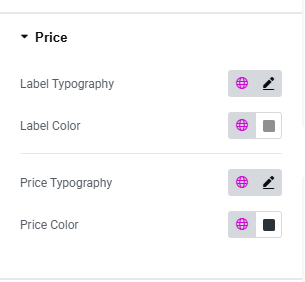
Fig. 2.4. Price Area.
In the “Button” section (fig. 3.10), user can style the appearance of the button:
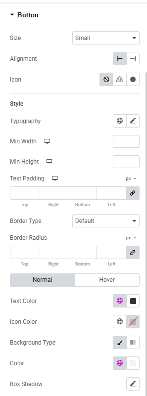
Fig. 2.5. Button Styling.
Advanced
Advanced section contains standard Elementor settings. More info is available here.