The7 Mini cart widget allows to display the cart summary and very useful for displaying the cart summary in the sidebar, footer, or in a popup
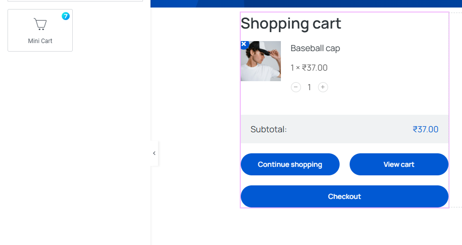
Fig. 1.1. The7 mini cart Widget.
Like any other Elementor widget, there are three main tabs at the top: “Content,” “Style,” and “Advanced,” with expandable sections under each.
Content Tab
Under the “General” section (fig. 2.1), there are settings for “Min Height” and “Max Height,” both with sliders and input fields. You can “Leave this field empty to fit the screen height.”
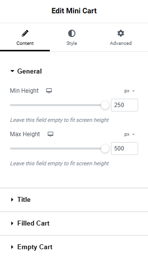
Fig. 2.1. General.
Under the Title section (fig. 2.2), you can add a title for the widget and set the visibility to Always or when cart has any item in it or not.
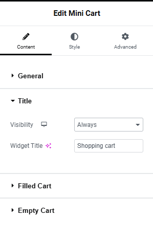
Fig. 2.2. Title.
Under the Filled Cart section (fig. 2.3) you can configure various option for the cart display.
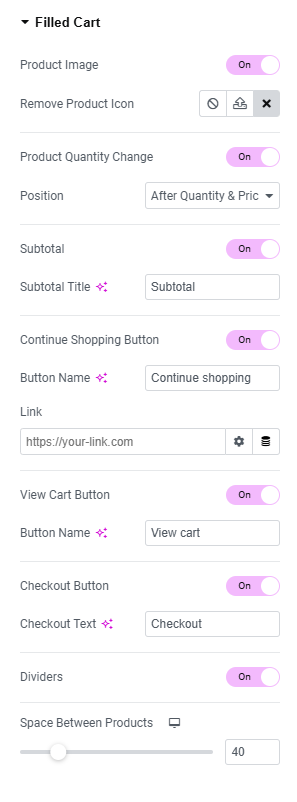
Fig. 2.3. Filled-cart.
- product Image: Enable/disable Product Image;
- remove Product Icon: select an icon for the product delete button;
- product Quantity Change: Enable/disable the option to change product Quantity and set position;
- subtotal: Enable/disable the Subtotal display;
- subtotal Title: set the Subtotal Text;
- continue Shopping Button: Enable/disable Continue Shopping Button;
- button Name: Set Text for Continue Shopping Button;
- link: set link for Continue Shopping Button, ie link to the shop page;
- view Cart Button: Enable/disable the View Cart Button;
- button Name: Set Text for the View Cart Button;
- checkout Button: Enable/disable Checkout Button;
- checkout Text: Set Text for the “Checkout” button;
- dividers: Enable/disable Dividers between the products;
- space Between Products: Adjust the space between the products;
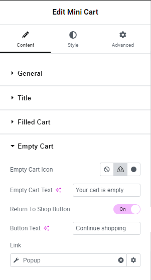
Under the Empty Cart section (fig. 2.4), you can configure various options when the cart is empty.
Fig. 2.3. Empty-cart.
- select an Icon/Image to display when the cart is empty;
- enter the text to display when the cart is empty”;
- enable/disable the return to shop button;
- enter the text for the return to shop button;
- enter the link for the return to shop button;
Style
Under the “Title Area” section (fig. 3), you can configure various style settings for the Title:
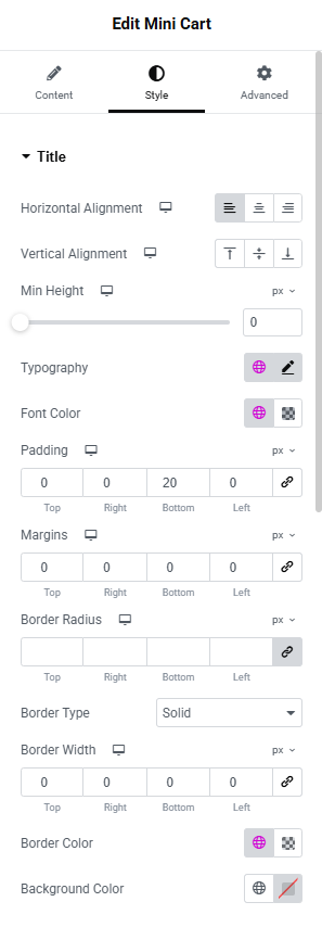
Fig. 3 Title.
- lets you align the title text to the left, center, or right;
- align the title;
- set the minimum container ;
- set font family, weight, size, and other text attributes;
- sett the title text color;
- padding;
- margin;
- border Radius;
- border Type;
- border Width;
- border Color;
- background Color;
Under the “Product Box” section (fig. 3.1), you can configure Padding, Border, Border radius, Background Color & Border Color for Normal state and Hover state.
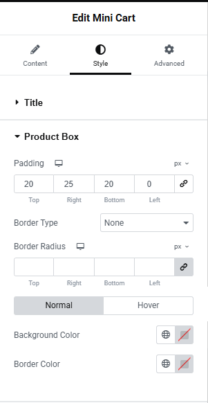
Fig.3.1. Product Box.
Under the “Image” section (fig. 3.2), you can configure
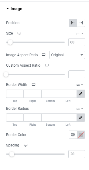
fig. 3.2 Image.
- set the alignment of the image;
- set the size of the image;
- set the Image Aspect Ratio;
- set Border Width;
- set Border Radius;
- border Color;
- spacing;
Under the “Product Content” section (fig. 3.3), you can configure
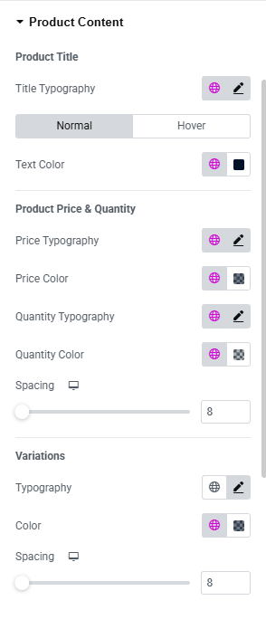
Fig. 3.3 Product Content.
Product Title
Typography: Configure the font size, weight, family, etc
Text Color: Set separate text color for Normal and Hover states.
Product Price & Quantity
Set the font style and color for the Price.
Adjust Spacing
Product Variations
Set the font style and color for the Variations.
Adjust Spacing
Under the “Product Quantity Change” section (fig. 3.4), you can configure various styles of the +/- Product Quantity Change button such as Spacing, Box & Number font styles, Min Width & Height, Padding, Border Type, Border Radius, Number Color, Background, Border Color, Box Shadow, +/- Icon size, color, background etc. All have customizable color pickers and effects for visual styling.
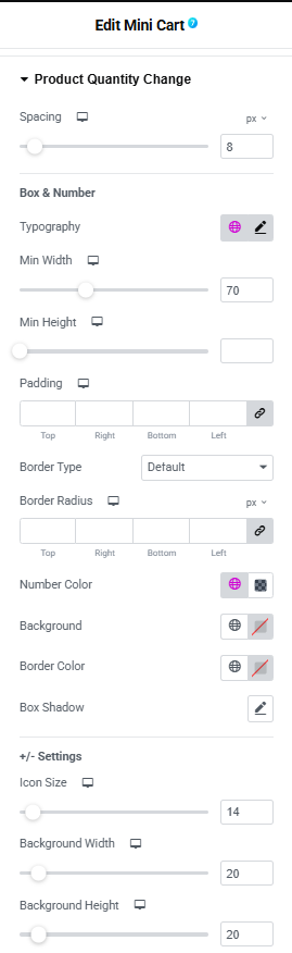
Fig. 3.4 Product Quantity Change.
Under the “Remove Product Icon” section (fig. 3.5), you can configure the visual behavior and placement of the icon that removes items from the mini cart widget for user experience optimization. You can adjust the Horizontal and Vertical Position of the icon, Icon size, padding, Border radius, Border width, Icon Color, Background Color, Border Color for Hover and Normal state.
Fig. 3.5 Remove product icon.
Under the “Divider” section (fig. 3.6), you can configure the divider style between products items in the Mini cart.
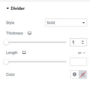
Fig. 3.5 Divider.
Under the “Subtotal” section (fig. 3.7), you can configure the style of “Subtotal.” text and amount separately.
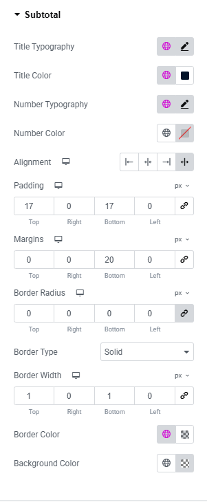
Fig. 3.6 Subtototal.
- configure font styling (weight, size, line height, etc.) for the word “Subtotal”;
- title Color;
- set separate settings for styling the subtotal amount;
- number Color;
- horizontal text alignment;
- padding;
- margin;
- border Type;
- border Color;
- border Radius;
- background Color;
Under the “Button” section (fig. 3.7), you can configure the layout and style of Button area.
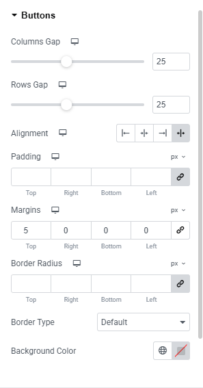
Fig. 3.7 Buttons.
- defines horizontal spacing between columns;
- controls vertical spacing between rows;
- layout adjustment within the container;
- padding;
- margin;
- border Radius;
- border Type;
- background Color;
Under the “Continue Shopping Button” section (fig. 3.8) you can specifically style the Continue Shopping Button such as Column width, alignment, Button Size, Font settings, Min Width / Min Height, Text padding, Option to choose Icon, set Icon Size and Position, Border style, text, Icon, Background color option for normal and Hover state etc.
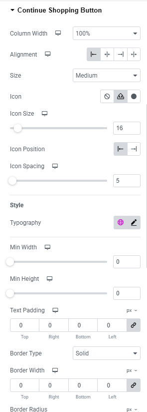
Fig. 3.8 Continue Shopping Button.
Similar option are available for “View Cart Button” and “Checkout Button”.
Under the “Empty Cart Box” section (fig. 3.9), you can configure the margin for Empty Cart container, Empty cart Icon color and size and Empty Cart Icon section, Empty Cart Text font style and can configure under Empty Cart Text section and Empty Cart Button style can configure under Empty Cart Button section.
Fig. 3.9 Empty cart.
Under the “Custom Scrollbar” section (fig. 3.10), you can customize the scrollbar that appear when there is more items in the Mini cart widget and choose Thumb color.
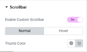
Fig. 3.10 Scrollbar.
Advanced
The Advanced section contains standard Elementor settings. More info is available here.