This widget allows displaying a scrolling ticker of text, which can be used for announcements, news updates, or promotional messages (fig. 1).
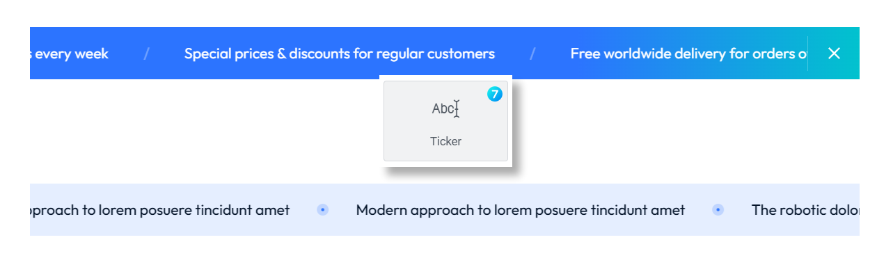
Fig. 1. Ticker Widget.
Content
This tab is for adding content of the Ticker widget. And it’s divided into three main sections (fig. 2):
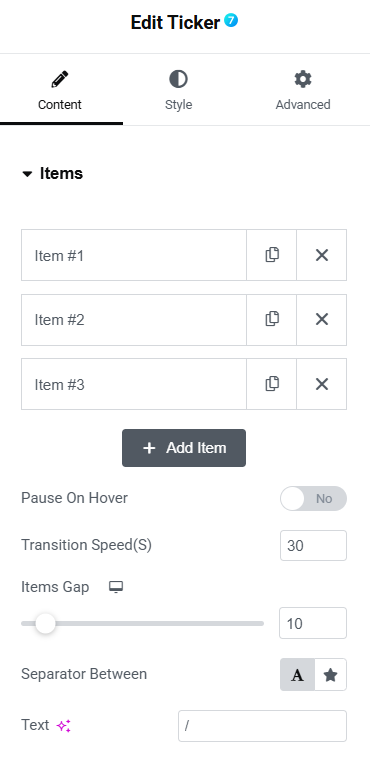
Fig. 2. Content Tab.
Items section – you can manage the items in your ticker here. Three items are listed by default (Item #1, Item #2, and Item #3), each with options to copy or delete them.
Pause On Hover toggle allows to enable or disable the ticker’s pause-on-hover function (set to “No” by default).
Transition Speed controls how fast the ticker items transition.
Items Gap slider to adjust the distance between ticker items.
Separator Between field to define the character or icon separating ticker items, by default set to “/”.
Style
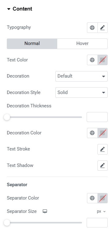
Fig. 3. Ticker Styling.
The Style widget settings tab (fig. 3) allows to customize various aspects of widget appearance. You can adjust text Typography. For normal and hover states you can configure:
- text color;
- decoration (underline, overline, line through);
- decoration style (solid, dotted, dashed, wavy);
- decoration thickness and color;
- text stroke;
- text shadow.
Talking about the Separator, it is possible to customize its color and size.
Advanced
The advanced section contains standard Elementor settings. More info is available here.