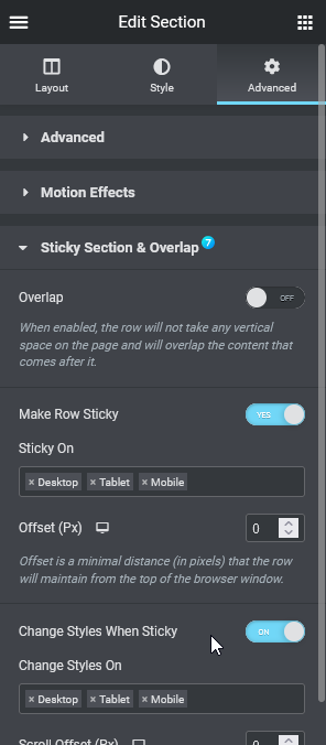
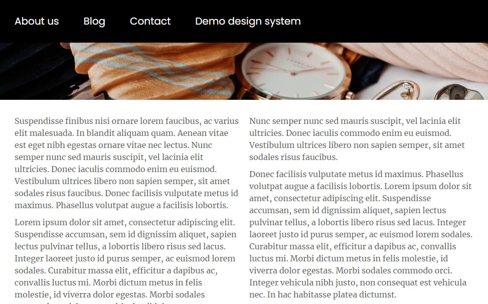
The7 Sticky Section & Overlap (fig. 1.1) option basically allows making a section sticky when scrolling. This feature is extremely helpful when creating header templates. Comparing to the native Elementor “Motion Effects” panel, The7 Sticky Section & Overlap tool provides a bigger number of flexible features. Therefore, keep in mind that these two “Sticky” sets should not be used together.
You can find all The7 Sticky Section features listed below.
Overlap. When enabled, the row does not take any vertical space on the page and overlaps the content that comes after it. This is particularly useful for creating transparent headers.
Sticky on. Enables the sticky effect on specific devices. Choose among Desktop, Tablet and Mobile.
Offset. A minimal distance (in pixels) that the row maintains from the top of the browser window. This setting is responsive.
Change Styles When Sticky. You can change the style of the section when scrolling:
- height;
- background color;
- border color;
- box-shadow.
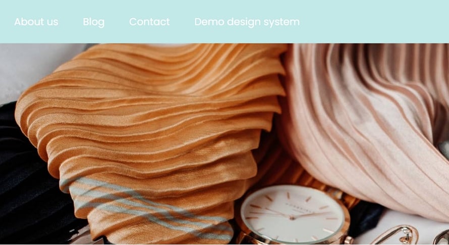
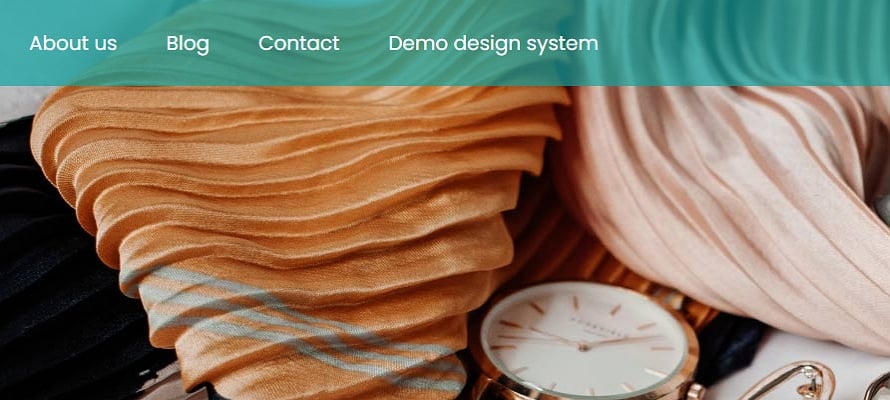
This is very useful when creating a floating header using Elementor: you may want to change its background color, height, etc. on scroll (fig. 2).
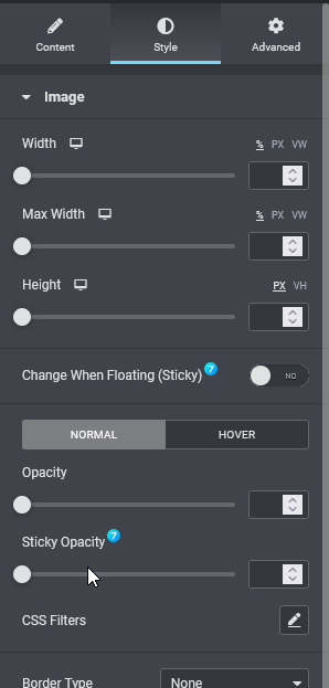
Additionally, The7 sticky section can affect some inner widgets with sticky options. For example, “The7 Horizontal Menu” (fig. 3.1) can change colors on scroll and the “Image” widget (fig. 3.2) can change its opacity, width, height, etc.
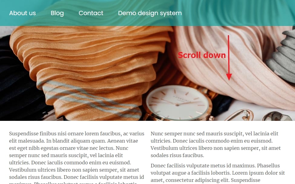
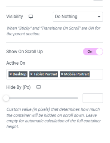
Show On Scroll Up. This feature (fig. 3.3) enables the sticky section to show up when scrolling the page up. This is a very useful feature for sticky headers. The header will disappear when scrolling down the page like normal sections and appear back and become sticky when scrolling upwards.
