The widget (fig. 1.) allows a user to create a search form inside of any kind of templates (header, footer, sidebar, search bar popup, etc.).
Content
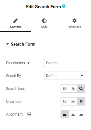
In the “Content” tab (fig. 2), the user can configure the following settings for the search form:
- placeholder (user can set a phrase that will be displayed as a placeholder in the search form);
- search by (restrict the search form to only search through a specified post type. By default, it searches through all content types);
- search icon (choose an icon that will appear in the search form to submit the search);
- clear icon (appears when the form is filled);
- alignment.
Style
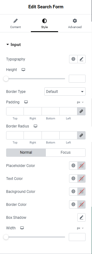
In the “Style” tab, the user can customize the appearance of the search form. “Input” section (fig. 3.1) controls the styling of the search form input field:
- typography of the text inside the form;
- height of the form, adjustable per device;
- border type, width and radius;
- internal padding of the form, adjustable per device;
- normal/focus colors for the placeholder, text, background, as well as box shadow;
- width for the idle and focus states.
Under the “Clear Icon” section (fig. 3.2), the user can style the appearance of the “clear” icon:
- icon size, adjustable per device;
- spacing around the icon, adjustable per device;
- border type, width and radius;
- width and height of the space around the icon, adjustable per device;
- normal/hover/focus colors for the placeholder, text, background, as well as box shadow.
In the “Search Icon” section (fig. 3.3), the user can adjust the appearance of the “search” icon:
- position (determines if the icon appears inside or outside the input field);
- alignment (left or right side of the form where the icon should appear);
- spacing around the icon, adjustable per device;
- icon size, adjustable per device;
- border type, width and radius;
- width and height of the space around the icon, adjustable per device;
- normal/hover/focus colors for the icon, background, border, as well as box shadow.
Advanced
The advanced section contains standard Elementor settings. More info is available here.


