The “Product Images Vertical Slider” widget (fig. 1) for WooCommerce enables seamless display of multiple product images in a vertically aligned slider, enhancing product page aesthetics and user interaction.
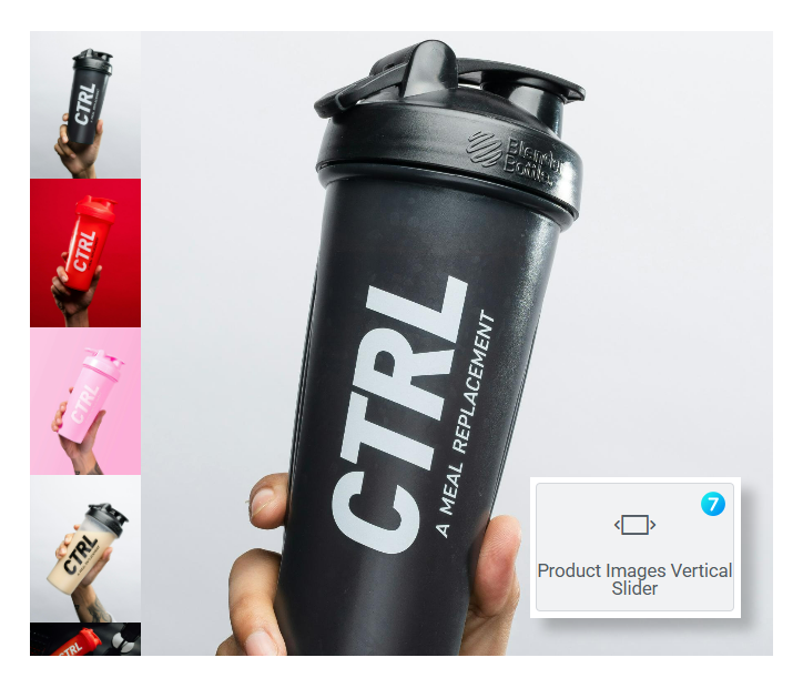
Fig. 1. Product Images Vertical Slider.
Content
Image tab (fig. 2.1) contains settings for slider pictures.
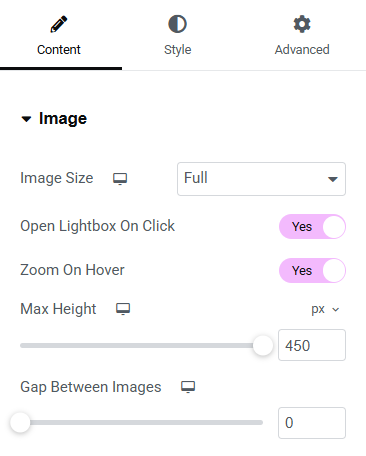
Fig. 2.1. Image Settings.
Here you can control:
- image size (allows user to pick the size of the source image: full, large, medium, small. It allows user to pick a smaller source image, if in general the element is smaller, so it will have a good impact on performance);
- opening lightbox on click;
- zoom-in image on hoverж
- max image height;
- gap between slider images.
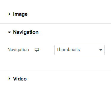
Fig. 2.2. Vertical Slider Navigation.
Available Navigation options (fig. 2.2) are:
- thumbnails;
- bullets;
- or disabled.
In the widget Video settings (fig. 2.3), you can:
- decide whether the video should be displayed at all;
- enable autoplay. Please note, most of browsers will autoplay muted videos only;
- mute video sound;
- enable loop re-play;
- hide or show video controls.
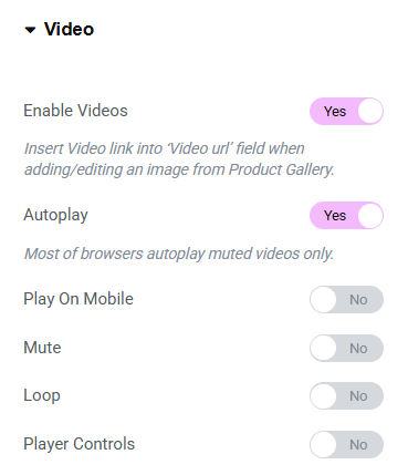
Fig. 2.3. Video Settings.
Style
Big image tab (fig. 3.1) allows to configure the appearance of the main picture:
- aspect ratio;
- object fit;
- padding;
- border type and radius;
- background color.
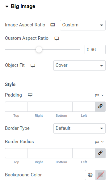
Fig. 3.1. Big Image Styling.
Control the appearance of Bullets (fig. 3.2) in the appropriate tab:
- size of bullets and borders;
- gap between bullet items;
- normal/hover/active colors;
- position and margins.
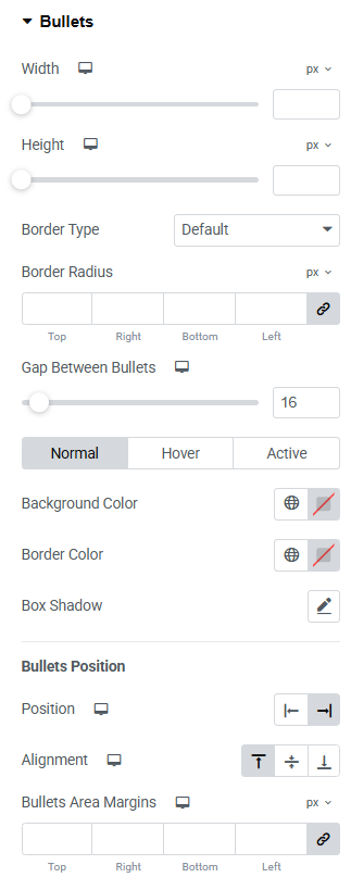
Fig. 3.2. Bullets Styling.
Thumbnails tab (fig. 3.3.1) gives an ability to:
- hide thumbnails if there is only one image uploaded for the product;
- push them outside the slider;
- configure position, paddings and margins;
- specify max length of thumbnails area;
- apply distance between thumbnails.
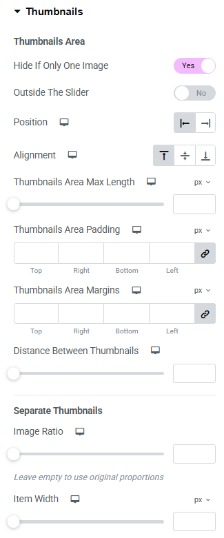
Fig. 3.3.1. Thumbnails Styling.
You also can configure appearance of a single thumbnail (fig. 3.3.2):
- image ratio and width;
- padding;
- border type, width and radius;
- normal/hover/active colors of background, border and opacity.
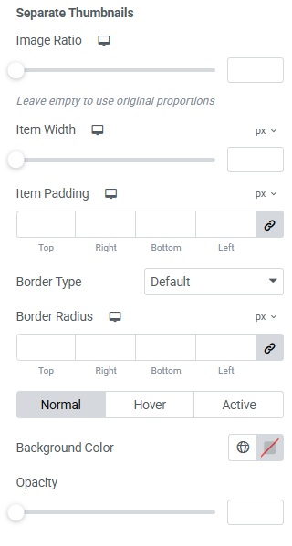
Fig. 3.3.2. Separate Thumbnails Styling.
Thumbnails Arrows tab (fig. 3.4) has the following setting:
- icons and their size;
- background width and height;
- border radius and width;
- normal/hover colors of icon, border and background;
- position and offset.
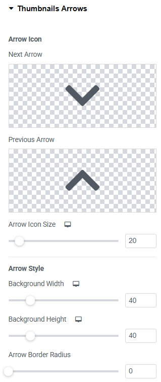
Fig. 3.4. Thumbnails Arrows Styling.
If video functionality is enabled in the Content tab, you can style “play” Image Video Icon (fig. 3.5):
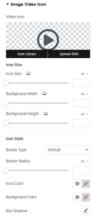
Fig. 3.5. Image Video Icon.
It allows to configure:
- select the appropriate icon and its size;
- background width and height;
- border type, width and radius;
- colors of icon, border, background;
- box shadow.
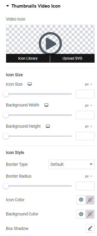
Fig. 3.6. Thumbnails Video Icon.
Thumbnails Video Icon (fig. 3.6) has the same settings as Image Video Icon.
Advanced
Advanced section contains standard Elementor settings. More info is available here.