This widget allows to display WooCommerce product featured image and its gallery as a slider (fig. 1.1 – 1.2). It’s useful for designing single product page, or products’ template in Theme Builder.
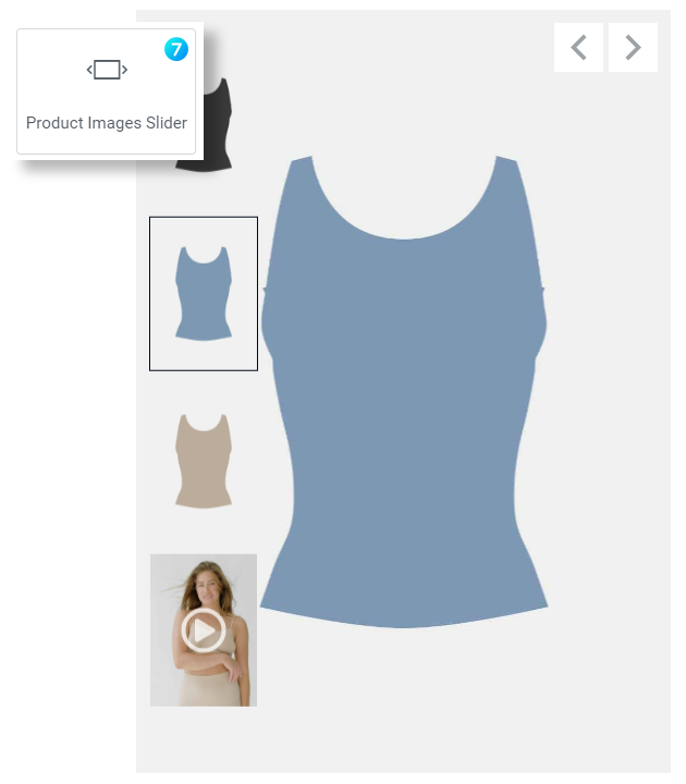
Fig. 1.1. Product Images Slider Widget.
Content
Image tab (fig. 1.2) contains settings for images of the gallery.
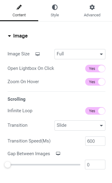
Fig. 1.2. Image Settings.
Here you can control:
- image size (allows user to pick the size of the source image: full, large, medium, small. It allows user to pick a smaller source image, if in general the element is smaller, so it will have a good impact on performance);
- opening lightbox on click;
- zoom-in image on hover.
In the Scrolling section, you can enable Infinite Loop, choose transition animation and speed. The last setting allows to specify gap size between images.
You can also decided whether you want to show/hide or display on hover slider Arrows (fig. 1.3). These options are responsive.
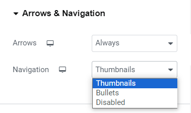
Fig. 1.3. Arrows and Navigation.
Available Navigation options are:
- thumbnails;
- bullets;
- or disabled.
This widget also has a unique feature – products Video. You can assign a video to any image from product gallery by adding video URL into the appropriate field in attachment details (fig. 1.4) in the Media Library. Both YouTube and self-hosted videos are supported.
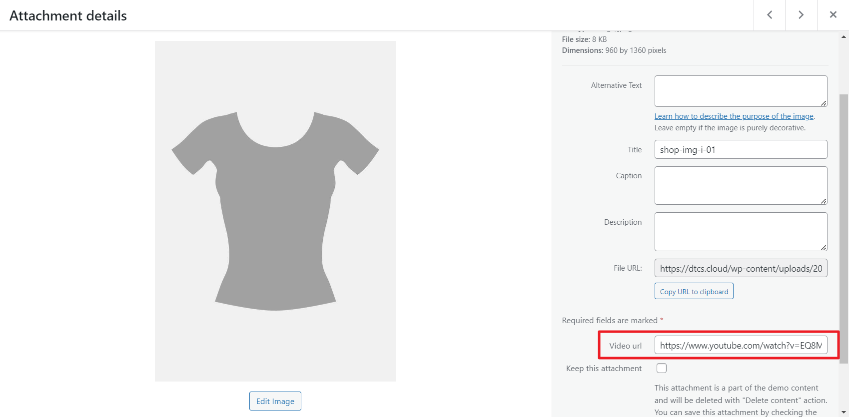
Fig. 1.4. Adding Video Link.
In the widget Video settings (fig. 1.5), you can:
- decide whether the video should be displayed at all;
- enable autoplay. Please note, most of browsers will autoplay muted videos only;
- mute video sound;
- enable loop re-play;
- hide or show video controls.
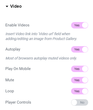
Fig. 1.5. Video Settings.
Style
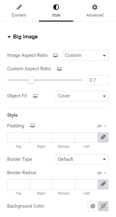
Fig. 2.1. Big Image Styling.
Big image tab (fig. 2.1) allows to configure the appearance of the main image:
- aspect ratio;
- object fit;
- padding;
- border type and radius;
- background color.
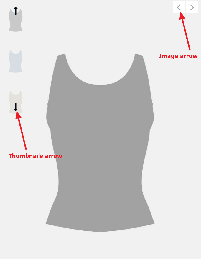
Fig. 2.2.1. Image and Thumbnails Arrows.
In the Image Arrows tab (fig. 2.2.2), you can adjust the appearance of [big] image arrows (fig. 2.2.1):
- icons and their size;
- background width and height;
- border radius and width;
- normal/hover colors of icon, border and background;
- position and offset.
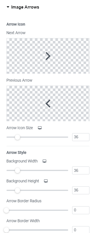
Fig. 2.2. Image Arrows Styling.
Control the appearance of Bullets (fig. 2.3) in the appropriate tab:
- style;
- size of bullets and borders;
- gap between bullet items;
- normal/hover/active colors;
- position, etc.
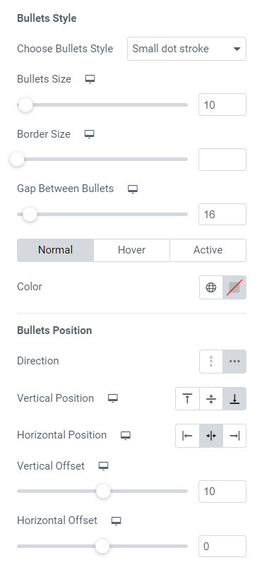
Fig. 2.3. BulletsStyling.
Thumbnails tab (fig. 2.4) gives an ability to:
- hide thumbnails if there is only one image uploaded for the product;
- select vertical or horizontal direction;
- configure position;
- specify max length of thumbnails area;
- apply distance between thumbnails.
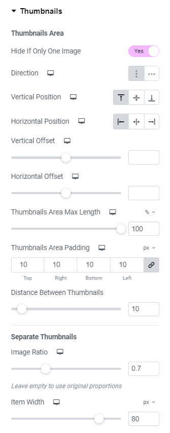
Fig. 2.4. Thumbnails Styling.
You also can configure appearance of a single thumbnail:
- image ratio and width;
- padding;
- border type, width and radius;
- normal/hover/active colors of background, border and opacity.
Thumbnails Arrows tab (fig. 2.5) has almost the same setting as Image Arrows tab:
- icons and their size;
- background width and height;
- border radius and width;
- normal/hover colors of icon, border and background;
- position and offset.
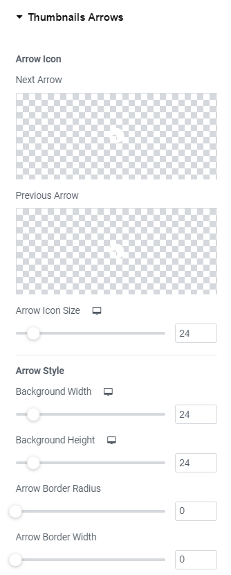
Fig. 2.5. Thumbnails Arrows.
Please consider that, if Vertical thumbnails direction is chosen, arrows are 90deg rotated (fig. 2.6):
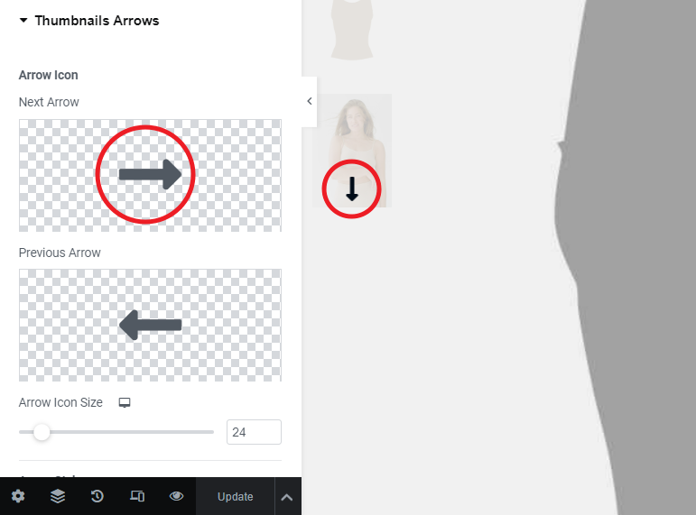
Fig. 2.6. Rotated Arrow.
If video functionality is enabled in the Content tab, you can style “play” Image Video Icon (fig. 2.7.1):
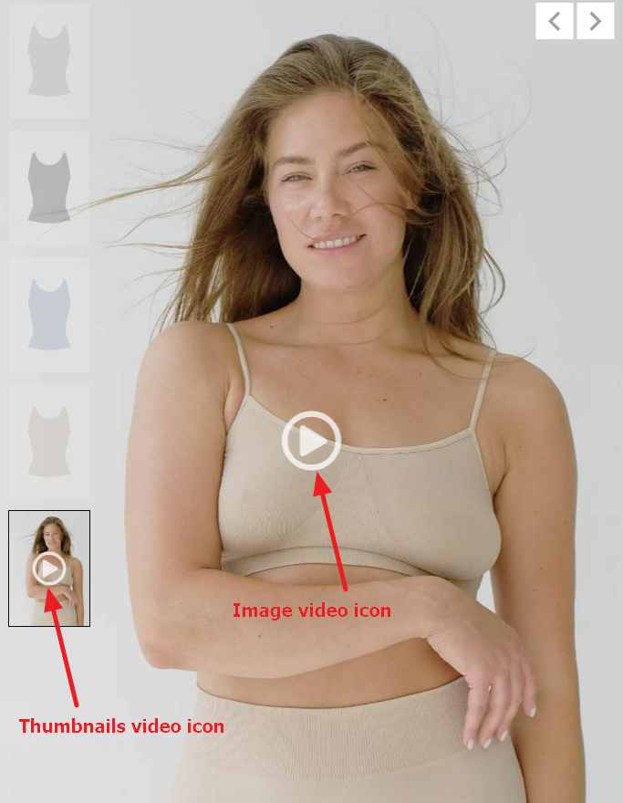
Fig. 2.7.1. Video Icons.
It allows to configure (fig. 2.7.2):
- select the appropriate icon and its size;
- background width and height;
- border type, width and radius;
- colors of icon, border, background;
- box shadow.
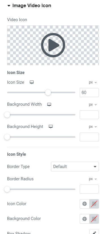
Fig. 2.7.2. Video Icon Styling.
Thumbnails Video Icon (fig. 2.7.1) has the same settings (fig. 2.8) as Image Video Icon.
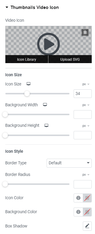
Fig. 2.8. Thumbnails Video Icon.
Advanced
Advanced section contains standard Elementor settings. More info is available here.