The Product Images List widget (fig. 1) for WooCommerce allows you to display multiple product images in an organized and visually appealing way, making it easier for customers to view detailed shots or alternate angles.
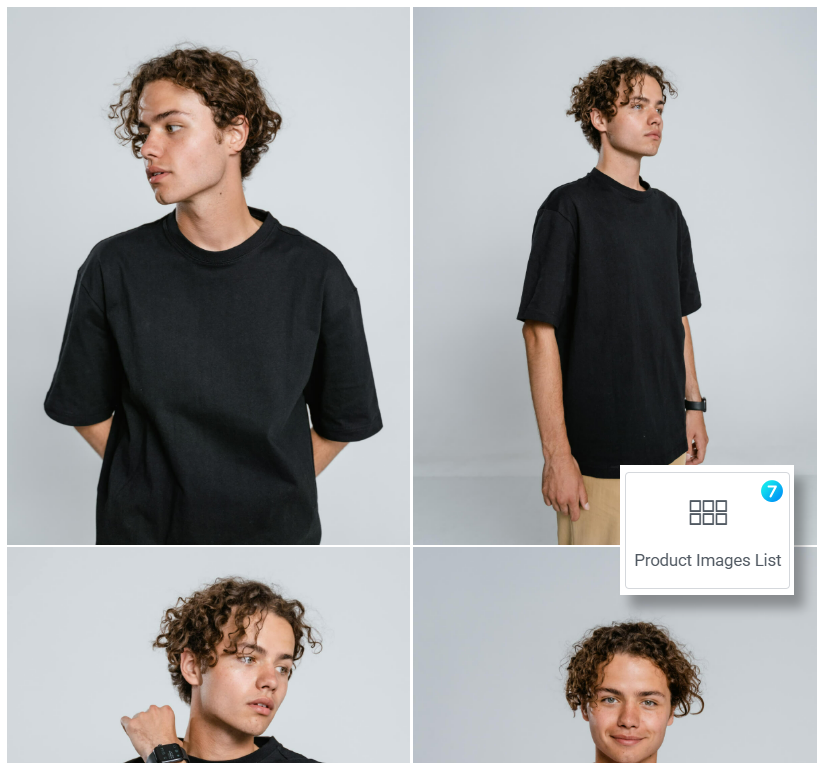
Fig. 1. Product Images List.
Content
“Image” tab (fig. 2.1) offers comprehensive controls for displaying product images. Here you can adjust:
- image size. Allows selection of the source image size (e.g., Full, Large, Medium, Small). Opting for a smaller size can improve performance if the displayed image is smaller in dimension;
- option to allow users to view images in lightbox – a larger, more detailed format when clicked;
- layout style (list or scroller);
- spacing between images.
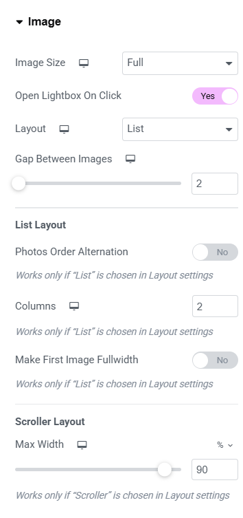
Fig. 2.1. Image Settings.
For the List you can decide whether you want to have constant number of columns or variable one (fig. 2.2). Available layouts are:
- 1/1/1/1
- 1/2/1/2
- 2/1/2/1
- 1/3/1/3
- 2/3/2/3
- 2/4/2/4
- 1/2/3/1/2/3
- 1/3/2/1/3/2
- 2/1/3/2/1/3
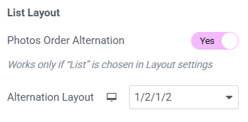
Fig. 2.2. List Layout.
For the Scroller you can only configure scroller width.
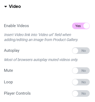
Fig. 2.3. Video Settings.
“Video” tab (fig. 2.3) contains settings to incorporate and manage video playback in the product gallery. Here you can control:
- support of videos in your gallery. Insert the video link into the “Video URL” field when adding or editing an image;
- autoplay;
- mute;
- automatic replay once the video reaches the end;
- player controls, such as play/pause buttons, volume adjustment, etc.
Style
“Image Tab” (fig. 3.1) includes settings to customize the visual appearance of product images in the loop. Here you can control:
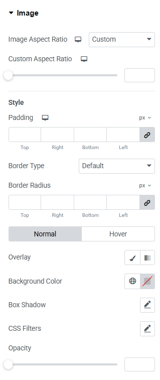
Fig. 3.1. Image Styling.
- aspect ratio. Adjust the proportion of the image to fit your design requirements, ensuring consistent display across various screen sizes;
- space around the image;
- border of the image and its corners;
For both normal and hover states you can configure:
- overlay and background colors;
- box shadow;
- CSS filters;
- opacity.
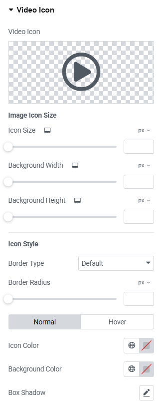
Fig. 3.2. Video Icon Styling.
“Video Icon” tab (fig. 3.2) offers settings to customize the appearance and behavior of the video icon displayed on product images. Here you can control:
- icon size;
- background dimensions;
- border type, width and radius;
- icon, background and box shadow colors for both normal and hover states.
Advanced
The advanced section contains standard Elementor settings. More info is available here.