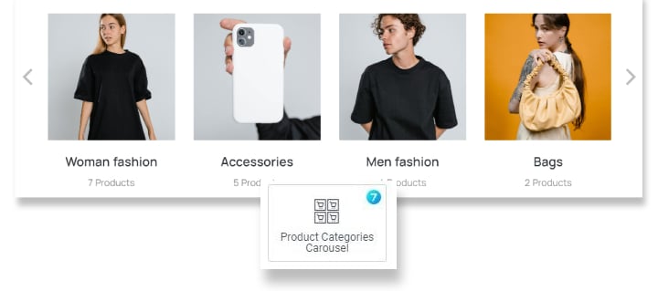
The widget (fig. 1) allows to display a carousel of Product Categories with thumbnails and product count:
Content
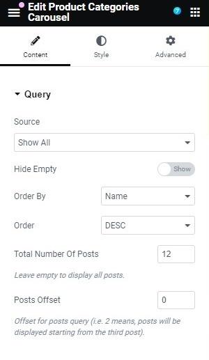
User can configure the Query (fig. 2.1) :
- source – which categories should be shown:
- show all;
- manual selection (pick the categories you want to show);
- by parent (show only parent categories);
- current Subcategories (show subcategories of the currently displayed category – useful for creating a product category archive template).
- hide empty;
- order by;
- order of the categories;
- total number of posts, which should be displayed;
- posts offset (how many posts should be omitted, start displaying from Nth post).
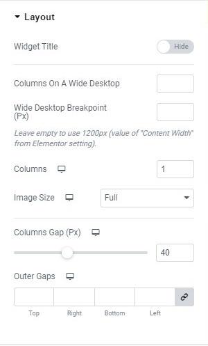
In the “Layout” tab (fig. 2.2), user can configure the layout of the carousel:
- widget title (show/hide);
- columns on a wide desktop;
- wide desktop breakpoint (resolution above which the screen is considered wide);
- number of columns;
- image size (select the source image size);
- columns gap (between carousel items);
- outer gaps (space around the entire carousel).
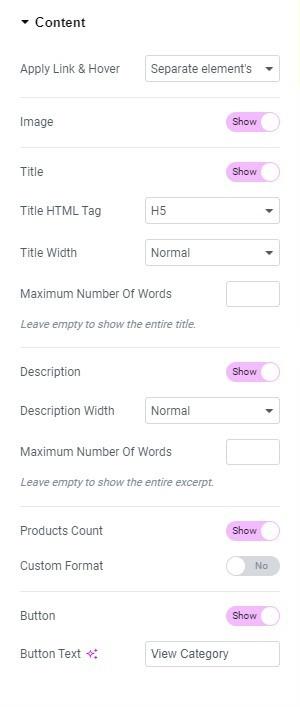
Under the “Content” tab (fig. 2.3), user can configure the appearance of the content:
- apply link & hover (determines whether the effect and link should apply to the entire element or to separate elements within it);
- image (hide/show);
- title (hide/show);
- title width (full form or cropped to one line to make all items equal);
- maximum number of words (works only with full titles and allows cropping them to a specific number of words);
- description (hide/show);
- description width (decides whether the description should be shown in its full form or cropped to one line to make all items equal);
- maximum number of words (works only with full descriptions and allows cropping them to a specific number of words);
- products count (hide/show);
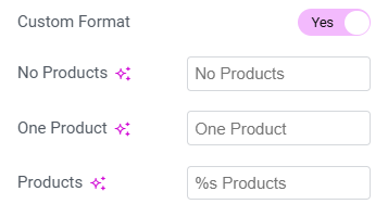
- custom format (allows setting custom formats for product quantity – fig. 2.4)
- button (hide/show);
- button text, if the button is enabled.
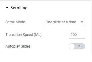
In the “Scrolling” tab (fig. 2.5), user can configure the scroll behavior.
- scroll mode (determines whether the slides should scroll one by one or the entire screen at once);
- transition speed;
- autoplay slides (yes/no);
- autoplay speed (time between each transition).
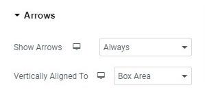
In the “Arrows” section (fig. 2.6), user can set the appearance of the arrows used to slide the carousel.
- show arrows (always/on hover/never);
- vertically aligned to (image/box area).
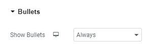
Under the “Bullets” section (fig. 2.7), user can decide whether they should be displayed always/on hover/never. Adjustable per device.
Style
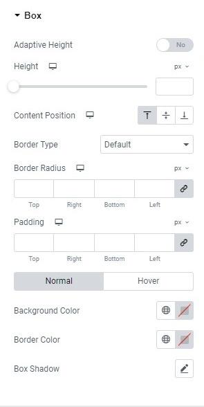
The “Box” section (fig. 3.1) allows user to adjust the appearance of the area behind a post (“box”):
- adaptive height (yes/no). It determines if the height of the carousel should be fixed to the highest item or adjust dynamically based on the visible elements;
- fixed height of the carousel;
- content position (top/middle/bottom position of the entire content within the box);
- border style and radius;
- padding around the carousel (adjustable per device);
- background, border and box shadow colors for normal and hover states.
In the “Featured Image” section (fig. 3.2), user can set the appearance of the featured image:
- position (left/top/right) to set the position of the image relative to the title and description;
- alignment of the image within the column;
- image spacing (space between the featured image and the content);
- maximum width of the image;
- image ratio. Leave empty to use the original proportions;
- hover icon (select from the library, upload your own, or disable it);
- border type and radius;
- overlay (plain/gradient), border, box shadow colors for hover and normal states;
- CSS filters and image opacity for hover and normal states.
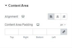
In the “Content Area” section (fig. 3.3), user can configure the content within its column:
- adjust the alignment of the content within its column;
- set the padding around the content within its column.
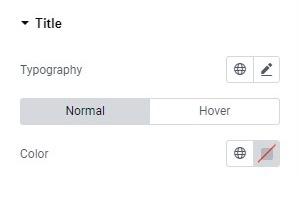
In the “Title” section (fig. 3.4), user can set the appearance of the category title:
- typography;
- set the color for normal and hover states.
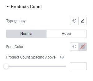
In the “Products Count” section (fig. 3.5), user can adjust the appearance of the product counter:
- typography;
- font color (normal/hover);
- spacing above the product count.
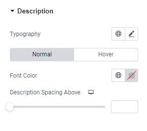
In the “Description” section (fig. 3.6), user can adjust the appearance of the category description:
- typography;
- font color (normal/hover);
- spacing above the product count.
In the “Button” section (fig. 3.7), user can style the appearance of the button^
- size (extra small/small/medium/large/extra large);
- icon (select from the library, upload your own, or disable it);
- icon size (adjustable per device);
- space between the button’s icon and text;
- typography of the button;
- min width min height;
- padding around the button’s text;
- border type and radius;
- text, icon, background, box shadow colors for normal and hover states;
- spacing above the button.
In the “Arrows” section (fig. 3.8), user can configure the appearance of the arrows used to navigate the carousel:
- icons for the previous and next arrows. The icon can be uploaded or selected from the icon library;
- arrow icon size;
- arrow width, height, border radius and border width;
- icon, border, background colors for normal and hover states.
Also, you can adjust “Previous” and “Next” arrows position:
- vertical (top/middle/bottom);
- horizontal (left/center/right);
- vertical offset, to move the arrow’s position vertically;
- horizontal offset, to move the arrow’s position horizontally.
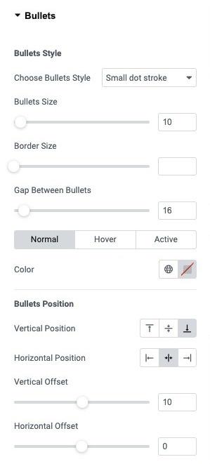
In the “Bullets” section (fig. 3.9), user can set the appearance of the bullets navigation.
The following bullets styles are available:
User can configure the settings listed below:
- bullets size;
- border size;
- gap between bullets;
- color for normal/hover/active states.
Also, you can adjust bullets position:
- vertical (top/middle/bottom);
- horizontal (left/center/right);
- vertical offset, to move the bullets position vertically;
- horizontal offset, to move the bullets position horizontally.
Advanced
Advanced section contains standard Elementor settings. More info is available here.
