The7 Menu Cart widget (fig. 1) for Elementor integrates a shopping cart into your site’s navigation or header, displaying items count and subtotal. It offers customization options for styling, behavior, and real-time AJAX updates.

Fig. 1. Menu Cart Widget.
Content
In the “Cart” content settings tab (fig. 2.1), you can customize elements of the cart widget:
- alignment;
- hide the cart if it doesn’t contain any products;
- title (with options for visibility and text);
- subtotal;
- cart icon (with options for visibility and text);
- indicator (with options for visibility and bubble design and text).
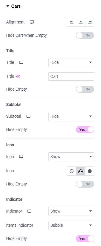
Fig. 2.1. Menu Cart Content Settings.
The “Popup” content settings tab (fig. 2.2) lets you tailor the behavior of the cart popup:
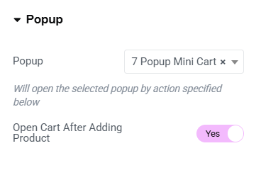
Fig. 2.2. Popup Content Settings.
- choose the specific popup (e.g., “Mini Cart”) to display when triggered. The popup can be designed under Dashboard -> Templates -> Popups;
- enable the option to open the cart automatically after adding a product.
Style
The “Box” styling settings (fig. 3.1) let you customize the visual appearance of your box element. Options allow to:
- adjust the thickness, color and radius of the box’s border;
- set internal spacing for the top, bottom, and sides of the container;
- choose a background color;
- add and configure shadow effects;
- style the box differently for normal and hover states;
- enable color changes for sticky or scroll transitions.
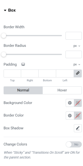
Fig. 3.1. Box Styling.
The “Title” styling settings tab (fig. 3.2) allows you to refine the appearance of your title section for a polished design:
- configure title font family, size, weight, and line height for both normal and hover states;
- set the color of the title and subtotal text;
- toggle color changes for sticky sections or scroll transitions when enabled for the parent section.
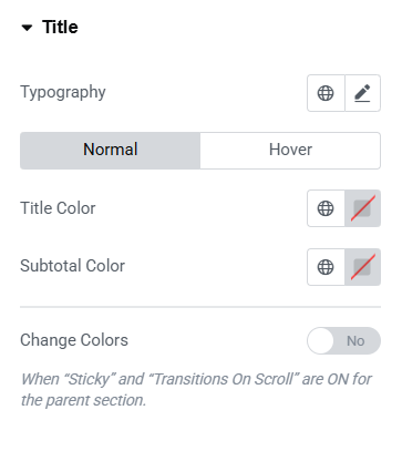
Fig. 3.2. Title Styling.
The “Cart Icon” styling (fig. 3.3) settings allow you to fine-tune the appearance and behavior of the cart icon:
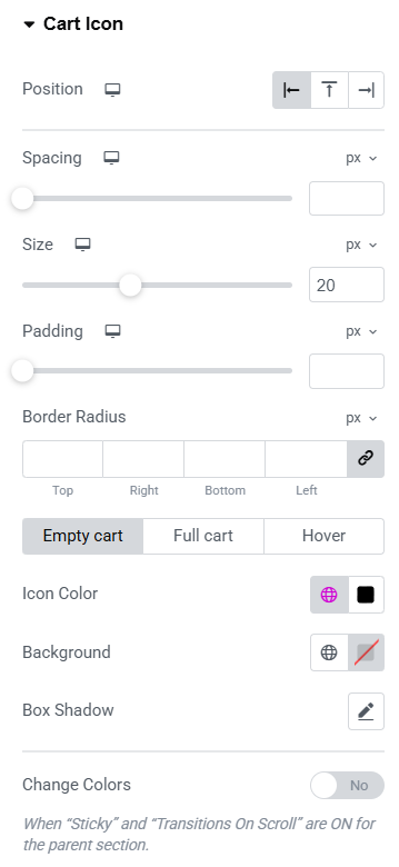
Fig. 3.3. Cart Icon Styling.
- placement of the cart icon within its section;
- spacing around the icon to ensure alignment;
- icon size and internal spacing for its container;
- corner roundness for the icon container;
- colors for the icon and its background, including states like empty cart, full cart, and hover;
- shadow effects to enhance the 3D appearance;
- color changes for sticky or scroll-transition effects tied to the parent section.
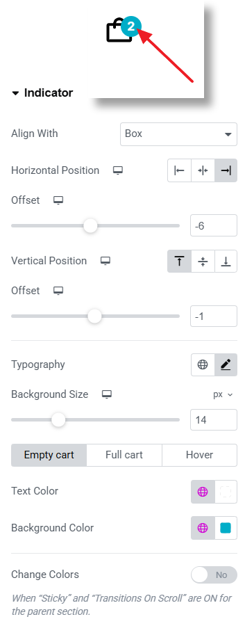
Fig. 3.4. Indicator Styling.
The “Indicator” styling settings (fig. 3.4) help you define the visual and positional aspects of the indicator within the cart widget:
- alignment of the indicator within the box or the icon;
- horizontal and vertical positioning of the indicator;
- typographic;
- size of the indicator’s background;
- text and background colors for different states (empty cart, full cart, and hover);
- color transitions for states like Sticky or Scroll, as inherited from the parent section.
Advanced
Advanced section contains standard Elementor settings. More info is available here.