The “Loop Scroller” widget (fig. 1) enables a smooth, continuous scrolling effect for dynamic content on your website. This is ideal for showcasing items such as client testimonials, product features, logo carousels, or team member profiles.
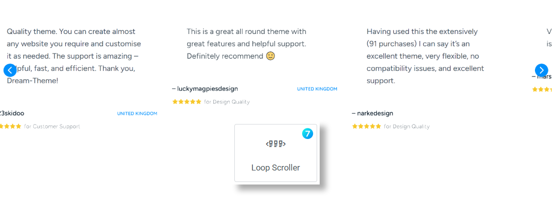
Fig. 1. Loop Scroller Widget.
Content
First of all, you need to create a Loop Template for an individual post under Templates -> Saved Templates -> Loop Item (fig. 2.1).
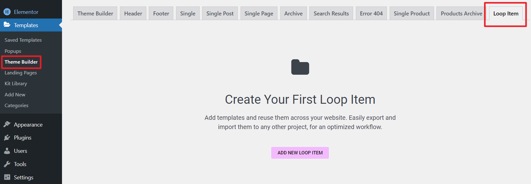
Fig. 2.1. Loop Item Template.
You can also create the template directly in the page editor (fig. 2.2):
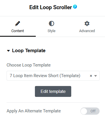
Fig. 2.2. Loop Template.
The idea of building a template is the same as for native Elementor Loop Items: you can insert Featured image widget, the Post Title widget, the Post Excerpt widget, etc. And style them in your own way.
The “Columns Layout” tab (fig. 3.1) in the Loop Scroller widget allows you to adjust:
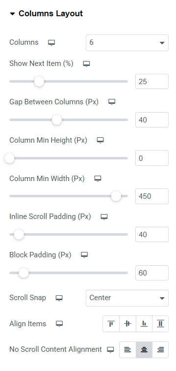
Fig. 3.1. Columns Layout.
- number of columns displayed within the scroller;
- percentage of the next item that remains visible;
- gap between columns;
- column min height;
- column min width;
- padding applied to the scroller for inline scrolling (fig. 3.2);
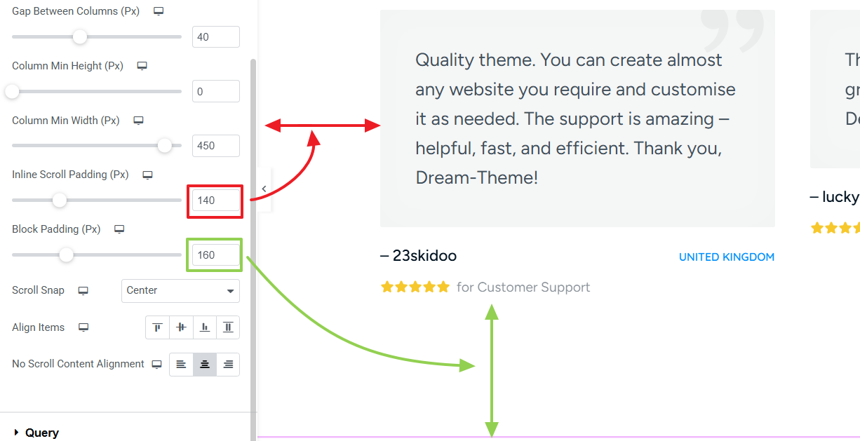
Fig. 3.2. Paddings.
- alignment of the scroll snap (fig. 3.3);
- alignment of the items within each column;
- content alignment for situations when scrolling isn’t necessary.
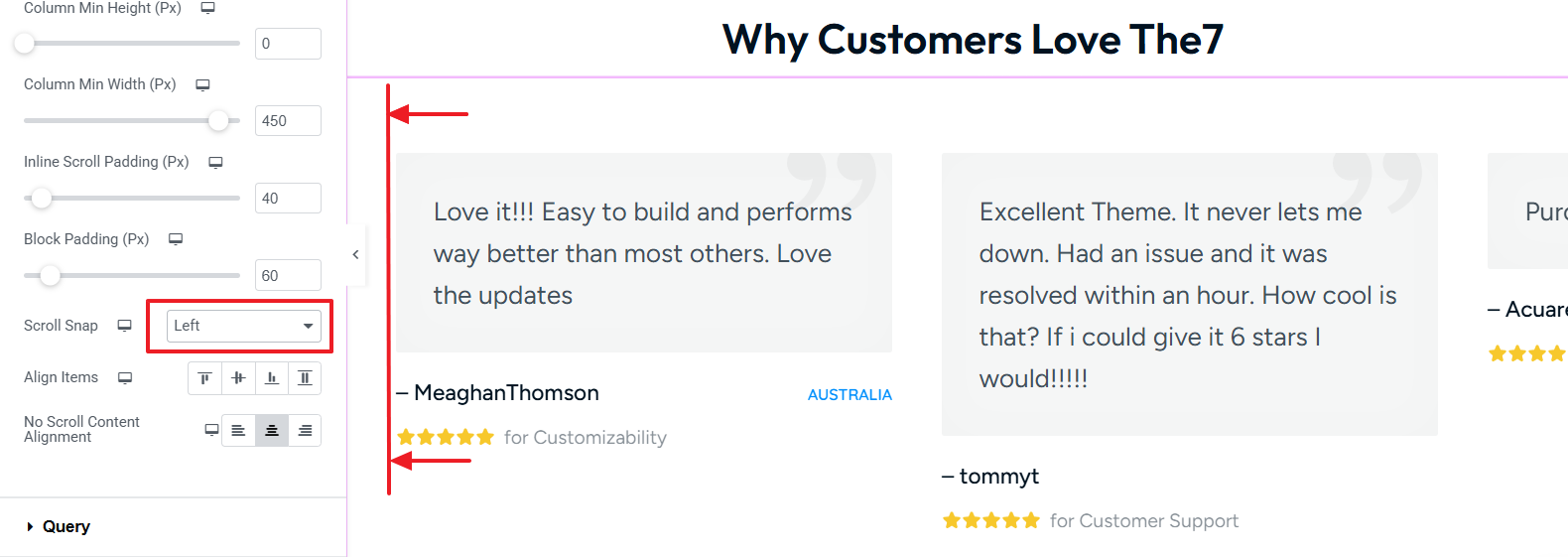
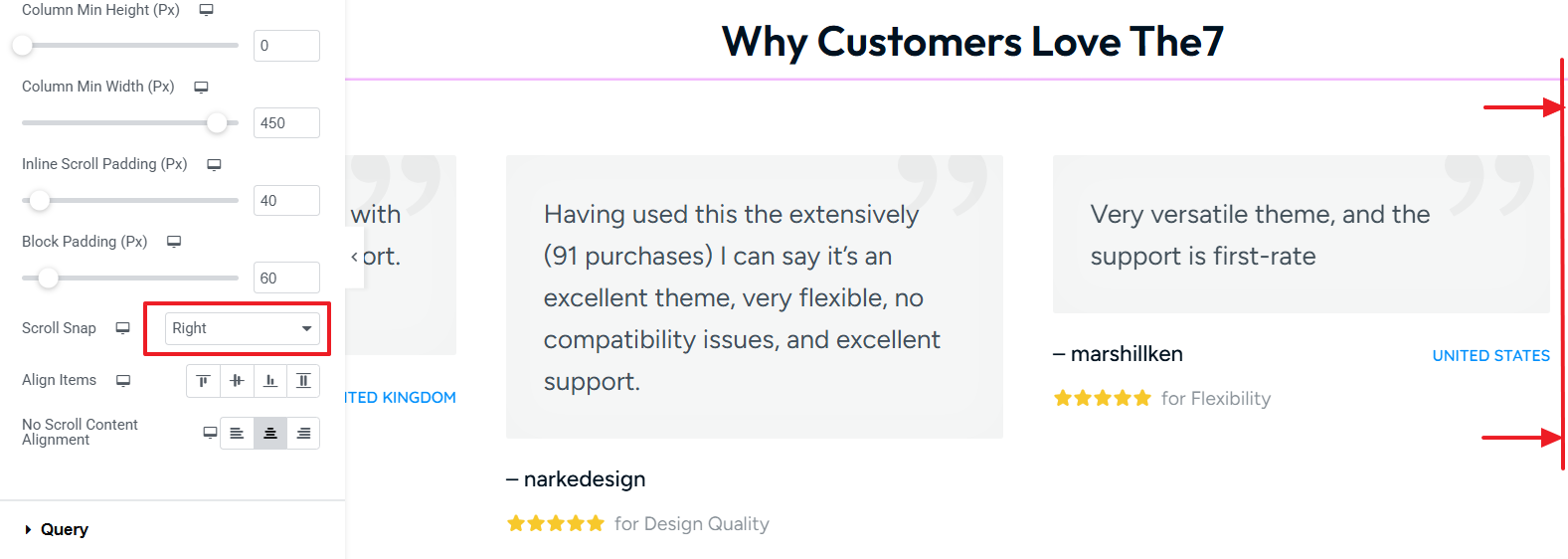
Fig. 3.3. Scroll Snap Alignment.
The “Query” tab in widget settings offers to select which posts to display (fig. 4):
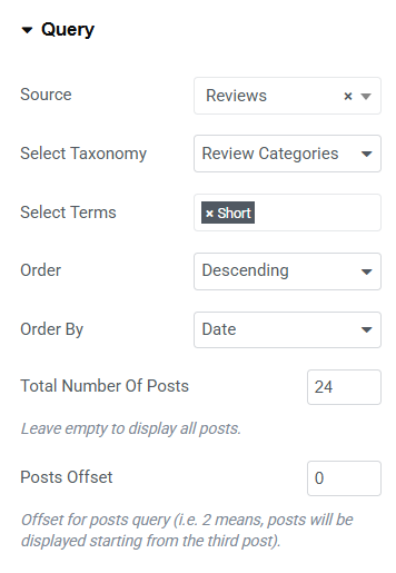
Fig. 4. Query Loop Scroll Settings.
You can select posts basing on their:
- post type: blog post, portfolio, album, team, testimonials. There are also options “Archive” – for displaying current query of posts, when building an archive template; and “Related” – for displaying so called “Related Posts” section on a single post page;
- category;
- tags (available for blog and portfolio posts only).
You can also decided whether you want to show/hide or display on hover slider Arrows and bullets (fig. 5). These options are responsive.
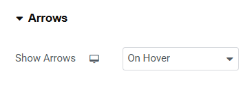
Fig. 5. Arrows Settings.
The “Scroll Indicator” tab allows configure visibility settings of the scroll bar: ‘Never,’ ‘Always,’ and ‘On Hover’. These options are responsive.
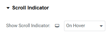

Fig. 6. Scroll Indicator.
Style
In the “Arrows” section (fig. 7), user can configure the appearance of the arrows used to navigate the scroller:
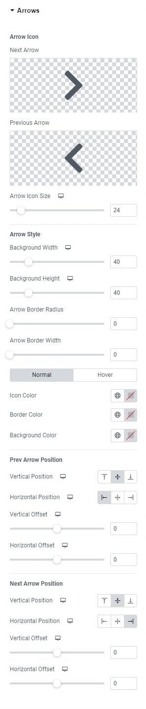
Fig. 7. Arrow Styling.
- icons for the previous and next arrows. The icon can be uploaded or selected from the icon library;
- arrow icon size;
- arrow width, height, border radius and border width;
- icon, border, background colors for normal and hover states.
Also, you can adjust “Previous” and “Next” arrows position:
- vertical (top/middle/bottom);
- horizontal (left/center/right);
- vertical offset, to move the arrow’s position vertically;
- horizontal offset, to move the arrow’s position horizontally.
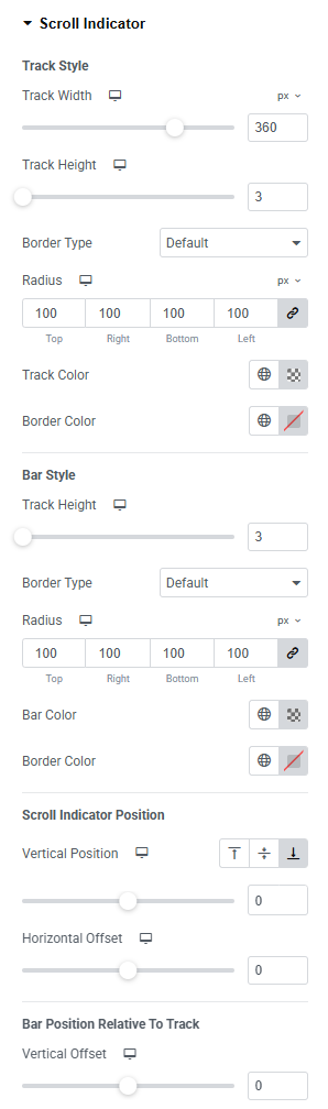
Fig. 8.1. Scroll Indicator Styling.
“Scroll Indicator” tab (fig. 8.1) allows to refine the behavior and appearance of the scrolling indicator within your widget.
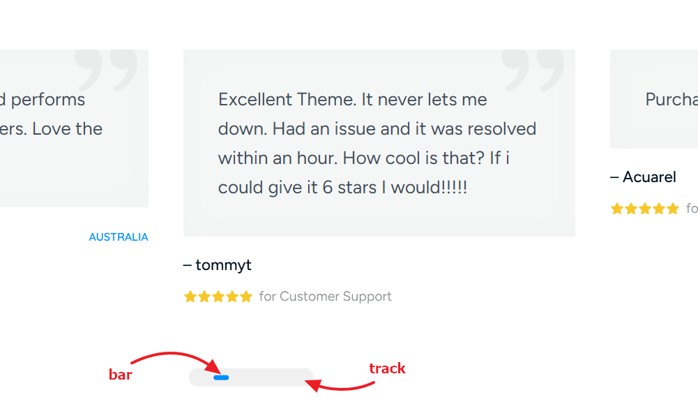
Fig. 8.2. Bar and Track within Scroll Indicator.
With controls (fig. 8.2) for Track Style (background or the pathway where the scroll bar moves) and Bar Style (draggable, interactive element that users manipulate to scroll through content), you can adjust:
- dimensions, color, and border type of the scrolling track;
- scrolling bar’s width, height, border radius, and border width;
- different colors for the track and bar, including hover states;
- position (vertical and horizontal);
- vertical and horizontal offsets;
- bar position inside of the track.
Advanced
The advanced section contains standard Elementor settings. More info is available here.