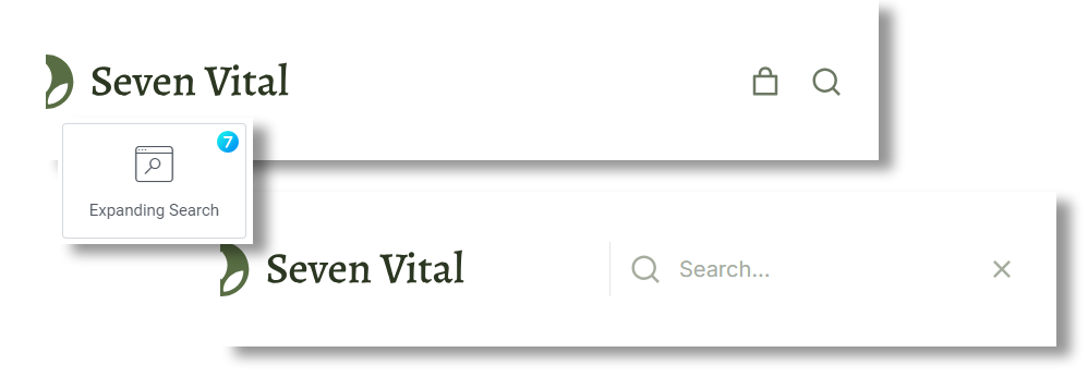
This widget (fig. 1) allows to display minimalistic “Search” icon and expand the search input on click. Such functionality is helpful for creating compact header interfaces, etc.
Content
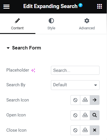
In the Search Form tab (fig. 2), you can specify:
- placeholder text;
- whether the search should be done within all post types or WooCommerce products only;
- icons for opening/closing the widget and entering the search request.
Style
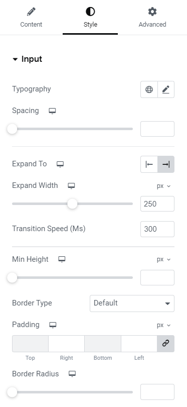
You can configure the following Input settings (fig. 3) in the appropriate tab:
- typography;
- spacing (between the “Search” placeholder and the icon);
- left or right expanding direction;
- width of the expanded input;
- animation speed when displaying the input;
- input min height;
- border style, width and radius.
In the Search Icon tab (fig. 3.2), you can adjust the following design options:
- icon size;
- width and height;
- border style, width and radius;
- colors for normal/hover/active states (for the icon, border, background);
- box shadow.
Open/Close Icon has almost the same settings (fig. 3.3):
- icon size;
- minimal width and height;
- border style, width and radius;
- colors for normal/hover/active states (for the icon, border, background);
- box shadow.
Advanced
The advanced section contains standard Elementor settings. More info is available here.


