The “Collapsible Banner” Elementor widget (fig. 1) enables you to add a collapsible, space-saving banner to your website. It is ideal for showcasing promotional content, such as limited-time offers, trial sizes, or sample sets.
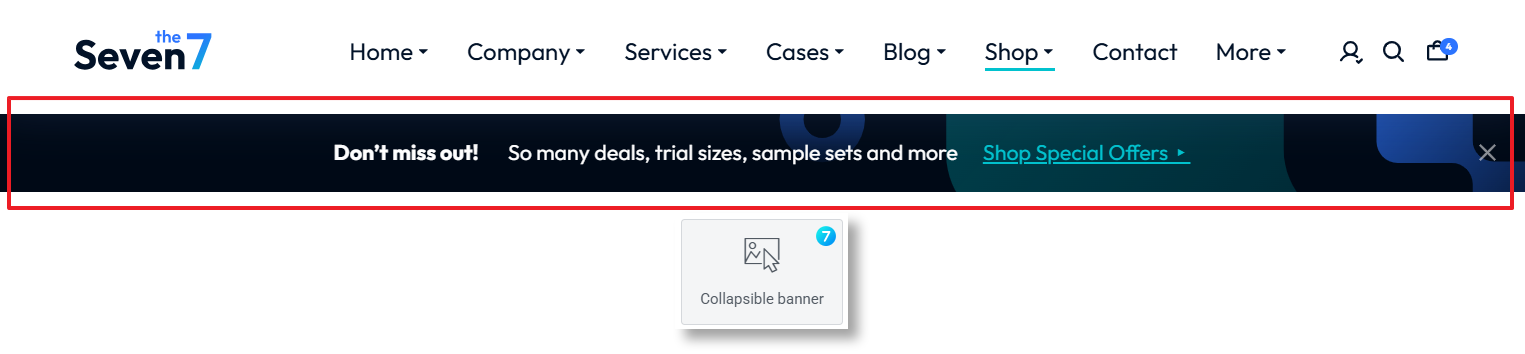
Fig. 1. Collapsible Banner Widget.
Content
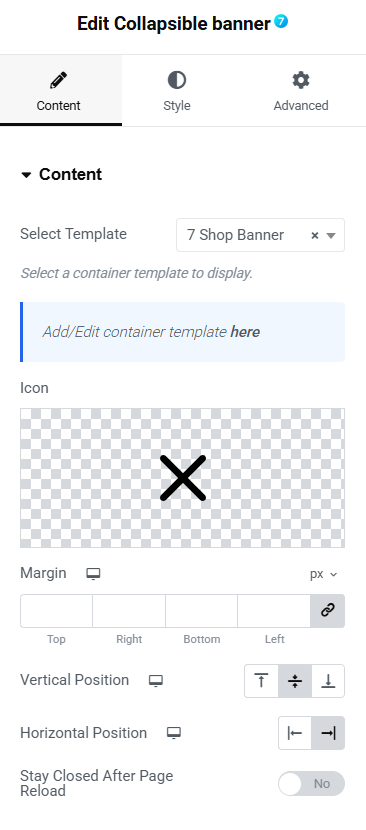
Fig. 2.1. Content Settings.
To configure the “Collapsible Banner” settings, navigate to the Content tab. Here, you can:
- use the dropdown menu labeled “Select Template” to choose a pre-designed template. You can create or edit them under Dashboard -> Templates -> Saved Templates -> Container;
- add a custom icon to the banner by clicking on the placeholder image;
- set the margin values;
- adjust vertical and horizontal alignment;
- enable persistent closure. Toggle the “Stay Closed After Page Reload” option to “Yes” or “No” to decide whether the banner remains closed after a page reload.
These settings allow you to fine-tune the appearance and behavior of the “Collapsible Banner” widget for a seamless user experience.
Style
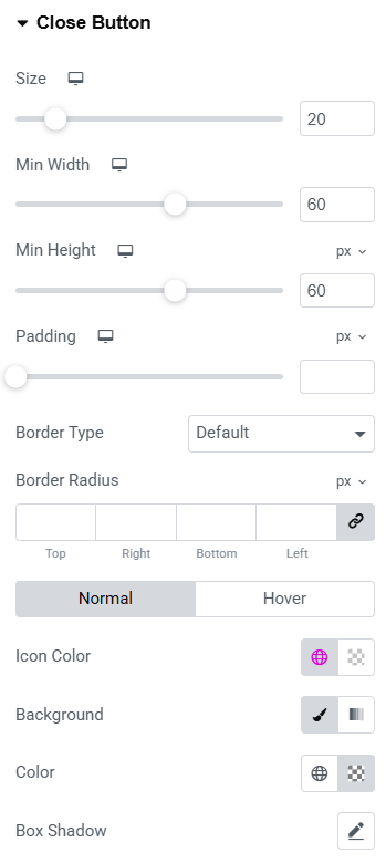
Fig. 2.2. Style Settings.
You can also configure Close icon appearance in the Style section (fig. 2.2):
- icon size;
- background minimal width and height;
- border style, width and radius;
- colors for normal/hover/active states (for the icon, border, background);
- box shadow.
Advanced
The advanced section contains standard Elementor settings. More info is available here.