The “Loop Add to Cart” widget enables users to add products to their shopping cart directly from a loop grid, while also displaying product variations as swatches, their prices, and other relevant options.
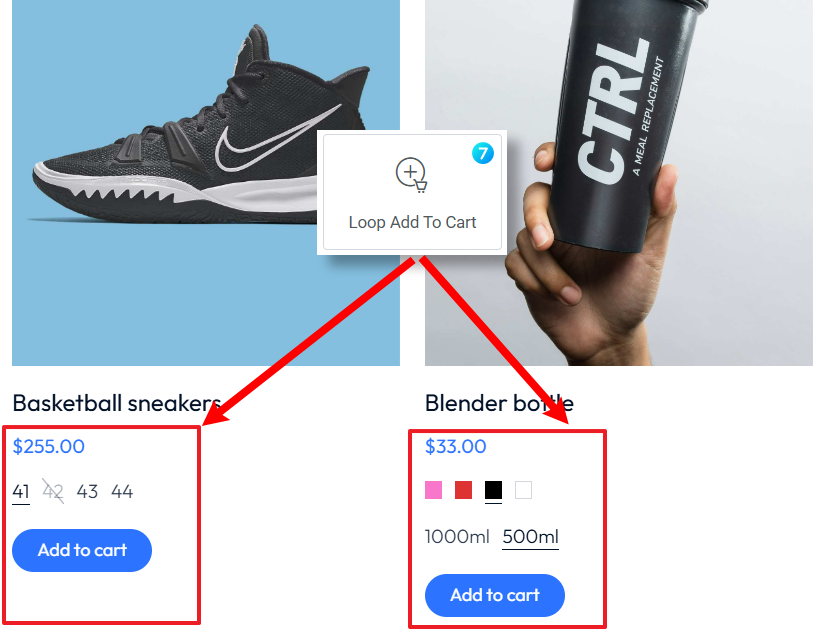
Fig. 1. Loop Add to Cart Widget.
Content
Content tab (fig. 2.1) for the “Loop Add to Cart” widget allows you to configure the essential functionality of the “Add to Cart” button within a loop layout. It offers settings for:
- button visibility;
- placement of the button (left, center, or right);
- visibility of the quantity selector for users to specify the desired number of items before adding them to the cart.
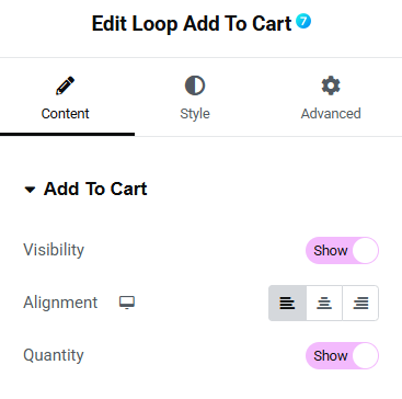
Fig. 2.1. Add to Cart Content Settings.
“Variations” tab (fig. 2.2) for the “Loop Add to Cart” widget allows you to manage the display and styling of product variations directly within a loop layout. Key settings include controls for:
- variations visibility;
- alignment (left, center, or right);
- visibility of the variation label;
- variation display type (default or swatch).
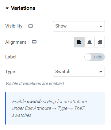
Fig. 2.2. Variations Settings.
You can enable this feature for any attribute under Edit Attribute → Type → The7 swatches (fig. 2.3):
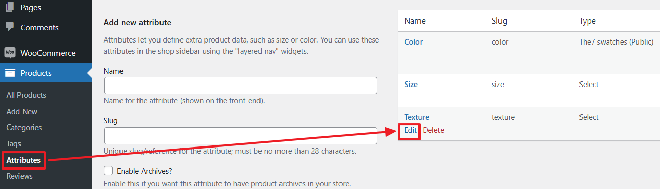
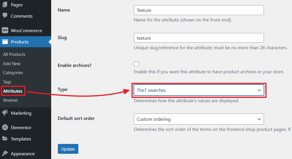
Fig. 2.3. Enabling Swatches for Product Attribute.
Style
“Variations Box” tab (fig. 3.1) for the “Loop Add to Cart” widget allows detailed customization of the container that holds product variations. It allows to adjust:
- spacing between variation attributes;
- margins and padding around and within the box;
- border type, width and radius;
- background and box shadow;
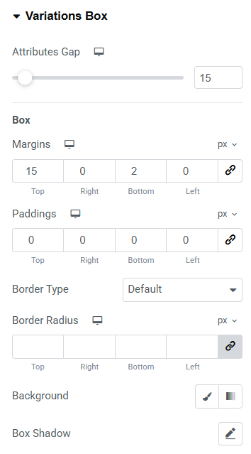
Fig. 3.1. Variation Box Styling.
“Default Variation Type” tab (fig. 3.2) for the “Loop Add to Cart” widget focuses on fine-tuning of default appearance of product variations. Key customization options include:
- typography;
- minimum width and height for variation elements to maintain uniformity;
- spacing between variations;
- margins and padding around the elements;
- border type, width and radius.
For normal, hover, selected and “our of store” states you also can adjust:
- text, background and border colors;
- box shadow;
- “out of stock” line.
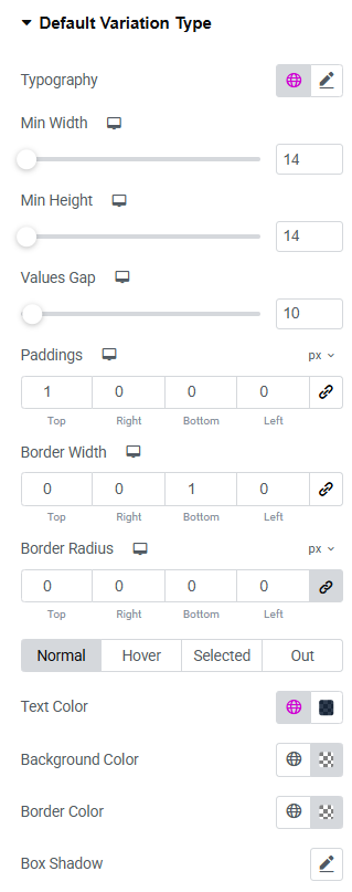
Fig. 3.2. Default Variation Styling.
In the “Swatch Variation Type” tab (fig. 3.3), you can customize the visual style of product attribute swatches with the following options:
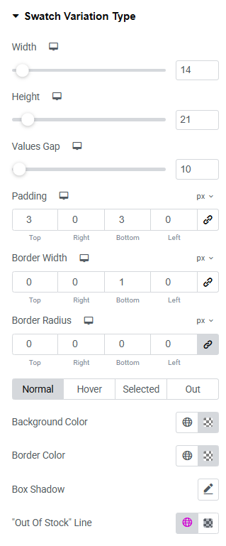
Fig. 3.3. Swatch Variation Styling.
- width and height of individual swatches for precise sizing;
- spacing between values;
- padding for top, right, bottom, and left sides;
- border width and radius for smooth or angular edges;
- normal, hover, selected, and out-of-stock states by styling background, border, and shadow effects;
- color and style of the “Out of Stock” strike-through line.
Fig. 3.4 shows a user interface for customizing the appearance of a “Quantity” box.
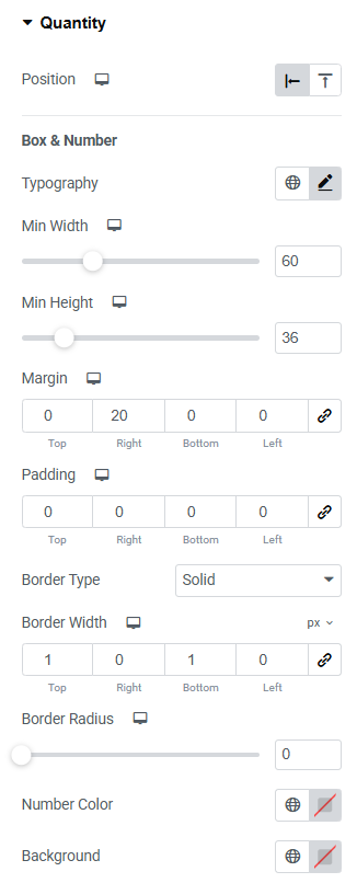
Fig. 3.4.1. Quantity Styling.
It includes various adjustable settings:
- box position;
- font style, size, and weight for text elements;
- minimum width and height of the container;
- padding;
- border design;
- color of number (product quantity);
- colors of background, border and box shadow.
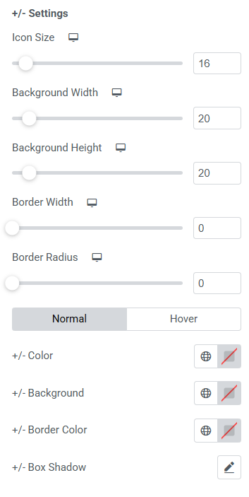
Fig.3.4.2. “+/-” Quantity Icons Styling.
Fig. 3.4.2 shows the settings panel for the “+/-” buttons of an “Add to cart” widget. It allows to customize various aspects of the widget’s appearance and behavior:
- icon size;
- background width and height;
- border width and radius;
- normal/hover colors for +/- icons themselves, background behind the icons, border and box shadow;
- spacing between the quantity field and the “Add to Cart” button.
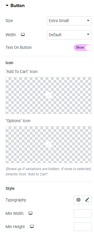
Fig. 3.5. Button Styling.
In the “Button” section (fig. 3.5), user can style the appearance of the button:
- size (extra small/small/medium/large/extra large);
- icon (select from the library, upload your own, or disable it);
- icon size (adjustable per device);
- space between the button’s icon and text;
- typography of the button;
- min width min height;
- padding around the button’s text;
- border type and radius;
- text, icon, background, box shadow colors for normal and hover states.
Advanced
Advanced section contains standard Elementor settings. More info is available here.