The widget (fig. 1) serves to show basic simple products carousel:
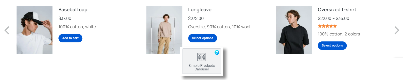
Fig. 1. Simple Products Carousel Widget.
Content
In the “Query” tab (fig. 2.1) you can select the source like:
- latest products;
- sale products;
- top rated products;
- best selling products;
- manual selection;
- featured products;
- related products – usable when you use it on a single product, or in product’s template;
- recently viewed products;
- current query – usable on archive templates.
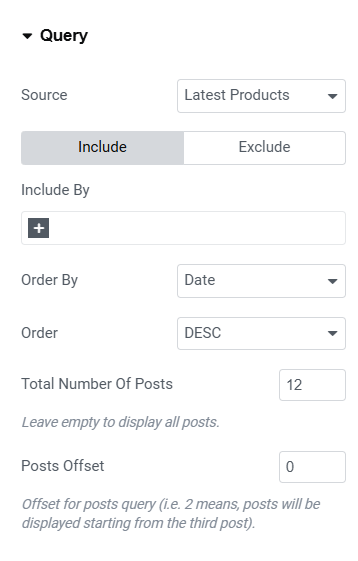
Fig. 2.1. Query Settings.
You can also limit the number of posts in the carousel and define the offset for posts query (i.e. 2 means, posts will be displayed starting from the 3-rd post).
In the “Layout” tab (fig. 2.2), user can configure the layout of the carousel:
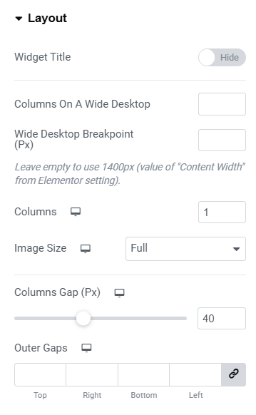
Fig. 2.2. Layout Settings.
- widget title (show/hide);
- columns on a wide desktop;
- wide desktop breakpoint (resolution above which the screen is considered wide);
- number of columns;
- image size (select the source image size);
- columns gap (between carousel items);
- outer gaps (space around the entire carousel).
Under the “Content” tab (fig. 2.3), user can configure the appearance of the content:
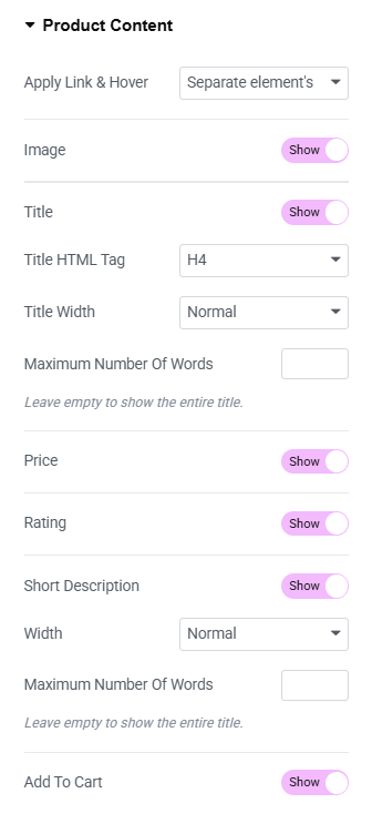
Fig. 2.3. Content Settings.
- apply link & hover (determines whether the effect and link should apply to the entire element or to separate elements within it);
- image (hide/show);
- title (hide/show);
- title HTML tag;
- title width (full form or cropped to one line to make all items equal);
- maximum number of words (works only with full titles and allows cropping them to a specific number of words);
- price (hide/show);
- rating (hide/show);
- short description (hide/show);
- description width (decides whether the description should be shown in its full form or cropped to one line to make all items equal);
- maximum number of words (works only with full descriptions and allows cropping them to a specific number of words);
- Add to Cart (hide/show).
“Scrolling” tab (fig. 2.4) allows to configure the aspects of animation:
- scrolling mode (one slide at a time OR all slides in the viewport);
- transition speed;
- autoplay.
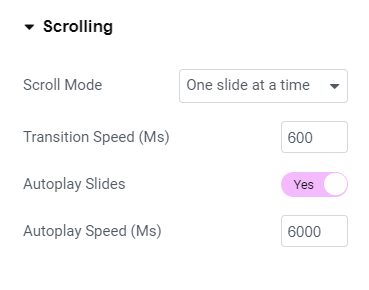
Fig. 2.4. Scrolling Settings.
In the “Arrows” tab (fig. 2.5) you can decide if the arrows should be displayed always, on hover only or never. Also, it allows to consider the entire height of a product or only featured image height, when positioning the arrows vertically.
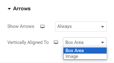
Fig. 2.5. Arrows Options.
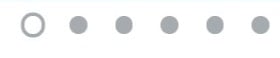
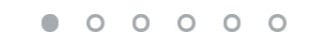
“Bullets” tab (fig. 2.7) also has setting for making bullets visible always/never/on hover.
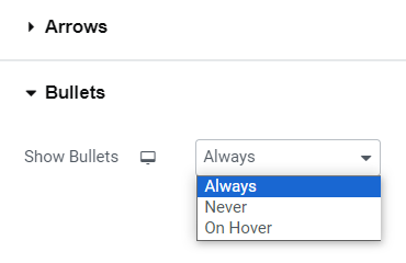
Fig. 2.6. Bullets Options.
Style
The “Box” tab allows to style the area behind the entire box (fig. 3.1):
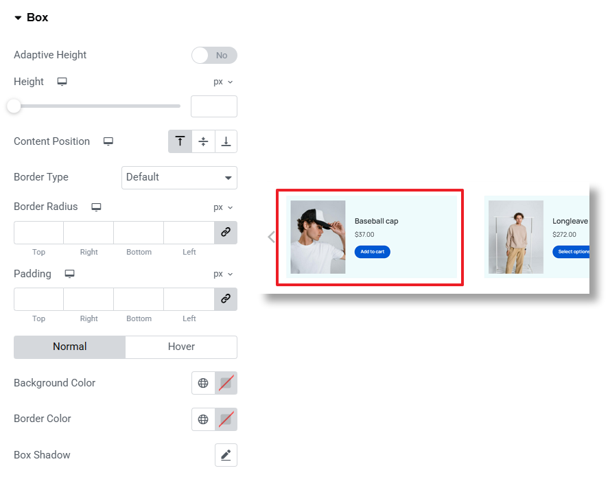
Fig. 3.1. Box Styling.
You can adjust:
- content position inside of the box;
- height or adaptive height (to automatically adjust the height of the box depending on the content height of each product);
- border width, color and radius;
- background color and padding;
- box shadow.
Within the “Featured Image” tab, it is possible to configure the following settings of products featured images (fig. 3.2):
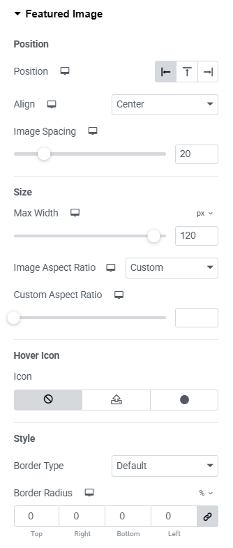
Fig. 3.2. Image Tab.
- vertical and horizontal alignment;
- gap between the image and text;
- max width and image width/height ratio (leave empty to keep the original image proportions). When choosing specific ratio, you can also select “object fit” (fill, cover or contain);
- hover icon and its styling;
- border width, color and radius;
- box shadow;
- overlay for normal and hover conditions;
- CSS filters;
- image opacity for normal and hover conditions.
“Content Area” tab allows to adjust appearance of the area behind text content: title, excerpt, etc. (fig. 3.3). In particular, its alignment and paddings.
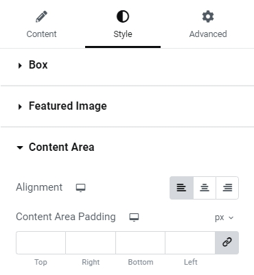
Fig. 3.3. Content Area Settings
Configure Product Title color and typography in the appropriate tab (fig. 3.4):
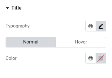
Fig. 3.4. Title Settings.
Under the “Price” tab (fig. 3.5), you can configure typography and colors for the:
- normal price;
- sale prices (old and new ones).
As well as the color of the strike line for the old price and spacing above the price.
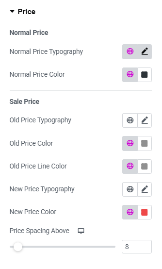
Fig. 3.5. Price Styling.
In the “Rating” tab (fig. 3.6), you can set the appearance of the star rating of the product. You can set:
- size of the stars;
- empty star color;
- filled star color;
- spacing above the stars.
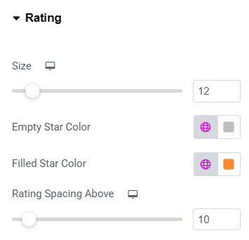
Fig. 3.6. Rating Styling.
In the “Button” section (fig. 3.7), user can style the appearance of the button:
- size (extra small/small/medium/large/extra large);
- icon (select from the library, upload your own, or disable it);
- icon size (adjustable per device);
- space between the button’s icon and text;
- typography of the button;
- min width min height;
- padding around the button’s text;
- border type and radius;
- text, icon, background, box shadow colors for normal and hover states.
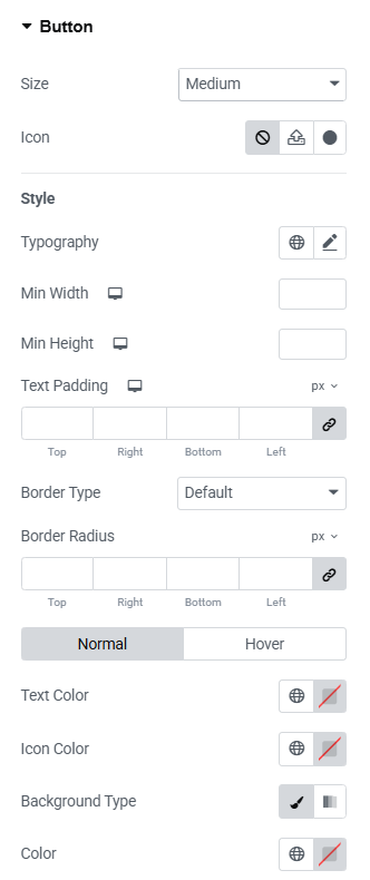
Fig. 3.7. Add to Cart Styling.
In the “Arrows” section (fig. 3.8), user can configure the appearance of the arrows used to navigate the carousel:
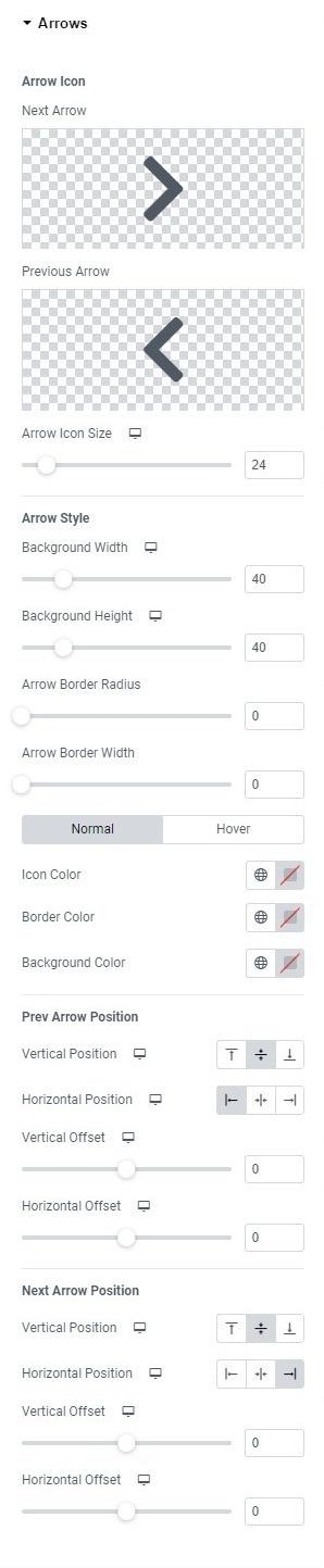
Fig. 3.8. Arrow Styling.
- icons for the previous and next arrows. The icon can be uploaded or selected from the icon library;
- arrow icon size;
- arrow width, height, border radius and border width;
- icon, border, background colors for normal and hover states.
Also, you can adjust “Previous” and “Next” arrows position:
- vertical (top/middle/bottom);
- horizontal (left/center/right);
- vertical offset, to move the arrow’s position vertically;
- horizontal offset, to move the arrow’s position horizontally.
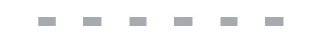
In the “Bullets” section (fig. 3.9), user can set the appearance of the bullets navigation.
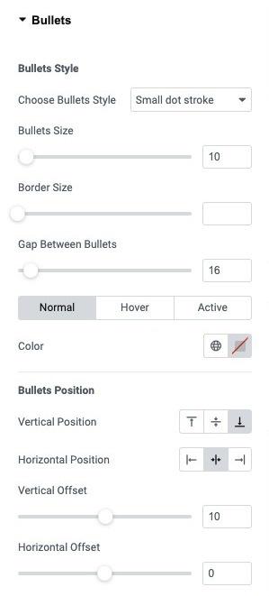
Fig. 3.9. Bullets Styling.
The following bullets styles are available:
- Small dot stroke

- Scale up

- Stroke
- Fill in
- Square
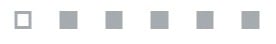
- Rectangular
User can configure the settings listed below:
- bullets size;
- border size;
- gap between bullets;
- color for normal/hover/active states.
Also, you can adjust bullets position:
- vertical (top/middle/bottom);
- horizontal (left/center/right);
- vertical offset, to move the bullets position vertically;
- horizontal offset, to move the bullets position horizontally.
Advanced
Advanced section contains standard Elementor settings. More info is available here.