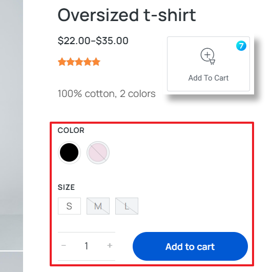
This widget (fig. 1) is meant to be used in Single Product templates in order to arrange “Add to Cart” functionality together with demonstrating product variations:
Content
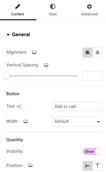
You can find the following settings under the “General” tab (fig. 2.1):
- alignment. Determines the horizontal positioning of the “Add to Cart” button within its container. You can choose to align the button to the left or center;
- vertical spacing. This slider adjusts the amount of space in-between the button and attributes;
- button text (the default text is “Add to cart”);
- button width (default or stretch across the container);
- quantity visibility. This toggle switch controls whether the quantity field is displayed next to the “Add to Cart” button. When enabled, customers can adjust the number of items they wish to purchase before adding them to the cart;
- quantity field position. Determines where the quantity field appears in relation to the button (inline or stacked above).
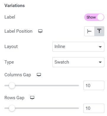
For variable products, it is also possible to configure (fig. 2.2):
- attribute label visibility and position (left or top);
- attribute values layout (inline, columns or dropdown);
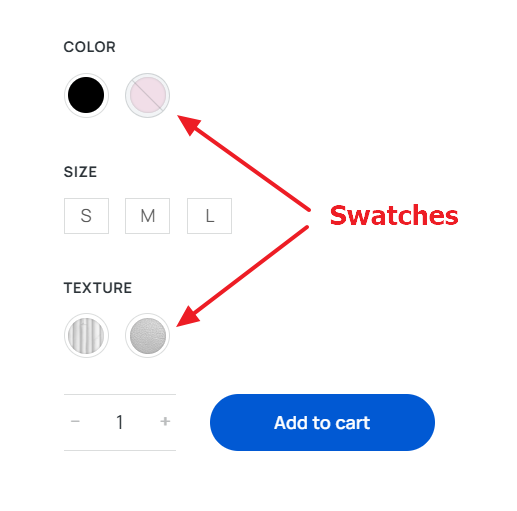
- swatch (fig. 3.3) attributes display.
For the Inline layout, you can specify vertical and horizontal distance between attributes. And for the Columns layout, you can also specify the number of columns.
Style
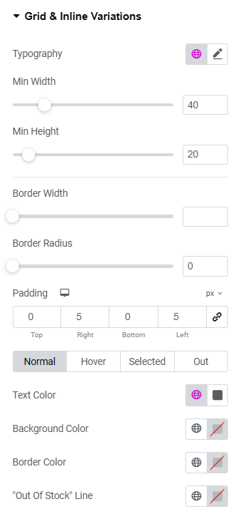
For the Grid and Inline variations layouts (fig. 3.1), you can configure the following options:
- attribute typography;
- minimal width and height of a single attribute value;
- item border width and radius;
- item padding;
- normal/hover/selected/out-of-stock colors for text, border, background and “Out of stock” strike line.
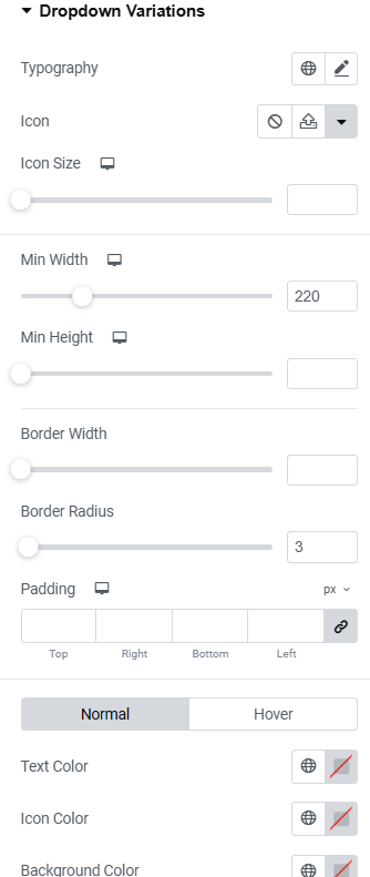
Styling is a bit different for Dropdown variations (fig. 3.2):
- attribute typography;
- dropdown icon and its size;
- minimal width and height of the list;
- dropdown border width and radius;
- inner padding;
- normal/hover colors for text, icon, border and background.
Swatch is a visual representation of product variations (fig. 3.3), such as colors, patterns, or images, used instead of traditional dropdown menus.
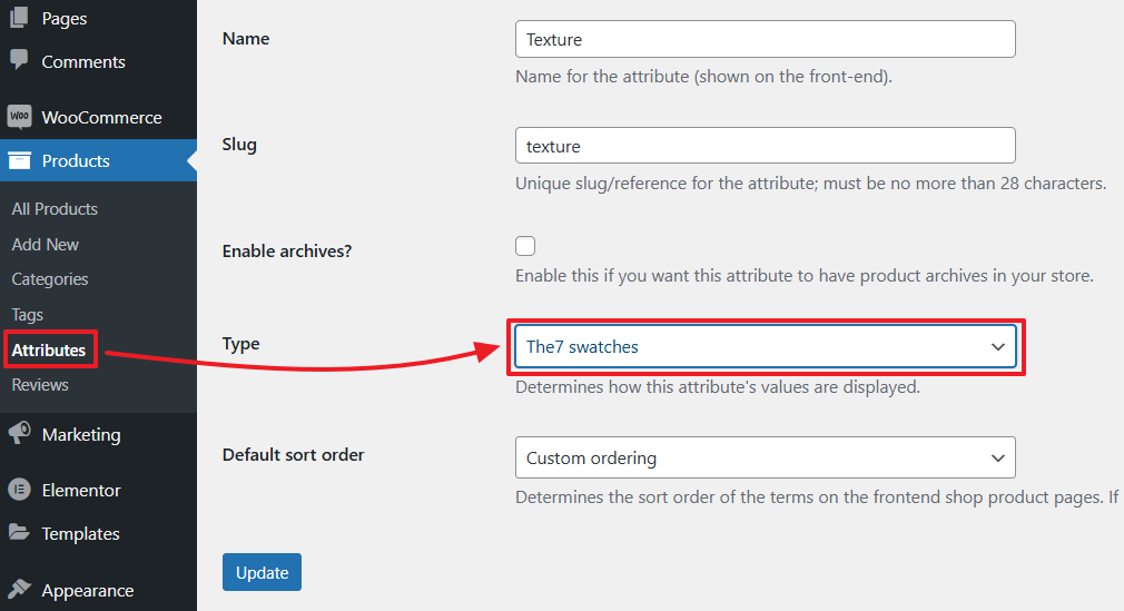
You can enable this feature for any attribute under Edit Attribute → Type → The7 swatches (fig. 3.4):
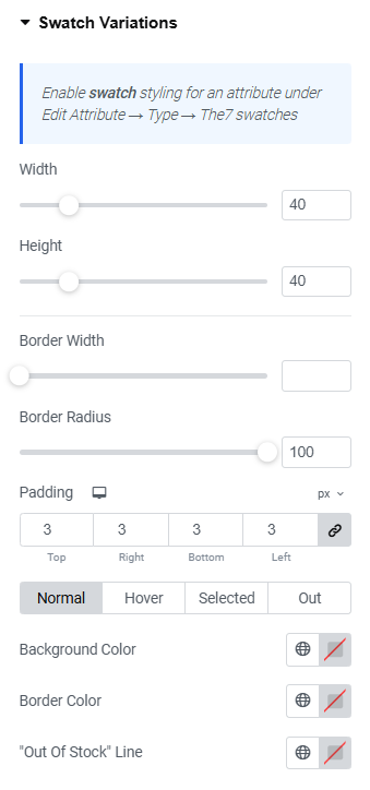
Now, you can style attribute appearance in the appropriate settings tab (fig. 3.5):
- single swatch width and height;
- item border width and radius;
- item padding;
- normal/hover/selected/out-of-stock colors for background, border and “Out of stock” strike line.
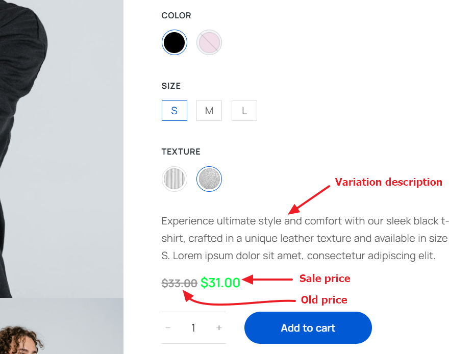
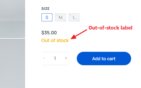
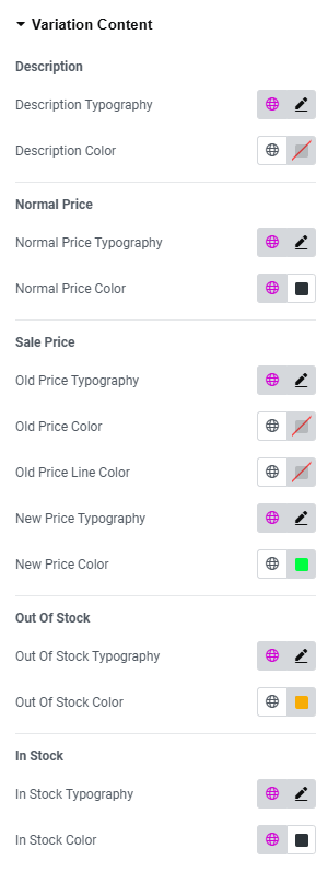
“Variation Content” tab (fig. 3.7) allows to style the following parts of variation info (fig. 3.6):
- description;
- normal price;
- sale price;
- old price;
- out-of-stock label.
In particular, their typography and colors.
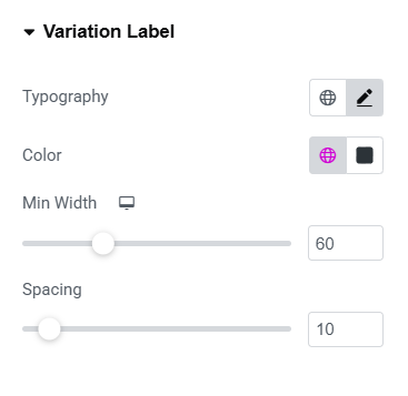
“Variation Label” tab (fig. 3.8) provides settings for styling of variation labels:
- typography;
- text color;
- minimal label width;
- spacing between the label and variation.
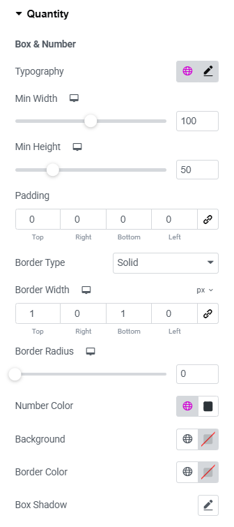
Fig. 3.9.1 shows a user interface for customizing the appearance of a “Quantity” box:
The interface includes various adjustable settings:
- typography;
- minimal width and height of the box;
- area padding;
- border type, width and radius;
- color of number (product quantity);
- colors of background, border and box shadow.
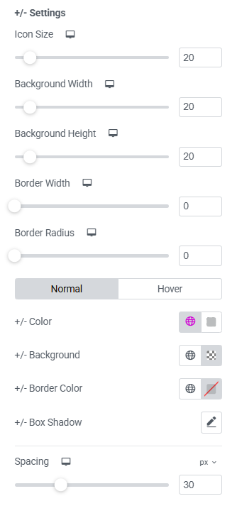
Fig. 3.9.2 shows the settings panel for the “+/-” buttons of an “Add to cart” widget. It allows to customize various aspects of the widget’s appearance and behavior:
- icon size;
- background width and height;
- border width and radius;
- normal/hover colors for +/- icons themselves, background behind the icons, border and box shadow;
- spacing between the quantity field and the “Add to Cart” button.
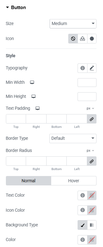
In the “Button” section (fig. 3.10), user can style the appearance of the button:
- size (extra small/small/medium/large/extra large);
- icon (select from the library, upload your own, or disable it);
- icon size (adjustable per device);
- space between the button’s icon and text;
- typography of the button;
- min width min height;
- padding around the button’s text;
- border type and radius;
- text, icon, background, box shadow colors for normal and hover states.
Advanced
Advanced section contains standard Elementor settings. More info is available here.
