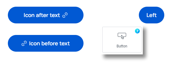
Buttons on a website are crucial in guiding user actions, providing clear calls to action, and enhancing overall user engagement. The Button widget (fig. 1) lets you add interactive and visually appealing buttons on your site.
The7 Button widget offers a range of customization options, enabling you to easily control the button’s appearance, behavior and link destinations.
Content
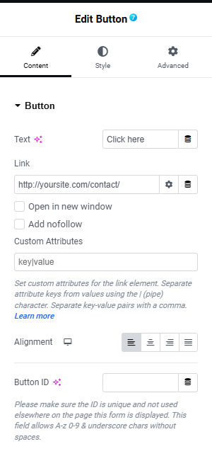
In the Content tab under the Button section:
- enter the button’s text In the Text field;
- in the Link field, add the URL for the button’s link. Click the ⚙️ to set the link to either Open in a new window or to Add nofollow to the link;
- the Alignment option lets you change the alignment of the button to left, right, center, etc.;
- (Optional) In the Button ID field, assign a unique button ID for specific situations, such as Google Analytics events, Meta Pixel, and more.
Style
Under the Style tab, you can select the button size Extra Small, Small, Medium, Large or Extra Large. These are predefined sizes and you customize it from Elementor site settings > The7 Buttons.
(Optional) In the Icon field, you can add an icon to the button:
- click the arrow icon to add an uploaded SVG image as a button icon;
- click on the black dot icon to add an icon from the icon library.
Under the style section, you can:
- select the font family, size, etc. in The Typogrpahy field;
- Min Width lets you set a minimum width for the button;
- Min Height you can set a minimum height for the button;
- apply padding in the Text Padding;
- select a Border type and border-radius
Then you can set colors for the text, icon, and background for the normal state. Click on the Hover tab and configure the same for hover state styles.
Advanced
Advanced section contains standard Elementor settings. More info is available here.


